Engage NY Eureka Math 8th Grade Module 6 Lesson 8 Answer Key
Eureka Math Grade 8 Module 6 Lesson 8 Exercise Answer Key
Example 1: Housing Costs
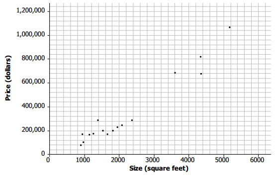
Let’s look at some data from one midwestern city that indicate the sizes and sale prices of various houses sold in this city.

Data Source: http://www.trulia.com/for_sale/Milwaukee,WI/5_p, accessed in 2013
A scatter plot of the data is given below.
Exercises 1–6
Exercise 1.
What can you tell about the price of large homes compared to the price of small homes from the table?
Answer:
Answers will vary. Students should make the observation that, overall, the larger homes cost more, and the smaller homes cost less. However, it is hard to generalize because one of the smaller homes costs nearly $150,000.
Exercise 2.
Use the scatter plot to answer the following questions.
a. Does the scatter plot seem to support the statement that larger houses tend to cost more? Explain your thinking.
Answer:
Yes, because the trend is positive, the larger the size of the house, the more the house tends to cost.
b. What is the cost of the most expensive house, and where is that point on the scatter plot?
Answer:
The house with a size of 5,232 square feet costs $1,050,000, which is the most expensive. It is in the upper right corner of the scatter plot.
c. Some people might consider a given amount of money and then predict what size house they could buy. Others might consider what size house they want and then predict how much it would cost. How would you use the scatter plot in Example 1?
Answer:
Answers will vary. Since the size of the house is on the horizontal axis and the price is on the vertical axis, the scatter plot is set up with price as the dependent variable and size as the independent variable. This is the way you would set it up if you wanted to predict price based on size. Although various answers are appropriate, move the discussion along using size to predict price.
d. Estimate the cost of a 3,000-square-foot house.
Answer:
Answers will vary. Reasonable answers range between $300,000 and $600,000.
e. Do you think a line would provide a reasonable way to describe how price and size are related? How could you use a line to predict the price of a house if you are given its size?
Answer:
Answers will vary; however, use this question to develop the idea that a line would provide a way to estimate the cost given the size of a house. The challenge is how to make that line. Note: Students are encouraged in the next exercise to first make a line and then evaluate whether or not it fits the data. This will provide a reasonable estimate of the cost of a house in relation to its size.
Exercise 3.
Draw a line in the plot that you think would fit the trend in the data.
Answer:
Answers will vary. Discuss several of the lines students have drawn by encouraging students to share their lines with the class. At this point, do not evaluate the lines as good or bad. Students may want to know a precise procedure or process to draw their lines. If that question comes up, indicate to students that a procedure will be developed in their future work (Algebra I) with statistics. For now, the goal is to simply draw a line that can be used to describe the relationship between the size of a home and its cost. Indicate that strategies for drawing a line will be explored in Exercise 5. Use the lines provided by students to evaluate the predictions in the following exercise. These predictions are used to develop a strategy for drawing a line. Use the line drawn by students to highlight their understanding of the data.
Exercise 4.
Use your line to answer the following questions:
a. What is your prediction of the price of a 3,000-square-foot house?
Answer:
Answers will vary. A reasonable prediction is around $500,000.
b. What is the prediction of the price of a 1,500-square-foot house?
Answer:
Answers will vary. A reasonable prediction is around $200,000.
Exercise 5.
Consider the following general strategies students use for drawing a line. Do you think they represent a good strategy for drawing a line that fits the data? Explain why or why not, or draw a line for the scatter plot using the strategy that would indicate why it is or why it is not a good strategy.
a. Laure thought she might draw her line using the very first point (farthest to the left) and the very last point (farthest to the right) in the scatter plot.
Answer:
Answers will vary. This may work in some cases, but those points might not capture the trend in the data. For example, the first point in the lower left might not be in line with the other points.
b. Phil wants to be sure that he has the same number of points above and below the line.
Answer:
Answers will vary. You could draw a nearly horizontal line that has half of the points above and half below, but that might not represent the trend in the data at all. Note: For many students just starting out, this seems like a reasonable strategy, but it often can result in lines that clearly do not fit the data. As indicated, drawing a nearly horizontal line is a good way to indicate that this is not a good strategy.
c. Sandie thought she might try to get a line that had the most points right on it.
Answer:
Answers will vary. That might result in, perhaps, three points on the line (knowing it only takes two to make a line), but the others could be anywhere. The line might even go in the wrong direction. Note: For students just beginning to think of how to draw a line, this seems like a reasonable goal; however, point out that this strategy may result in lines that are not good for predicting price.
d. Maree decided to get her line as close to as many of the points as possible.
Answer:
Answers will vary. If you can figure out how to do this, Maree’s approach seems like a reasonable way to find a line that takes all of the points into account.
Exercise 6.
Based on the strategies discussed in Exercise 5, would you change how you draw a line through the points? Explain your answer.
Answer:
Answers will vary based on how a student drew his original line. Summarize that the goal is to draw a line that is as close as possible to the points in the scatter plot. More precise methods are developed in Algebra I.
Example 2: Deep Water
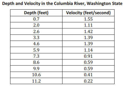
Does the current in the water go faster or slower when the water is shallow? The data on the depth and velocity of the Columbia River at various locations in Washington State listed below can help you think about the answer.
Data Source: www.seattlecentral.edu/qelp/sets/011/011.html
a. What can you tell about the relationship between the depth and velocity by looking at the numbers in the table?
Answer:
Answers will vary. According to the table, as the depth increases, the velocity appears to decrease.
b. If you were to make a scatter plot of the data, which variable would you put on the horizontal axis, and why?
Answer:
Answers will vary. It might be easier to measure the depth and use that information to predict the velocity of the water, so the depth should go on the horizontal axis.
Exercises 7–9
Exercise 7.
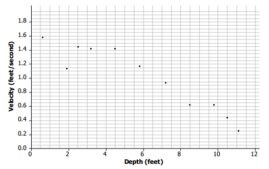
A scatter plot of the Columbia River data is shown below.
a. Choose a data point in the scatter plot, and describe what it means in terms of the context.
Answer:
Answers will vary. For example, (4.6,1.39) would represent a place in the river that was 4.6 feet deep and had a velocity of 1.39 ft/sec.
b. Based on the scatter plot, describe the relationship between velocity and depth.
Answer:
The deeper the water, the slower the current velocity tends to be.
c. How would you explain the relationship between the velocity and depth of the water?
Answer:
Answers will vary. Sample response: Velocity may be a result of the volume of water. Shallow water has less volume, and as a result, the water runs faster. Note: Students may have several explanations. For example, they may say that depth is a result of less water runoff; therefore, water depth increases.
d. If the river is two feet deep at a certain spot, how fast do you think the current would be? Explain your reasoning.
Answer:
Answers will vary. Based on the data, it could be around 1.11 ft/sec, or it could be closer to 1.42 ft/sec, which is more in line with the pattern for the other points.
Exercise 8.
Consider the following questions:
a. If you draw a line to represent the trend in the plot, would it make it easier to predict the velocity of the water if you know the depth? Why or why not?
Answer:
Answers will vary. A line will help you determine a better prediction for 1.5 ft. or 5 ft., where the points are a bit scattered.
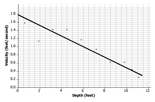
b. Draw a line that you think does a reasonable job of modeling the trend on the scatter plot in Exercise 7. Use the line to predict the velocity when the water is 8 feet deep.
Answer:
Answers will vary. A line is drawn in the following graph. Using this line, when the water is 8 ft. deep, the velocity is predicted to be 0.76 ft/sec.
Exercise 9.
Use the line to predict the velocity for a depth of 8.6 feet. How far off was your prediction from the actual observed velocity for the location that had a depth of 8.6 feet?
Answer:
Answers will vary. Sample response: The current would be moving at a velocity of 0.68 ft/sec. The observed velocity was 0.59 ft/sec, so the line predicted a velocity that was 0.09 ft/sec faster than the observed value.
Eureka Math Grade 8 Module 6 Lesson 8 Problem Set Answer Key
Question 1.
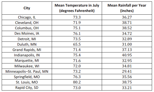
The table below shows the mean temperature in July and the mean amount of rainfall per year for 14 cities in the Midwest.
Data Source: http://countrystudies.us/united-states/weather/
a. What do you observe from looking at the data in the table?
Answer:
Answers will vary. Many of the temperatures were in the 70’s, and many of the mean inches of rain were in the 30’s. It also appears that, in general, as the rainfall increased, the mean temperature also increased.
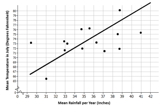
b. Look at the scatter plot below. A line is drawn to fit the data. The plot in the Exit Ticket had the mean July temperatures for the cities on the horizontal axis. How is this plot different, and what does it mean for the way you think about the relationship between the two variables—temperature and rain?
Answer:
This scatter plot has the labels on the axes reversed: (mean inches of rain, mean temperature). This is the scatter plot I would use if I wanted to predict the mean temperature in July knowing the mean amount of rain per year.
c. The line has been drawn to model the relationship between the amount of rain and the temperature in those Midwestern cities. Use the line to predict the mean July temperature for a Midwestern city that has a mean of 32 inches of rain per year.
Answer:
Answers will vary. For 32 in. of rain per year, the line indicates a mean July temperature of approximately 70°F.
d. For which of the cities in the sample does the line do the worst job of predicting the mean temperature? The best? Explain your reasoning with as much detail as possible.
Answer:
Answers will vary. I looked for points that were really close to the line and ones that were far away. The line prediction for temperature would be farthest off for Minneapolis. For 29.41 in. of rain in Minneapolis, the line predicted approximately 67°F, whereas the actual mean temperature in July was 73.2°F. The line predicted very well for Milwaukee.
For 32.95 in. of rain in Milwaukee, the line predicted approximately 73°F, whereas the actual mean temperature in July was 72°F and was only off by about 1°F. The line was also close for Marquette. For 34.81 in. of rain in Marquette, the line predicted approximately 71°F, whereas the actual mean temperature in July was 71.6°F and was only off by about 1°F.
Question 2.
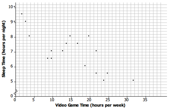
The scatter plot below shows the results of a survey of eighth-grade students who were asked to report the number of hours per week they spend playing video games and the typical number of hours they sleep each night.
Mean Hours Sleep per Night Versus Mean Hours Playing Video Games per Week
a. What trend do you observe in the data?
Answer:
The more hours that students play video games, the fewer hours they tend to sleep.
b. What was the fewest number of hours per week that students who were surveyed spent playing video games? The most?
Answer:
Two students spent 0 hours, and one student spent 32 hours per week playing games.
c. What was the fewest number of hours per night that students who were surveyed typically slept? The most?
Answer:
The fewest hours of sleep per night was around 5 hours, and the most was around 10 hours.
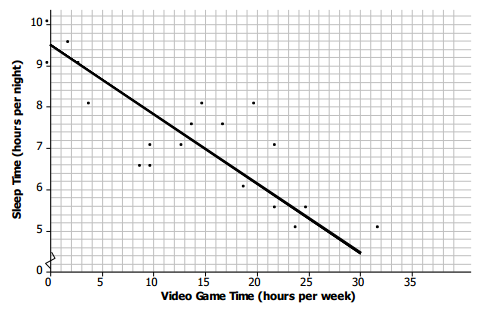
d. Draw a line that seems to fit the trend in the data, and find its equation. Use the line to predict the number of hours of sleep for a student who spends about 15 hours per week playing video games.
Answer:
Answers will vary. A student who spent 15 hours per week playing games would get about 7 hours of sleep per night.
Question 3.
Scientists can take very good pictures of alligators from airplanes or helicopters. Scientists in Florida are interested in studying the relationship between the length and the weight of alligators in the waters around Florida.
a. Would it be easier to collect data on length or weight? Explain your thinking.
Answer:
Answers will vary. You could measure the length from the pictures, but you would have to actually have the alligators to weigh them.
b. Use your answer to decide which variable you would want to put on the horizontal axis and which variable you might want to predict.
Answer:
You would probably want to predict the weight of the alligator knowing the length; therefore, the length would go on the horizontal axis and the weight on the vertical axis.
Question 4.
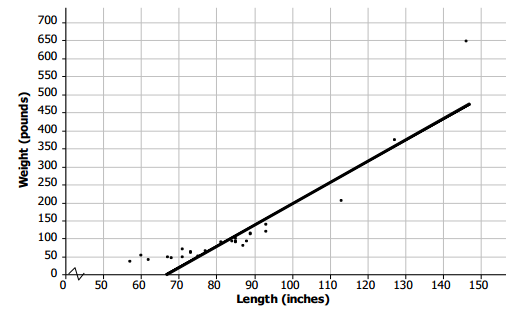
Scientists captured a small sample of alligators and measured both their length (in inches) and weight (in pounds). Torre used their data to create the following scatter plot and drew a line to capture the trend in the data. She and Steve then had a discussion about the way the line fit the data. What do you think they were discussing, and why?
Alligator Length (inches) and Weight (pounds)
Data Source: James Landwehr and Ann Watkins, Exploring Data, Quantitative Literacy Series (Dale Seymour, 1987).
Answer:
Answers will vary. Sample response: The pattern in the scatter plot is curved instead of linear. All of the data points in the middle of the scatter plot fall below the line, and the line does not really capture the pattern in the scatter plot. A line does not pass through the cluster of points between 60 to 80 in. in length that fit the other points. A model other than a line might be a better fit.
Eureka Math Grade 8 Module 6 Lesson 8 Exit Ticket Answer Key
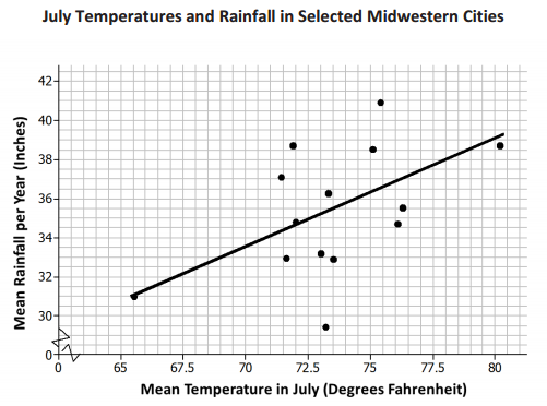
The plot below is a scatter plot of mean temperature in July and mean inches of rain per year for a sample of midwestern cities. A line is drawn to fit the data.
Data Source: http://countrystudies.us/united-states/weather/
Question 1.
Choose a point in the scatter plot, and explain what it represents.
Answer:
Answers will vary. Sample response: The point at about (72,35) represents a Midwestern city where the mean temperature in July is about 72°F and where the rainfall per year is about 35 inches.
Question 2.
Use the line provided to predict the mean number of inches of rain per year for a city that has a mean temperature of 70°F in July.
Answer:
Predicted rainfall is 33 inches of rain per year. (Some students will state approximately 33.5 inches of rain.)
Question 3.
Do you think the line provided is a good one for this scatter plot? Explain your answer.
Answer:
Yes. The line follows the general pattern in the scatter plot, and it does not look like there is another area in the scatter plot where the points would be any closer to the line.