Engage NY Eureka Math Grade 6 Module 6 Lesson 16 Answer Key
Eureka Math Grade 6 Module 6 Lesson 16 Exercise Answer Key
Exercise 1: Supreme Court Chief Justices
Exercise 1.
The Supreme Court is the highest court of law in the United States, and it makes decisions that affect the whole country. The chief justice is appointed to the court and is a justice the rest of his lite unless he resigns or becomes ill. Some people think that this means that the chief justice serves for a very long time. The first chief justice was appointed in 1789.
The table shows the years in office for each of the chief justices of the Supreme Court as of 2013:
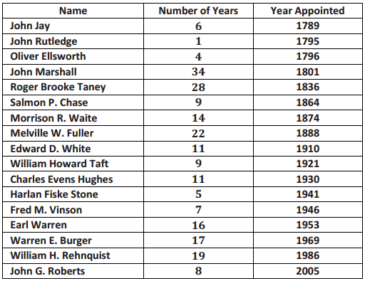
Use the table to answer the following:
a. Which chief justice served the longest term, and which served the shortest term? How many years did each of these chief justices serve?
Answer:
John Marshall had the longest term, which was 34 years. He served from 1801 to 1835. John Rutledge served the shortest term, which was 1 year in 1795.
b. What is the median number of years these chief justices have served on the Supreme Court? Explain how you found the median and what it means In terms of the data.
Answer:
First, you have to put the data in order. There are 17 justices, so the median would fall at the 9th value (11 years) counting from the top or from the bottom. The median is 11. Approximately half of the justices served less than or equal to 11 years, and half served greater than or equal to 11 years.
c. Make a box plot of the years the justices served. Describe the shape of the distribution and how the median
and IQR relate to the box plot.
Answer:
The distribution seems to have more justices serving a small number of years (on the lower end). The range (max – mm) is 33 years, from 1 year to 34 years. The IQR is 18 – 6. 5 = 11.5, so about half of the chief justices had terms in the 11.5-year interval from 6.5 to 18 years.
d. Is the median halfway between the least and the most number of years served? Why or why not?
Answer:
The halfway point on the number line between the smallest number of years served, 1, and the greatest number of years served, 34, is 17.5, but because the data are clustered in the lower end of the distribution, the median, 11, is to the left of (smaller than) 17.5. The middle of the interval from the smallest to the largest data value has no connection to the median. The median depends on how the data are spread out over the interval.
Exercises 2 – 3: Downloading Songs
Exercise 2.
A broadband company timed how long it took to download 232 four-minute songs on a dial-up connection. The dot plot below shows their results.
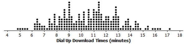
a. What can you observe about the download times from the dot plot?
Answer:
The smallest time was a little bit less than 5 minutes, and the largest is a little bit more than 17 minutes. Most of the times seem to be between 8 to 13 minutes.
b. Is it easy to tell whether or not 12.5 minutes is in the top quarter of the download times?
Answer:
You cannot easily tell from the dot plot.
c. The box plot of the data is shown below. Now, answer parts (a) and (b) above using the box plot.
Answer:
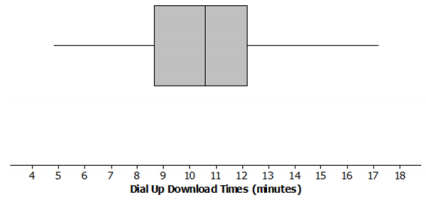
Answer for part (a) based on the box plot: About half of the times are above 10.6 minutes. The distribution is roughly symmetric around the median. About half of the times are between 8.7 minutes and 12.2 minutes.
Answer for part (b) based on the box plot: 12.5 is above Q3, so it was in the top quarter of the data.
d. What are the advantages of using a box plot to summarize a large data set? What are the disadvantages?
Answer:
With lots of data, the dots in a dot plot overlap, and while you can see general patterns, it is hard to really get anything quantifiable. The box plot shows at least an approximate value for each of the five-number summary measures and gives a pretty good idea of how the data are spread out.
The disadvantage of box plots is that the specific values in the data set are not given.
Teacher note: It may be useful to have a brief class discussion of the advantages/disadvantages of dot plots and box plots. You can use the dot plot in part (a) and the box plot in part (b) to facilitate this discussion.
Exercise 3.
Molly presented the box plots below to argue that using a dial-up connection would be better than using a broadband connection. She argued that the dial-up connection seems to have less variability around the median even though the overall range seems to be about the same for the download times using broadband. What would you say?
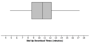
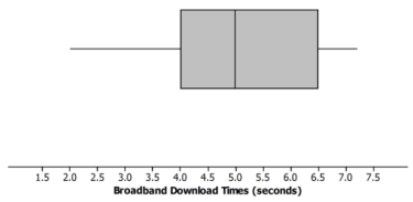
Answer:
The scales are different for the two plots, and so are the units, so you cannot just look at the box plots. The time using broadband is centered near seconds to download the song while the median for dial-up is almost minutes for a song. This suggests that broadband is going to be faster than dial-up.
Teacher note:
This is an important point. Make sure that students understand the importance of using the same scale if box plots are being constructed to compare two data distributions.
Exercises 4 – 5: Rainfall
Exercise 4.
Data on the average rainfall for each of the twelve months of the year were used to construct the two-dot plots below.
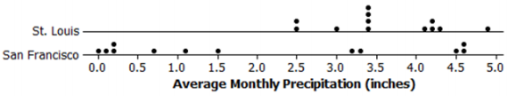
a. How many data points are in each dot plot? What does each data point represent?
Answer:
There are 12 data points in the St. Louis dot plot. There are also 12 data points in the San Francisco dot plot. Each data point represents the average monthly precipitation in inches for one month.
b. Make a conjecture about which city has the most variability in the average monthly amount of precipitation and how this would be reflected in the lQRs for the data from both cities.
Answer:
San Francisco has the most variability in the average monthly amount of precipitation. It should have the largest IQR of the two cities.
c. Based on the dot plots, what are the approximate values of the interquartile ranges (IQRs) for the average monthly precipitations for each city? Use the lQRs to compare the cities.
Answer:
The answers that follow are based on estimates from the dot plot. Students might get slightly different values. For St. Louis, the IQR is 4.2 – 3.2 = 1; for San Francisco, the IQR is 3.9 – 0.2 = 3.7. About the middle half of the monthly precipitation amounts in St. Louis are within 1 inch of each other. In San Francisco, the middle half of the monthly precipitation amounts are within about 4 inches of each other.
d. In an earlier lesson, the average monthly temperatures were rounded to the nearest degree Fahrenheit. Would it make sense to round the amount of precipitation to the nearest inch? Why or why not?
Answer:
Answers will vary. Possible answers include: It would not make sense because the numbers are pretty close together, or yes, it would make sense because you would still get a good idea of how the precipitation varied.
If you rounded to the nearest inch, the IQR for San Francisco would be 4 because three of the values round to 0, and three of the values round to 5. The IQR for St. Louis would be 1 because most of the values round to 3 or 4. In both cases, that is pretty close to the IQR found in part (c).
Exercise 5.
Use the data from Exercise 4 to answer the following.
a. Make a box plot of the monthly precipitation amounts for each city using the same scale.
Answer:
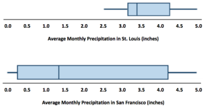
b. Compare the percent of months that have above 2 inches of pi-ecipitation for the two cities. Explain your thinking.
Answer:
In St. Louis, the average amount of precipitation each month is always over 2 inches, while this happens, at most, for half of the months In San Francisco because the median amount of precipitation is just above 1 inch.
c. How does the top 25% of the average monthly precipitations compare for the two cities?
Answer:
The top 25% of the precipitation amounts in the two cities are spread over about the same interval (about 4 to 5 inches). St. Louis has a bit more spread; the top 25% in St. Louis are between 4.2 inches and 4.8 inches, while the top 25% in San Francisco are all very close to 4.5 inches.
d. Describe the intervals that contain the smallest 25% of the average monthly precipitation amounts for each city.
Answer:
In St. Louis, the smallest 25% of the monthly averages are between about 2.5 inches and 3.0 inches; in San Francisco, the smallest averages are much lower, ranging from O to 0.2 inches.
e. Think about the dot plots and the box plots. Which representation do you think helps you the most in understanding how the data vary?
Answer:
Answers will vary. Some sample answers are provided below.
The dot plot because we can see individual values.
The box plot because it just shows how the data are spread out in each of the four sections.
Eureka Math Grade 6 Module 6 Lesson 16 Problem Set Answer Key
Question 1.
The box plots below summarize the ages at the time of the award for leading actress and leading actor Academy Award winners.
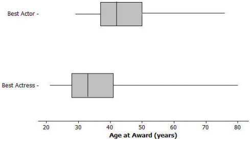
a. Based on the box plots, do you think it is harder for an older woman to win an Academy Award for a best actress than it is for an older man to win the best actor award? Why or why not?
Answer:
Answers will vary. Students might take either side as long as they give an explanation for why they made the choice they did that is based on the box plots.
b. The oldest female to win an Academy Award was Jessica Tandy in 1990 for Driving Miss Daisy. The oldest actor was Henry Fonda for On Golden Pond in 1982. How old were they when they won the award? How can you tell? Were they a lot older than most of the other winners?
Answer:
Henry Fonda was 76, and Jessica Tandy was 80. I know this because those are the maximum values. You cannot tell if there were actors or actresses that were nearly as old.
c. The 2013 winning actor was Daniel Day-Lewis for Lincoln. He was 55 years old at that time. What can you say about the percent of male award winners who were older than Daniel Day-Lewis when they won their Oscars?
Answer:
He was in the upper quarter and one of the older actors. Fewer than 25% of the male award winners were older than Daniel Day-Lewis.
d. Use the information provided by the box plots to write a paragraph supporting or refuting the claim that fewer older actresses than actors win Academy Awards.
Answer:
Overall, the box plot for actresses starts about 10 years younger than actors and is centered around a lower age than the box plot for- actors. The median age for actresses who won the award is 33, and for actors it is 42. The upper quartile is also lower for actresses, 41, compared to 49 for actors.
The range for actresses’ ages is larger, 80 – 21 = 59, compared to the range for actors, 76 – 29 = 47. About \(\frac{3}{4}\) of the actresses who won the award were younger than the median age for the men.
Question 2.
The scores of sixth and seventh graders on a test about polygons and their characteristics are summarized in the box plots below.
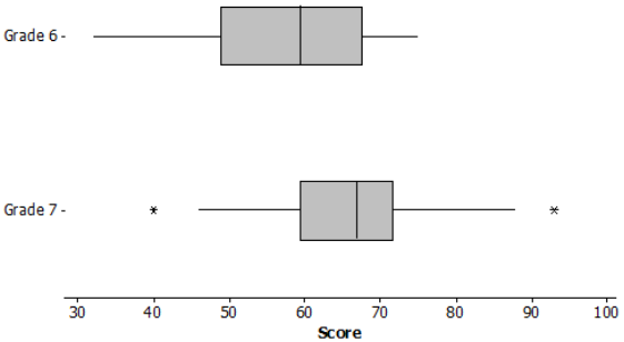
a. In which grade did the students do the best? Explain how you can tell.
Answer:
Three-fourths of the seventh-grade students did better than half of the sixth graders. You can tell by comparing Q1 for Grade 7 to the median for Grade 6. Therefore, the seventh-grade students performed the best.
b. Why do you think two of the data values in Grade 7 are not part of the line segments?
Answer:
The highest and lowest scores were pretty far away from the other scores, so they were marked separately.
c. How do the median scores for the two grades compare? Is this surprising? Why or why not?
Answer:
The median score in Grade 7 was higher than the median in Grade 6. This makes sense because the seventh graders should know more than the sixth graders.
d. How do the lQRs compare for the two grades?
Answer:
The middle half of the Grade 7 scores were close together in a span of about 11 with the median around 66.
The middle half of the Grade 6 scores were spread over a larger span, about 17 points from about 50 to 67.
Question 3.
A formula for the IQR could be written as Q3 – Q1 = IQR. Suppose you knew the IQR and the Q1. How could you find the Q3?
Answer:
Q3 = IQR + Q1. Add the lower quartile to the IQR.
Question 4.
Consider the statement, “Historically, the average length of service as chief justice on the Supreme Court has been less than 15 years; however, since 1969 the average length of service has increased.” Use the data given in Exercise 1 to answer the following questions.
a. Do you agree or disagree with the statement? Explain your thinking.
Answer:
The mean number of years as chief justice overall is about 13. The mean number of years since 1969 is about 14.7. Even though the mean has increased, it does not seem like a big difference because there have only been three justices since then to cover o span of 44 years (and three times 13 is 39, so not enough to really show an increasing trend).
b. Would your answer change if you used the median number of years rather than the mean?
Answer:
The median overall was 11 years; the median since 1969 was 17 years, which is considerably larger. This seems to justify the statement.
Eureka Math Grade 6 Module 6 Lesson 16 Exit Ticket Answer Key
Data on the number of pets per family for students in a sixth-grade class are summarized in the box plot below:
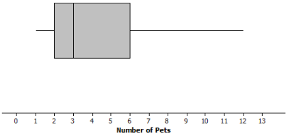
Question 1.
Can you tell how many families have two pets? Explain why or why not.
Answer:
You cannot tell from the box plot. You only know that the lower quartile (Q]) is 2 pets. You do not know how many families are included in the data set.
Question 2.
Given the box plot above, which of the following statements are true? If the statement is false, modify it to make the statement true.
a. Every family has at least one pet.
Answer:
True
b. About one-fourth of the families have six or more pets.
Answer:
True
c. Most of the families have three pets.
Answer:
False, because you cannot determine the number of any specific data value. Revise to “You cannot determine the number of pets most families have.”
d. About half of the families have two or fewer pets.
Answer:
False. Revise to “About half of the families have three or fewer pets.”
e. About three-fourths of the families have two or more pets.
Answer:
True