Students can grab the complete knowledge on Divide Fractions on Go Math Grade 8 Answer Key Chapter 14 Scatter Plots. This article consists of the solutions to practice problems, review tests along with answers and explanations for students to have more practice. So, the students who are in search of Go Math 8th Grade Answer Key Chapter 14 Scatter Plots can Download pdf from here. It is difficult for parents and teachers to deal with the students & give explanations for their questions. Therefore, start practicing the maths with the help of Go Math Grade 8 Answer Key.
Go Math Grade 8 Answer Key Chapter 14 Scatter Plots
We the team of ccss math answers offer the pdf of Go Math Grade 8 Answer Key Chapter 14 Scatter Plots. Get step by step solution for Go Math Grade 8 Answer Key Chapter 14 Scatter Plots here. With the help of the HMH Go Math 8th Grade Solution Key you can score good marks in the exams. If you learn the concepts you can make the question on your own and test your knowledge. Hence make use of the below links and practice the given problems from now.
Lesson 1: Scatter Plots and Association
Lesson 2: Trend Lines and Predictions
Model Quiz
Mixed Review
Guided Practice – Scatter Plots and Association – Page No. 436
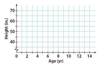
Bob recorded his height at different ages. The table below shows his data.
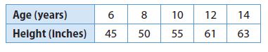
Question 1.
Make a scatter plot of Bob’s data.
Type below:
_____________
Answer:
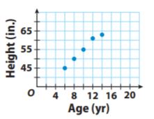
Explanation:
As Bob gets older, his height increases along with the straight line on the
graph. So, the association is positive and linear.
Question 2.
Describe the association between Bob’s age and his height. Explain the association.
Type below:
_____________
Answer:
The association is positive and linear. Bob’s height increases as he gets older. We would see that Bob’s height eventually stops increasing if the data continued.
Question 3.
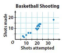
The scatter plot shows the basketball shooting results for 14 players. Describe any clusters you see in the scatter plot. Identify any outliers.
Type below:
_____________
Answer:
There is an outlier at (35,18)
Explanation:
There is a cluster in the “20 – 25” shots attempted range and a smaller cluster in the “5 – 14” shots attempted range.
There is an outlier at (35,18)
ESSENTIAL QUESTION CHECK-IN
Question 4.
Explain how you can make a scatter plot from a set of bivariate data.
Type below:
_____________
Answer:
Bivariate data – data that has two variables per observation,
An x variable and y variable.
Scatterplot – The graph displaying categorical data, with an x and y-axis.
Response Variable – the variable that is explained by the other.
Explanatory Variable – the variable which explains the other.
14.1 Independent Practice – Scatter Plots and Association – Page No. 437
Sports Use the scatter plot for 5–8.
Olympic Men’s Long Jump Winning Distances
Question 5.
Describe the association between the year and the distance jumped for the years 1960 to 1988.
Type below:
_____________
Answer:
The data shows a positive linear association. If the year increases, the winning distance increases.
Question 6.
Describe the association between the year and the distance jumped for the years after 1988.
Type below:
_____________
Answer:
Between 1996 and 2004, there was a slight increase in distance over time. The data from 1988 to 2012 will show a negative association.
Question 7.
For the entire scatter plot, is the association between the year and the distance jumped linear or nonlinear?
_____________
Answer:
The data show a rise between 1960 and 1988. The data also show a fall between 1988 and 2012. Therefore, overall, there is no linear pattern.
Question 8.
Identify the outlier and interpret its meaning.
Type below:
_____________
Answer:
The outlier is at (1968, 8.9). It represents a long jump of 8.9 meters in 1968 that exceeds the other jumps made in the surrounding years.
Question 9.
Communicate Mathematical Ideas Compare a scatter plot that shows no association to one that shows negative association.
Type below:
_____________
Answer:
Randomly scattered data points with no apparent pattern define a scatter plot with no association. Data points that fall from left to right and has data set values that increases as the other decreases define a scatter plot with a negative association.
Scatter Plots and Association – Page No. 438
For 10–11, describe a set of real-world bivariate data that the given scatter plot could represent. Define the variable represented on each axis.
Question 10.
_____________
Answer:
The x-axis represents the number of containers. The y-&is represents the price per container.
Question 11.
_____________
Answer:
The x-axis represents the number of hours spent watching tv. The y-axis represents the number of TVs owned.
FOCUS ON HIGHER ORDER THINKING
Question 12.
Multiple Representations Describe what you might see in a table of bivariate data that would lead you to conclude that the scatter plot of the data would show a cluster.
Type below:
_____________
Answer:
A cluster in a scatter plot is when there are a lot of points all grouped around the same location.
Look for points that have the same input and output values. If there are a lot of points together, you must have a cluster in your scatter plot.
Question 13.
Justify Reasoning Is it possible for a scatter plot to have a positive or negative association that is not linear? Explain.
Type below:
_____________
Answer:
Yes
Explanation:
Yes; it is possible for a scatter plot to have a positive or negative association that is not linear. The data points may have a falling or rising curve that will exhibit a nonlinear association.
Question 14.
Critical Thinking To try to increase profits, a theater owner increases the price of a ticket by $25 every month. Describe what a scatter plot might look like if x represents the number of months and y represents the profits. Explain your reasoning.
Type below:
_____________
Answer:
Initially, the number of tickets sold might decline a little, but the price increase would offset the loss in sales. That means that profits would increase, showing a positive association.
When the price would get too high, ticket sales would decline rapidly, so profits would fall giving a negative association.
Guided Practice – Trend Lines and Predictions – Page No. 442
Angela recorded the price of different weights of several bulk grains. She made a scatter plot of her data. Use the scatter plot for 1–4.
Question 1.
Draw a trend line for the scatter plot.
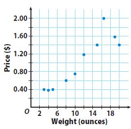
Type below:
_____________
Answer:
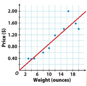
Question 2.
How do you know whether your trend line is a good fit for the data?
Type below:
_____________
Answer:
Most of the data points are close to the trend line. The trend line has about the same number of points above and below it.
Question 3.
Write an equation for your trend line.
Type below:
_____________
Answer:
y = 0.09x
Explanation:
The trend line passes through (0, 0) and (19, 1.80).
Find the slope by using the slope formula.
slope = m = (y2 – y1)/(x2 – x1) = 1.80/19 = 0.09
The line passes through the origin. So, the y-intercept is 0.
From an equation for the trend line by substituting the slope value for m and the value of the y-intercept b in the slope-intercept formula.
y = mx + b
y = 0.09x + 0
y = 0.09x
Question 4.
Use the equation for your trend line to interpolate the price of 7 ounces and extrapolate the price of 50 ounces.
Type below:
_____________
Answer:
The price for 7 and 50 ounces is $0.63 and $4.50
Explanation:
Use the equation for the trend line (y = 0.09x) to interpolate the price of 7 ounces by substituting 7 for x (y= 0.09 • 7) and solving for y.
Use the equation for the trend line (y = 0.09x) to interpolate the price of 50 ounces by substituting 50 for x (y= 0.09 • 50) and solving for y.
ESSENTIAL QUESTION CHECK-IN
Question 5.
A trend line passes through two points on a scatter plot. How can you use the trend line to make a prediction between or outside the given data points?
Type below:
_____________
Answer:
Use two points on the line. rind the slope and y-intercept. Substitute the values of the slope (m) and y-intercept (b) to form an equation using y = mx + b. Substitute the value of x for which you want to make a prediction and solve for y OR substitute your prediction for y and solve to find its value.
14.2 Independent Practice – Trend Lines and Predictions – Page No. 443
Use the data in the table for Exercises 6–10.
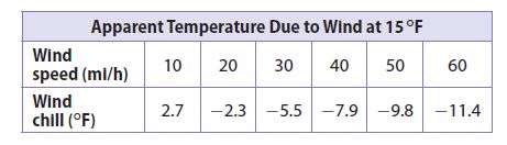
Question 6.
Make a scatter plot of the data and draw a trend line.
Type below:
_____________
Answer:
Question 7.
What type of association does the trend line show?
Type below:
_____________
Answer:
Negative Association
Explanation:
One data set increases – Wind Speed and the other – Wind Chill decreases. So, the trend line shows a Negative Association.
Question 8.
Write an equation for your trend line.
Type below:
_____________
Answer:
y = -0.25x + 2.5
Explanation:
Find the slope using the Slope Formula
m = (y2 – y1)/(x2 – x1) = ((-10) – 5)/(50 – 30) = -5/20 = -0.25
Find the y-intercept using the Slope-Intercept Formula
y = mx + b
-5 = -0.25(30) + b
-5 = -7.5 + b
2.5 = b
Substitute the value of m and b into the Slope-Intercept Formula to form an equation for the trend line.
y = -0.25x + 2.5
Question 9.
Make a Prediction Use the trend line to predict the wind chill at these wind speeds.
a. 36 mi/h
_________ °F
Answer:
-6.5°F
Explanation:
Use the trend line to predict the wind chill at 36mi/h
y = -0.25x + 2.5
y = -0.25(36) + 2.5
y = -9 + 2.5
y = -6.5
The wind chill at 36mi/h is -6.5ºF
Question 9.
b. 100 mi/h
_________ °F
Answer:
-22.5°F
Explanation:
Use the trend line to predict the wind chill at 100mi/h
y = -0.25x + 2.5
y = -0.25(100) + 2.5
y = -25 + 2.5
y = -22.5
The wind chill at 100mi/h is -22.5ºF
Question 10.
What is the meaning of the slope of the line?
Type below:
_____________
Answer:
The slope means that the wind chill falls about 1°F for every 4 mph increase in wind speed.
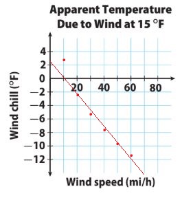
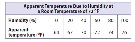
Use the data in the table for Exercises 11–14.
Question 11.
Make a scatter plot of the data and draw a trend line.
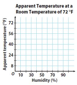
Type below:
_____________
Answer:
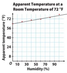
Question 12.
Write an equation for your trend line.
Type below:
_____________
Answer:
y = -(2/15)x + 64
Explanation:
Find the slope using the Slope Formula
m = (y2 – y1)/(x2 – x1) = (72 – 64)/(60 – 0) = 8/60 = -2/15
Find the y-intercept using the Slope-Intercept Formula at (0, 64)
y = mx + b
b = 64
Substitute the value of m and b into the Slope-Intercept Formula to form an equation for the trend line.
y = -2/15x + 64
Question 13.
Make a Prediction Use the trend line to predict the apparent temperature at 70% humidity.
Type below:
_____________
Answer:
73.3º F
Explanation:
Use the equation of the trend line. Substitute 70(for 70%) into the equation for x.
y = -(2/15)x + 64
y = -(2/15)(70) + 64
y = -140/15 + 64
y = -9.3 + 64
y = 73.3
The apparent temperature is 73.3º F
Question 14.
What is the meaning of the y-intercept of the line?
Type below:
_____________
Answer:
The y-intercept explains that at 0% humidity, the apparent temperature is 64ºF
FOCUS ON HIGHER ORDER THINKING – Trend Lines and Predictions – Page No. 444
Question 15.
Communicate Mathematical Ideas Is it possible to draw a trend line on a scatter plot that shows no association? Explain.
_____________
Answer:
No
Explanation:
It is not possible to draw a trend line on a scatter plot that shows no association. If the scatter plot shows no association, the data points have no relationships with one another. You can draw a trend line if a linear association is available.
Question 16.
Critique Reasoning Sam drew a trend line that had about the same number of data points above it as below it, but did not pass through any data points. He then picked two data points to write the equation for the line. Is this a correct way to write the equation? Explain.
_____________
Answer:
No
Explanation:
Sam did not use the correct way to write an equation.
Sam may have drawn a correct trend line but using the data points that are not on the trend line may have an incorrect equation for the line. He should use two points on that trend line to write the equation.
Question 17.
Marlene wanted to find a relationship between the areas and populations of counties in Texas. She plotted x (area in square miles) and y (population) for two counties on a scatter plot:
Kent County (903, 808) Edwards County (2118, 2002)
She concluded that the population of Texas counties is approximately equal to their area in square miles and drew a trend line through her points.
a. Critique Reasoning Do you agree with Marlene’s method of creating a scatter plot and a trend line? Explain why or why not.
_____________
Answer:
I do not agree with Marlene’s method of creating a scatter plot and a trend line. She did not have enough data. Marlene should have collected and plotted data for many more counties.
Question 17.
b. Counterexamples Harris County has an area of 1778 square miles and a population of about 4.3 million people. Dallas County has an area of 908 square miles and a population of about 2.5 million people. What does this data show about Marlene’s conjecture that the population of Texas counties is approximately equal to their area?
Type below:
_____________
Answer:
The data collected are only of two counties whose populations are nearly equal to their area. The fact that the populations of Harris and Dallas counties are in the millions, Marlene’s conjecture about the population of Texas counties being equivalent to their area is invalid.
Ready to Go On? – Model Quiz – Page No. 445
14.1 Scatter Plots and Association
An auto store is having a sale on motor oil. The chart shows the price per quart as the number of quarts purchased increases. Use the data for Exs. 1–2.
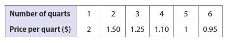
Question 1.
Use the given data to make a scatter plot.
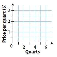
Type below:
_____________
Answer:
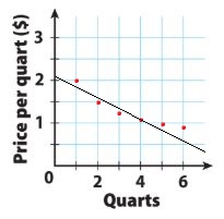
Question 2.
Describe the association you see between the number of quarts purchased and the price per quart. Explain.
Type below:
_____________
Answer:
Negative nonlinear association
Explanation:
The association seen between the number of quarts purchased and the price per quart is negative and nonlinear. As the number of quarts rises, the price per quart decreases but you can see a data curve.
14.2 Trend Lines and Predictions
The scatter plot below shows data comparing wind speed and wind chill for an air temperature of 20 °F. Use the scatter plot for Exs. 3–5.
Question 3.
Draw a trend line for the scatter plot.
Type below:
_____________
Answer:
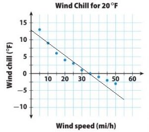
Question 4.
Write an equation for your trend line.
Type below:
_____________
Answer:
y = -0.35x + 12.25
Explanation:
The line passes through (10, 8.75) and (35, 0) so we can use these points to find the slope.
The slope of the line is :
Slope = m = (y2 – y1)/(x2 – x1) = (0 – 8.75)/(35 – 10) = -8.75/25 = -0.35
Find the y-intercept using the slope-intercept formula :
y = mx + b
0 = -0.35 . 35 + b
0 = -12.25 + b
b = 12.25
Substitute the slope m and the y-intercept b in the slope-intercept formula.
The equation for the trend line is :
y = mx + b
y = -0.35x + 12.25
Question 5.
Use your equation to predict the wind chill to the nearest degree for a wind speed of 60 mi/h.
________ °F
Answer:
9°F
Explanation:
y = −0.35x + 12.25
y = -0.35(60) + 12.25
y = -21 + 12.25
y = -8.75
The wind chill to the nearest degree for a wind speed of 60 mi/h is 9°F.
ESSENTIAL QUESTION
Question 6.
How can you use scatter plots to solve real-world problems?
Type below:
_____________
Answer:
Using a scatter plot, you can see positive and negative trends such as prices over time. You can also make predictions such as height at a certain age.
Selected Response – Mixed Review – Page No. 446
Question 1.
Which scatter plot could have a trend line whose equation is y = 3x + 10?
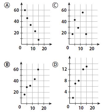
Options:
a. A
b. B
c. C
d. D
Answer:
b. B
Question 2.
What type of association would you expect between a person’s age and hair length?
Options:
a. linear
b. negative
c. none
d. positive
Answer:
c. none
Explanation:
The length of their hair reduces. This is because the length of hair changes with the growth phase of the hair follicles. When one is young, the cells of the papilla divide more rapidly, and hence the length of the hair to be long before reaching the transitional phase and then shed off in the telogen phase. The older one gets, the papilla cells do not divide as rapidly and the length of the hair shortens with age.
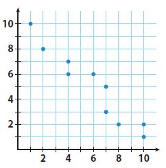
Question 3.
Which is not shown on the scatter plot?
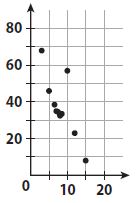
Options:
a. cluster
b. negative association
c. outlier
d. positive association
Answer:
d. positive association
Explanation:
The scatter plot shows a cluster, some outliers, and a negative association.
It does not show a positive association.
Question 4.
A restaurant claims to have served 352,000,000 hamburgers. What is this number in scientific notation?
Options:
a. 3.52 × 10⁶
b. 3.52 × 10⁸
c. 35.2 × 10⁷
d. 352 × 106
Answer:
b. 3.52 × 10⁸
Explanation:
100,000,000
So, 3.52 × 10⁸
Question 5.
Which equation describes the relationship between x and y in the table?
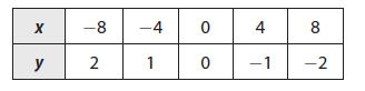
Options:
a. y = −4x
b. y = −\(\frac{1}{4}\)x
c. y = 4x
d. y = \(\frac{1}{4}\)x
Answer:
b. y = −\(\frac{1}{4}\)x
Explanation:
In order to find out the relationship between x and y, we have to use the values in the question and substitute them into the solution options.
So, y = -1/4x
Mini-Task
Question 6.
Use the data in the table.
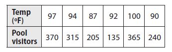
a. Make a scatterplot of the data.
Type below:
______________
Answer:
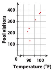
Question 6.
b. Which data point is an outlier?
Type below:
______________
Answer:
The outlier is the point (92, 135).
Question 6.
c. Predict the number of visitors on a day when the high temperature is 102 °F.
Type below:
______________
Answer:
Based on the cluster around 100°F, I would expect that on a day with a temperature of 102 °F, the pool would have between 350 and 400 visitors.
Conclusion:
Hope our Go Math Grade 8 Answer Key Chapter 14 Scatter Plots helped you a lot. Stick to our page to get chapter-wise Answer Keys of Go Math Grade 8. You can get step by step explanations for all the questions in an easy manner.