Eureka Math Grade 8 Module 6 End of Module Assessment Answer Key

Engage NY Eureka Math 8th Grade Module 6 End of Module Assessment Answer Key

Eureka Math Grade 8 Module 6 End of Module Assessment Task Answer Key

Question 1.
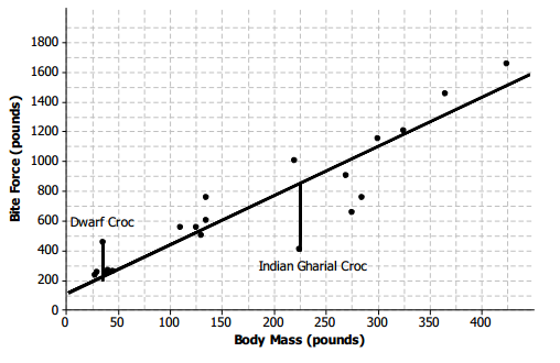
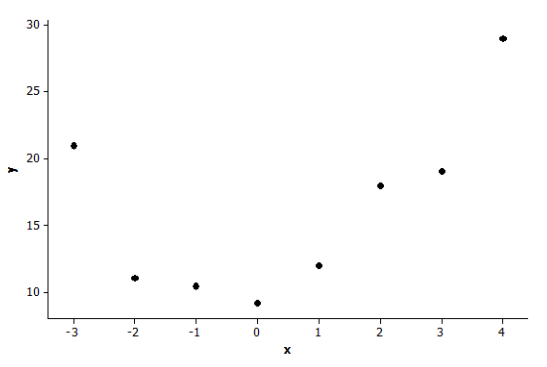
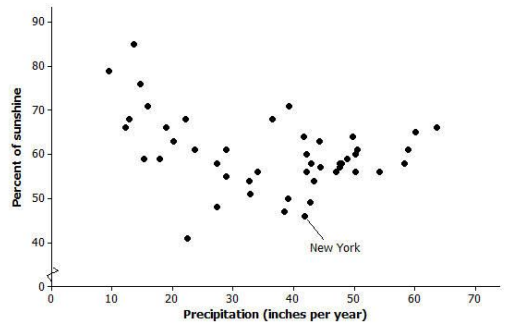
The Kentucky Derby is a horse race held each year. The following scatter plot shows the speed of the winning horse at the Kentucky Derby each year between 1875 and 2012.
Engage NY Math 8th Grade Module 6 End of Module Assessment Answer Key 1
Data Source: http://www.kentuckyderby.com/
(Note: Speeds were calculated based on times given on website.)
a. Is the association between speed and year positive or negative? Give a possible explanation in the context of this problem for why the association behaves this way considering the variables involved.
Answer:
The association is positive overall, as horses have been getting faster over time. This is perhaps due to improved training methods.

b. Comment on whether the association between speed and year is approximately linear, and then explain in the context of this problem why the form of the association (linear or not) makes sense considering the variables involved.
Answer:
The association is not linear. There is probably a physical limit to how fast horses can go that we are approaching.

c. Circle an outlier in this scatter plot, and explain, in context, how and why the observation is unusual.
Answer:
The winner that year was much slower than we could have predicted.

Question 2.
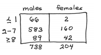
Students were asked to report their gender and how many times a day they typically wash their hands. Of the 738 males, 66 said they wash their hands at most once a day, 583 said two to seven times per day, and 89 said eight or more times per day. Of the 204 females, 2 said they wash their hands at most once a day, 160 said two to seven times per day, and 42 said eight or more times per day.
a. Summarize these data in a two-way table with rows corresponding to the three different frequency-of-hand-washing categories and columns corresponding to gender.
Answer:
Engage NY Math 8th Grade Module 6 End of Module Assessment Answer Key 3

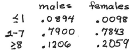
b. Do these data suggest an association between gender and frequency of hand washing? Support your answer with appropriate calculations.
Answer:
Engage NY Math 8th Grade Module 6 End of Module Assessment Answer Key 4
Males are more likely than females to wash hands at most once per day. Females are more likely to wash 8 or more times per day.

Question 3.
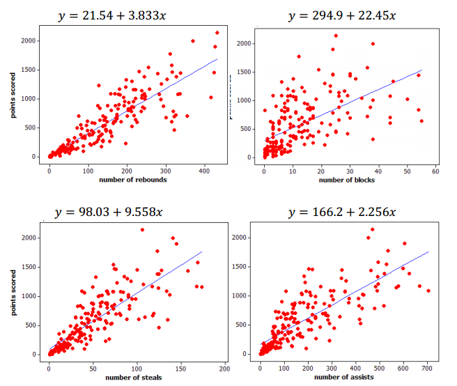
Basketball players who score a lot of points also tend to be strong in other areas of the game such as number of rebounds, number of blocks, number of steals, and number of assists. Below are scatter plots and linear models for professional NBA (National Basketball Association) players last season.
Engage NY Math 8th Grade Module 6 End of Module Assessment Answer Key 2
a. The line that models the association between points scored and number of rebounds is y = 21.54 + 3.833x, where y represents the number of points scored and x represents the number of rebounds. Give an interpretation, in context, of the slope of this line.
Answer:
If the number of rebounds increases by one, we predict the number of points increases by 3.833.

b. The equations on the previous page all show the number of points scored (y) as a function of the other variables. An increase in which of the variables (rebounds, blocks, steals, and assists) tends to have the largest impact on the predicted points scored by an NBA player?
Answer:
Each additional block corresponds to 22.45 more points, the largest slope or rate of increase.

c. Which of the four linear models shown in the scatter plots on the previous page has the worst fit to the data? Explain how you know using the data.
Answer:
Probably number of blocks because the association is weaker. There is more scatter of the points away from the line.

Eureka Math Grade 8 Module 6 Mid Module Assessment Answer Key

Engage NY Eureka Math 8th Grade Module 6 Mid Module Assessment Answer Key

Eureka Math Grade 8 Module 6 Mid Module Assessment Task Answer Key

Question 1.
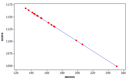
Many computers come with a Solitaire card game. The player moves cards in certain ways to complete specific patterns. The goal is to finish the game in the shortest number of moves possible, and a player’s score is determined by the number of moves. A statistics teacher played the game 16 times and recorded the number of moves and the final score after each game. The line represents the linear function that is used to determine the score from the number of moves.
Engage NY Math 8th Grade Module 6 Mid Module Assessment Answer Key 1
a. Was this person’s average score closer to 1130 or 1110? Explain how you decided.
Answer:
Most of the games had scores between 1125 and 1175. The mean score will be closer to 1130.

b. The first two games she played took 169 moves (1131 points) and 153 moves (1147 points). Based on this information, determine the equation of the linear function used by the computer to calculate the score from the number of moves. Explain your work.
Answer:
The difference in the scores is 1131 – 1147 or – 16.
The difference in the number of moves is 169 – 153 = 16
The slope is –\(\frac{16}{16}\) or – 1. This means that 1131 = intercept – 169, So intercept equals 1300
Score = 1300 – moves

c. Based on the linear function, each time the player makes a move, how many points does she lose?
Answer:
One point last per move.

d. Based on the linear function, how many points does the player start with in this game? Explain your reasoning.
Answer:
1300, or the score when the number of moves equals 0.

Question 2.
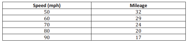
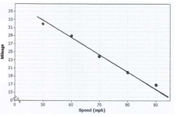
To save money, drivers often try to increase their mileage, which is measured in miles per gallon (mpg). One theory is that speed traveled impacts mileage. Suppose the following data are recorded for five different 300-mile tests, with the car traveling at different speeds in miles per hour (mph) for each test.
Engage NY Math 8th Grade Module 6 Mid Module Assessment Answer Key 2
a. For the data in this table, is the association positive or negative? Explain how you decided.
Answer:
As the speed increases in miles per hour, the miles per gallon decrease. This describes a negative association.

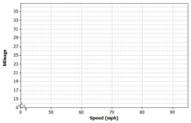
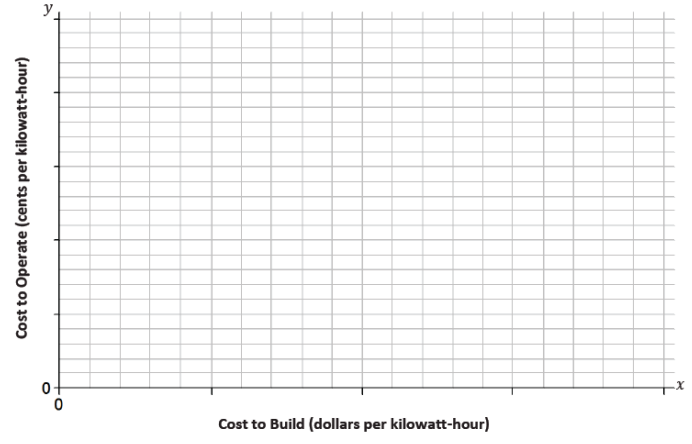
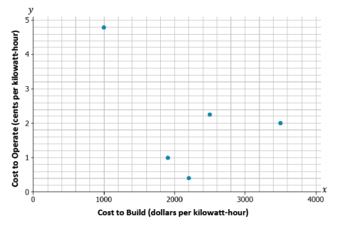
b. Construct a scatter plot of these data using the following coordinate grid. The vertical axis represents the mileage, and the horizontal axis represents the speed in miles per hour (mph).
Engage NY Math 8th Grade Module 6 Mid Module Assessment Answer Key 3
Answer:
Engage NY Math 8th Grade Module 6 Mid Module Assessment Answer Key 5

c. Draw a line on your scatter plot that you think is a reasonable model for predicting the mileage from the car speed.
Answer:
Engage NY Math 8th Grade Module 6 Mid Module Assessment Answer Key 5

d. Estimate and interpret the slope of the line you found in part (c).
Answer:
Two points are approximately (80, 20) and (50, 33).
So, slope ≈ \(\frac{20-33}{80-50}\) ≈ – \(0.43 \overline{3}\)
Each increase of 1 mph in speed predicts a decrease of \(0.43 \overline{3}\) mpg.

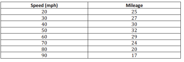
Suppose additional data were measured for three more tests. These results have been added to the previous tests, and the combined data are shown in the table below.
Engage NY Math 8th Grade Module 6 Mid Module Assessment Answer Key 4

e. Does the association for these data appear to be linear? Why or why not?
Answer:
No, While the speeds increase, the milage value increase and then mostly decrease. There is no fixed rate of increase or decrease for milage based on increased speed.

f. If your only concern was mileage and you had no traffic constraints, what speed would you recommend traveling based on these data? Explain your choice.
Answer:
About 50 mph. It is around 50 mph that the mpg stops increasing and starts to decrease.

Eureka Math Grade 8 Module 6 Lesson 14 Answer Key

Engage NY Eureka Math 8th Grade Module 6 Lesson 14 Answer Key

Eureka Math Grade 8 Module 6 Lesson 14 Exercise Answer Key

Example 1.
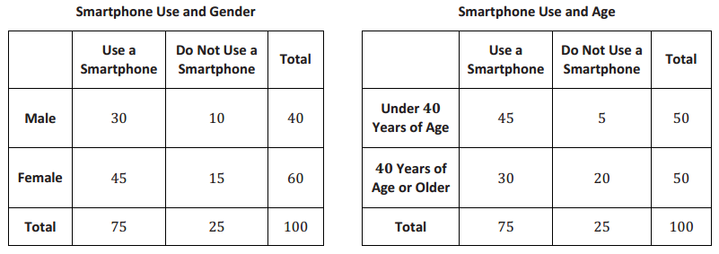
Suppose a random group of people are surveyed about their use of smartphones. The results of the survey are summarized in the tables below.
Engage NY Math Grade 8 Module 6 Lesson 14 Exercise Answer Key 1

Example 2.
Suppose a sample of 400 participants (teachers and students) was randomly selected from the middle schools and high schools in a large city. These participants responded to the following question:

Which type of movie do you prefer to watch?
1. Action (The Avengers, Man of Steel, etc.)
2. Drama (42 (The Jackie Robinson Story), The Great Gatsby, etc.)
3. Science Fiction (Star Trek into Darkness, World War Z, etc.)
4. Comedy (Monsters University, Despicable Me 2, etc.)

Movie preference and status (teacher or student) were recorded for each participant.

Exercises 1–7

Exercise 1.
Two variables were recorded. Are these variables categorical or numerical?
Answer:
Both variables are categorical.

Exercise 2.
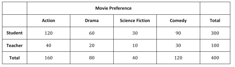
The results of the survey are summarized in the table below.
Engage NY Math Grade 8 Module 6 Lesson 14 Exercise Answer Key 2
a. What proportion of participants who are teachers prefer action movies?
Answer:
\(\frac{40}{100}\) = 0.40

b. What proportion of participants who are teachers prefer drama movies?
Answer:
\(\frac{20}{100}\) = 0.20

c. What proportion of participants who are teachers prefer science fiction movies?
Answer:
\(\frac{10}{100}\) = 0.10

d. What proportion of participants who are teachers prefer comedy movies?
Answer:
\(\frac{30}{100}\) = 0.30

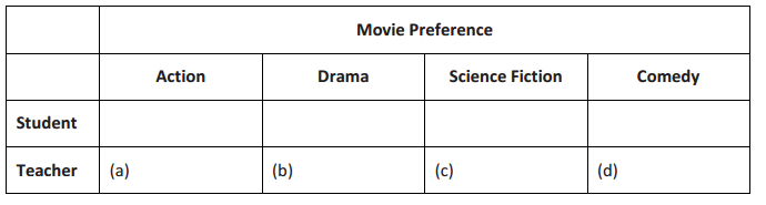
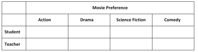
The answers to Exercise 2 are called row relative frequencies. Notice that you divided each cell frequency in the Teacher row by the total for that row. Below is a blank relative frequency table.
Table of Row Relative Frequencies
Engage NY Math Grade 8 Module 6 Lesson 14 Exercise Answer Key 3
Answer:
Engage NY Math Grade 8 Module 6 Lesson 14 Exercise Answer Key 4

Write your answers from Exercise 2 in the indicated cells in the table above.

Exercise 3.
Find the row relative frequencies for the Student row. Write your answers in the table above.
a. What proportion of participants who are students prefer action movies?
b. What proportion of participants who are students prefer drama movies?
c. What proportion of participants who are students prefer science fiction movies?
d. What proportion of participants who are students prefer comedy movies?
Answer:
See the table above.

Exercise 4.
Is a participant’s status (i.e., teacher or student) related to what type of movie he would prefer to watch? Why or why not? Discuss this with your group.
Answer:
No. Teachers are just as likely to prefer each movie type as students are, according to the row relative frequencies.

Exercise 5.
What does it mean when we say that there is no association between two variables? Discuss this with your group.
Answer:
Answers will vary. No association means that knowing the value of one variable does not tell anything about the value of the other variable.

Exercise 6.
Notice that the row relative frequencies for each movie type are the same for both the Teacher and Student rows. When this happens, we say that the two variables, movie preference and status (student or teacher), are not associated. Another way of thinking about this is to say that knowing if a participant is a teacher (or a student) provides no information about his movie preference.
What does it mean if row relative frequencies are not the same for all rows of a two-way table?
Answer:
It means that there is an association or a tendency between the two variables.

Exercise 7.
You can also evaluate whether two variables are associated by looking at column relative frequencies instead of row relative frequencies. A column relative frequency is a cell frequency divided by the corresponding column total.
For example, the column relative frequency for the Student/Action cell is \(\frac{120}{160}\) = 0.75.
a. Calculate the other column relative frequencies, and write them in the table below.
Table of Column Relative Frequencies
Engage NY Math Grade 8 Module 6 Lesson 14 Exercise Answer Key 5
Answer:
Table of Column Relative Frequencies
Engage NY Math Grade 8 Module 6 Lesson 14 Exercise Answer Key 6

b. What do you notice about the column relative frequencies for the four columns?
Answer:
The column relative frequencies are equal for all four columns.

c. What would you conclude about association based on the column relative frequencies?
Answer:
Because the column relative frequencies are the same for all four columns, we would conclude that there is no association between movie preference and status.

Example 3
In the survey described in Example 2, gender for each of the 400 participants was also recorded. Some results of the survey are given below:

  • 160 participants preferred action movies.
  • 80 participants preferred drama movies.
  • 40 participants preferred science fiction movies.
  • 240 participants were females.
  • 78 female participants preferred drama movies.
  • 32 male participants preferred science fiction movies.
  • 60 female participants preferred action movies.

Exercises 8–15
Use the results from Example 3 to answer the following questions. Be sure to discuss these questions with your group members.

Exercise 8.
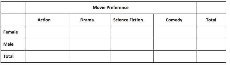
Complete the two-way frequency table that summarizes the data on movie preference and gender.
Engage NY Math Grade 8 Module 6 Lesson 14 Exercise Answer Key 7
Answer:
Engage NY Math Grade 8 Module 6 Lesson 14 Exercise Answer Key 8

Exercise 9.
What proportion of the participants are female?
Answer:
\(\frac{240}{400}\) = 0.60

Exercise 10.
If there was no association between gender and movie preference, should you expect more females than males or fewer females than males to prefer action movies? Explain.
Answer:
If there was no association between gender and movie preference, then I would expect more females than males to prefer action movies just because there are more females in the sample. However, if there was an association between gender and movie preference, then I would expect either fewer females than males who prefer action movies or considerably more females than males who prefer action movies.

Exercise 11.
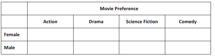
Make a table of row relative frequencies of each movie type for the Male row and the Female row. Refer to Exercises 2–4 to review how to complete the table below.
Engage NY Math Grade 8 Module 6 Lesson 14 Exercise Answer Key 9
Answer:
Engage NY Math Grade 8 Module 6 Lesson 14 Exercise Answer Key 10

Suppose that you randomly pick 1 of the 400 participants. Use the table of row relative frequencies on the previous page to answer the following questions.
Exercise 12.
If you had to predict what type of movie this person chose, what would you predict? Explain why you made this choice.
Answer:
The participant likely prefers action movies because the largest proportion of participants preferred action movies.

Exercise 13.
If you know that the randomly selected participant is female, would you predict that her favorite type of movie is action? If not, what would you predict, and why?
Answer:
No. A female participant is more likely to prefer comedy since it has the greatest row relative frequency in the Female row.

Exercise 14.
If knowing the value of one of the variables provides information about the value of the other variable, then there is an association between the two variables.
Is there an association between the variables gender and movie preference? Explain.
Answer:
Yes. The row relative frequencies are not the same (not even close) in each row in the table.

Exercise 15.
What can be said when two variables are associated? Read the following sentences. Decide if each sentence is a correct statement based upon the survey data. If it is not correct, explain why not.
a. More females than males participated in the survey.
Answer:
Correct

b. Males tend to prefer action and science fiction movies.
Answer:
Correct

c. Being female causes one to prefer drama movies.
Answer:
Incorrect Association does not imply a cause-and-effect relationship.

Eureka Math Grade 8 Module 6 Lesson 14 Problem Set Answer Key

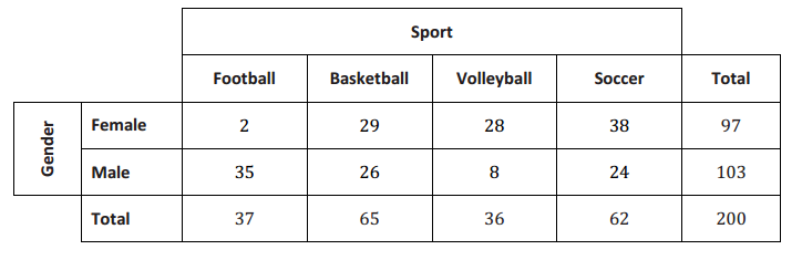
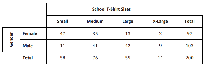
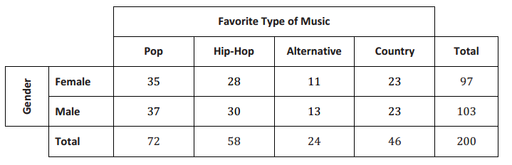
A sample of 200 middle school students was randomly selected from the middle schools in a large city. Answers to several survey questions were recorded for each student. The tables below summarize the results of the survey.
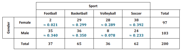
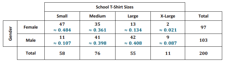
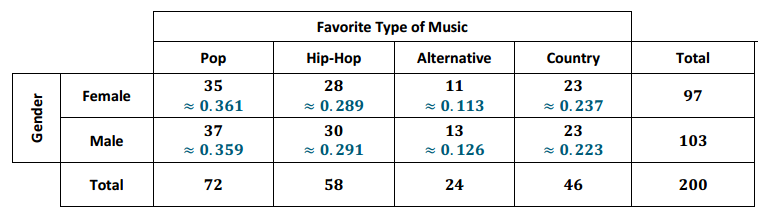
For each table, calculate the row relative frequencies for the Female row and for the Male row. Write the row relative frequencies beside the corresponding frequencies in each table below.

Question 1.
This table summarizes the results of the survey data for the two variables, gender and which sport the students prefer to play. Is there an association between gender and which sport the students prefer to play? Explain.
Eureka Math 8th Grade Module 6 Lesson 14 Problem Set Answer Key 1
Answer:
Eureka Math 8th Grade Module 6 Lesson 14 Problem Set Answer Key 2
Yes, there appears to be an association between gender and sports preference. The row relative frequencies are not the same for the Male and the Female rows, as shown in the table above.

Question 2.
This table summarizes the results of the survey data for the two variables, gender and the students’ T-shirt sizes. Is there an association between gender and T-shirt size? Explain.
Eureka Math 8th Grade Module 6 Lesson 14 Problem Set Answer Key 3
Answer:
Eureka Math 8th Grade Module 6 Lesson 14 Problem Set Answer Key 4
Yes, there appears to be an association between gender and T-shirt size. The row relative frequencies are not the same for the Male and the Female rows, as shown in the table above.

Question 3.
This table summarizes the results of the survey data for the two variables, gender and favorite type of music. Is there an association between gender and favorite type of music? Explain.
Eureka Math 8th Grade Module 6 Lesson 14 Problem Set Answer Key 5
Answer:
Eureka Math 8th Grade Module 6 Lesson 14 Problem Set Answer Key 6
No, there does not appear to be an association between gender and favorite type of music. The row relative frequencies are about the same for the Male and Female rows, as shown in the table above.

Eureka Math Grade 8 Module 6 Lesson 14 Exit Ticket Answer Key

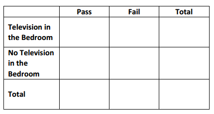
A random sample of 100 eighth-grade students are asked to record two variables: whether they have a television in their bedrooms and if they passed or failed their last math test. The results of the survey are summarized below.

  • 55 students have a television in their bedrooms.
  • 35 students do not have a television in their bedrooms and passed their last math test.
  • 25 students have a television and failed their last math test.
  • 35 students failed their last math test.

Question 1.
Complete the two-way table.
Eureka Math Grade 8 Module 6 Lesson 14 Exit Ticket Answer Key 1
Answer:
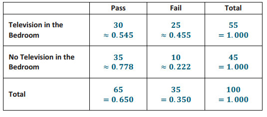
Eureka Math Grade 8 Module 6 Lesson 14 Exit Ticket Answer Key 2

Question 2.
Calculate the row relative frequencies, and enter the values in the table above. Round to the nearest thousandth.
Answer:
The row relative frequencies are displayed in the table above.

Question 3.
Is there evidence of association between the variables? If so, does this imply there is a cause-and-effect relationship? Explain.
Answer:
Yes, there is evidence of association between the variables because the relative frequencies are different among the rows. However, this does not necessarily imply a cause-and-effect relationship. The fact that a student has a television in his room does not cause the student to fail a test. Rather, it may be that the student is spending more time watching television or playing video games instead of studying.

Eureka Math Grade 8 Module 6 Lesson 13 Answer Key

Engage NY Eureka Math 8th Grade Module 6 Lesson 13 Answer Key

Eureka Math Grade 8 Module 6 Lesson 13 Exercise Answer Key

Exercises 1–8
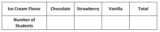
On an upcoming field day at school, the principal wants to provide ice cream during lunch. She offers three flavors: chocolate, strawberry, and vanilla. She selected your class to complete a survey to help her determine how much of each flavor to buy.

Exercise 1.
Answer the following question. Wait for your teacher to count how many students selected each flavor.
Then, record the class totals for each flavor in the table below.
“Which of the following three ice cream flavors is your favorite: chocolate, strawberry, or vanilla?”
Engage NY Math Grade 8 Module 6 Lesson 13 Exercise Answer Key 1
Answer:
Answers will vary. One possibility is shown below.
Engage NY Math Grade 8 Module 6 Lesson 13 Exercise Answer Key 2

Exercise 2.
Which ice cream flavor do most students prefer?
Answer:
Students should respond with the most-selected flavor. For the data set shown here, that is chocolate.

Exercise 3.
Which ice cream flavor do the fewest students prefer?
Answer:
Students should respond with the least-selected flavor. For the data set shown here, that is strawberry.

Exercise 4.
What percentage of students preferred each flavor? Round to the nearest tenth of a percent.
Answer:
Answers will vary based on the data gathered in Exercise 1.
Chocolate: \(\frac{17}{28}\) ≈ 60.7%
Strawberry: \(\frac{4}{28}\) ≈ 14.3%
Vanilla: \(\frac{7}{28}\) = 25%

Exercise 5.
Do the numbers in the table in Exercise 1 summarize data on a categorical variable or a numerical variable?
Answer:
The numbers in this table summarize data on a categorical variable—the preferred flavor of ice cream.

Exercise 6.
Do the students in your class represent a random sample of all the students in your school? Why or why not? Discuss this with your neighbor.
Answer:
No, because there is no indication that the students were selected randomly.

Exercise 7.
Is your class representative of all the other classes at your school? Why or why not? Discuss this with your neighbor.
Answer:
This class might be representative of the other eighth-grade classes but might not be representative of sixth- and seventh-grade classes.

Exercise 8.
Do you think the principal will get an accurate estimate of the proportion of students who prefer each ice cream flavor for the whole school using only your class? Why or why not? Discuss this with your neighbor.
Answer:
It is unlikely to give a good estimate. It would depend on how representative the class is of all of the students at the school.

Example 1
Students in a different class were asked the same question about their favorite ice cream flavors. The table below shows the ice cream flavors and the number of students who chose each flavor for that particular class. This table is called a one-way frequency table because it shows the counts of a univariate categorical variable.
Engage NY Math Grade 8 Module 6 Lesson 13 Exercise Answer Key 3
We compute the relative frequency for each ice cream flavor by dividing the count by the total number of observations.
relative frequency = \(\frac{\text { count for a category }}{\text { total number of observations }}\)

Since 11 out of 25 students answered chocolate, the relative frequency would be \(\frac{11}{25}\) = 0.44. This relative frequency shows that 44% of the class prefers chocolate ice cream. In other words, the relative frequency is the proportional value that each category is of the whole.

Exercises 9–10
Use the table for the preferred ice cream flavors from the class in Example 1 to answer the following questions.

Exercise 9.
What is the relative frequency for the category strawberry?
Answer:
Relative frequency = \(\frac{4}{25}\) = 0.16

Exercise 10.
Write a sentence interpreting the relative frequency value in the context of strawberry ice cream preference.
Answer:
16% of the students in this class prefer strawberry ice cream.

Example 2.
The principal also wondered if boys and girls have different favorite ice cream flavors. She decided to redo the survey by taking a random sample of students from the school and recording both their favorite ice cream flavors and their genders. She asked the following two questions:
“Which of the following ice cream flavors is your favorite: chocolate, strawberry, or vanilla?”
“What is your gender: male or female?”

The results of the survey are as follows:
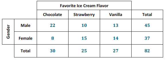
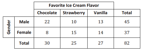
Of the 30 students who prefer chocolate ice cream, 22 are males.
Of the 25 students who prefer strawberry ice cream, 15 are females.
Of the 27 students who prefer vanilla ice cream, 13 are males.

The values of two variables, which were ice cream flavor and gender, were recorded in this survey. Since both of the variables are categorical, the data are bivariate categorical data.

Exercises 11–17

Exercise 11.
Can we display these data in a one-way frequency table? Why or why not?
Answer:
No, a one-way frequency table is for univariate data. Here we have bivariate data, so we would need to use a two-way table.

Exercise 12.
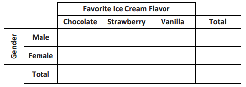
Summarize the results of the second survey of favorite ice cream flavors in the following table:
Engage NY Math Grade 8 Module 6 Lesson 13 Exercise Answer Key 4
Answer:
Engage NY Math Grade 8 Module 6 Lesson 13 Exercise Answer Key 5

Exercise 13.
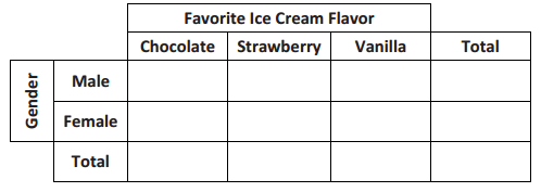
Calculate the relative frequencies of the data in the table in Exercise 12, and write them in the following table.
Engage NY Math Grade 8 Module 6 Lesson 13 Exercise Answer Key 6
Answer:
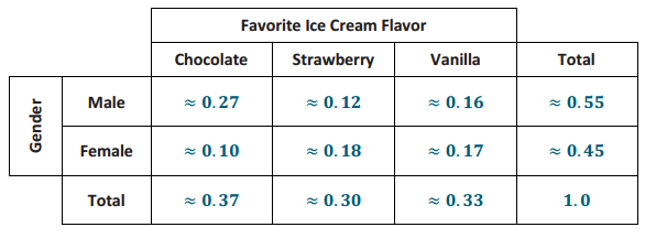
Engage NY Math Grade 8 Module 6 Lesson 13 Exercise Answer Key 7

Use the relative frequency values in the table to answer the following questions:
Exercise 14.
What is the proportion of the students who prefer chocolate ice cream?
Answer:
0.37

Exercise 15.
What is the proportion of students who are female and prefer vanilla ice cream?
Answer:
0.17

Exercise 16.
Write a sentence explaining the meaning of the approximate relative frequency 0.55.
Answer:
Approximately 55% of students responding to the survey are males.

Exercise 17.
Write a sentence explaining the meaning of the approximate relative frequency 0.10.
Answer:
Approximately 10% of students responding to the survey are females who prefer chocolate ice cream.

Example 3.
In the previous exercises, you used the total number of students to calculate relative frequencies. These relative frequencies were the proportion of the whole group who answered the survey a certain way. Sometimes we use row or column totals to calculate relative frequencies. We call these row relative frequencies or column relative frequencies.
Below is the two-way frequency table for your reference. To calculate “the proportion of male students who prefer chocolate ice cream,” divide the 22 male students who preferred chocolate ice cream by the total of 45 male students. This proportion is \(\frac{22}{45}\) ≈ 0.49. Notice that you used the row total to make this calculation. This is a row relative frequency.
Engage NY Math Grade 8 Module 6 Lesson 13 Exercise Answer Key 8

Exercises 18–22
In Exercise 13, you used the total number of students to calculate relative frequencies. These relative frequencies were the proportion of the whole group who answered the survey a certain way.

Exercise 18.
Suppose you are interested in the proportion of male students who prefer chocolate ice cream. How is this value different from “the proportion of students who are male and prefer chocolate ice cream”? Discuss this with your neighbor.
Answer:
The proportion of students who are male and prefer chocolate ice cream is \(\frac{22}{82}\) ≈ 0.27. This proportion uses all
82 students. The proportion of male students who prefer chocolate ice cream is \(\frac{22}{45}\) ≈ 0.49. This proportion uses only the 45 male students as its total.

Exercise 19.
Use the table provided in Example 3 to calculate the following relative frequencies.
a. What proportion of students who prefer vanilla ice cream are female?
\(\frac{14}{27}\) ≈ 0.52

b. What proportion of male students prefer strawberry ice cream? Write a sentence explaining the meaning of this proportion in the context of this problem.
Answer:
\(\frac{10}{45}\) ≈ 0.22 Twenty-two percent of male students in this survey prefer strawberry ice cream.

c. What proportion of female students prefer strawberry ice cream?
Answer:
\(\frac{15}{37}\) ≈ 0.41

d. What proportion of students who prefer strawberry ice cream are female?
Answer:
\(\frac{15}{25}\) ≈ 0.60

Exercise 20.
A student is selected at random from this school. What would you predict this student’s favorite ice cream to be? Explain why you chose this flavor.
Answer:
I would predict that the student’s favorite flavor is chocolate because more students chose chocolate in the survey.

Exercise 21.
Suppose the randomly selected student is male. What would you predict his favorite flavor of ice cream to be? Explain why you chose this flavor.
Answer:
I would predict his favorite flavor to be chocolate because more male students chose chocolate in the survey.

Exercise 22.
Suppose the randomly selected student is female. What would you predict her favorite flavor of ice cream to be? Explain why you chose this flavor.
Answer:
I would predict her favorite flavor to be strawberry because more female students chose strawberry in the survey.

Eureka Math Grade 8 Module 6 Lesson 13 Problem Set Answer Key

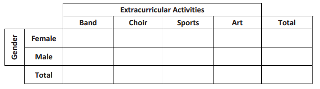
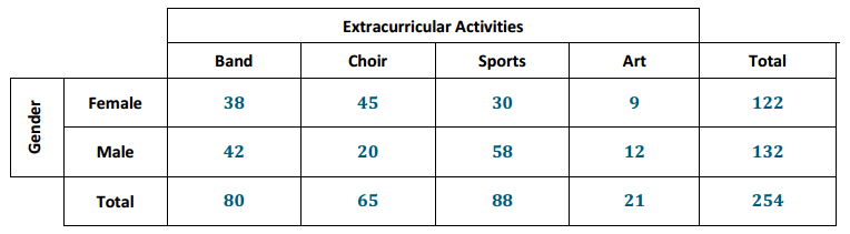
Every student at Abigail Douglas Middle School is enrolled in exactly one extracurricular activity. The school counselor recorded data on extracurricular activity and gender for all 254 eighth-grade students at the school.
The counselor’s findings for the 254 eighth-grade students are the following:
Of the 80 students enrolled in band, 42 are male.
Of the 65 students enrolled in choir, 20 are male.
Of the 88 students enrolled in sports, 30 are female.
Of the 21 students enrolled in art, 9 are female.

Question 1.
Complete the table below.
Eureka Math 8th Grade Module 6 Lesson 13 Problem Set Answer Key 1
Answer:
Eureka Math 8th Grade Module 6 Lesson 13 Problem Set Answer Key 2

Question 2.
Write a sentence explaining the meaning of the frequency 38 in this table.
Answer:
The frequency of 38 represents the number of eighth-grade students who are enrolled in band and are female.

Use the table provided above to calculate the following relative frequencies.
Question 3.
What proportion of students are male and enrolled in choir?
Answer:
\(\frac{20}{254}\) ≈ 0.08

Question 4.
What proportion of students are enrolled in a musical extracurricular activity (i.e., band or choir)?
Answer:
\(\frac{80+65}{254}\) ≈ 0.57

Question 5.
What proportion of male students are enrolled in sports?
Answer:
\(\frac{58}{132}\) ≈ 0.44

Question 6.
What proportion of students enrolled in sports are male?
Answer:
\(\frac{58}{88}\) ≈ 0.66

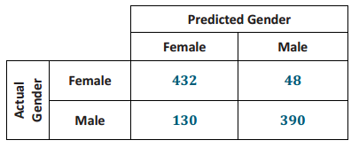
Pregnant women often undergo ultrasound tests to monitor their babies’ health. These tests can also be used to predict the gender of the babies, but these predictions are not always accurate. Data on the gender predicted by ultrasound and the actual gender of the baby for 1,000 babies are summarized in the two-way table below.
Eureka Math 8th Grade Module 6 Lesson 13 Problem Set Answer Key 3

Question 7.
Write a sentence explaining the meaning of the frequency 130 in this table.
Answer:
The frequency of 130 represents the number of babies who were predicted to be female but were actually male (i.e., the ultrasound prediction was not correct for these babies).

Use the table provided above to calculate the following relative frequencies.
Question 8.
What is the proportion of babies who were predicted to be male but were actually female?
Answer:
\(\frac{48}{1000}\) = 0.048

Question 9.
What is the proportion of incorrect ultrasound gender predictions?
Answer:
\(\frac{130+48}{1000}\) = 0.178

Question 10.
For babies predicted to be female, what proportion of the predictions were correct?
Answer:
\(\frac{432}{562}\) ≈ 0.769

Question 11.
For babies predicted to be male, what proportion of the predictions were correct?
Answer:
\(\frac{390}{438}\) ≈ 0.890

Eureka Math Grade 8 Module 6 Lesson 13 Exit Ticket Answer Key

Question 1.
Explain what the term bivariate categorical data means.
Answer:
Bivariate categorical data means that the data set comprises data on two variables that are both categorical.

Question 2.
Explain how to calculate relative frequency. What is another word for relative frequency?
Answer:
Relative frequency is calculated by dividing a frequency by the total number of observations. Another word for relative frequency is proportion.

Question 3.
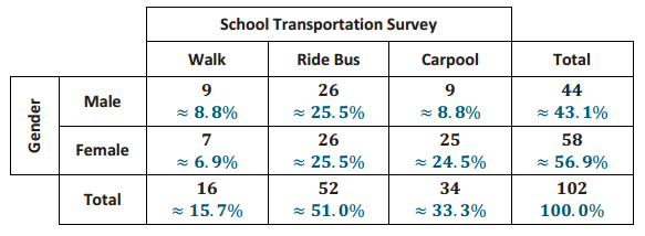
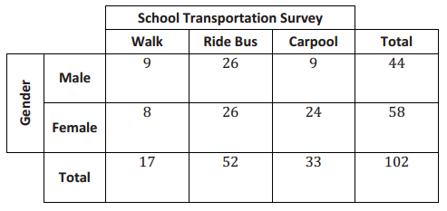
A random group of students are polled about how they get to school. The results are summarized in the table below.
Eureka Math Grade 8 Module 6 Lesson 13 Exit Ticket Answer Key 1
Answer:
Eureka Math Grade 8 Module 6 Lesson 13 Exit Ticket Answer Key 2

a. Calculate the relative frequencies for the table above. Write them as a percent in each cell of the table. Round to the nearest tenth of a percent.
Answer:
See the completed table above.

b. What is the relative frequency for the Carpool category? Write a sentence interpreting this value in the context of school transportation.
Answer:
The relative frequency is 0.333, or 33.3%. Approximately 33.3% of the students surveyed use a carpool to get to school.

c. What is the proportion of students who are female and walk to school? Write a sentence interpreting this value in the context of school transportation.
Answer:
The proportion is 0.069, or 6.9%. Approximately 6.9% of the students surveyed are female and walk to school.

d. A student is selected at random from this school. What would you predict this student’s mode of school transportation to be? Explain.
Answer:
I would predict the student would ride the bus because more students in the survey chose this mode of transportation.

Eureka Math Grade 8 Module 6 Lesson 12 Answer Key

Engage NY Eureka Math 8th Grade Module 6 Lesson 12 Answer Key

Eureka Math Grade 8 Module 6 Lesson 12 Exercise Answer Key

Example 1: Growing Dahlias
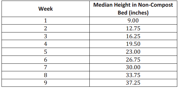
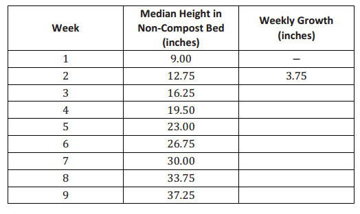
A group of students wanted to determine whether or not compost is beneficial in plant growth. The students used the dahlia flower to study the effect of composting. They planted eight dahlias in a bed with no compost and another eight plants in a bed with compost. They measured the height of each plant over a 9-week period. They found the median growth height for each group of eight plants. The table below shows the results of the experiment for the dahlias grown in non-compost beds.
Engage NY Math Grade 8 Module 6 Lesson 12 Exercise Answer Key 1

Exercises 1 – 15

Exercise 1.
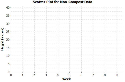
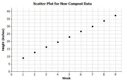
On the grid below, construct a scatter plot of non-compost height versus week.
Engage NY Math Grade 8 Module 6 Lesson 12 Exercise Answer Key 2
Answer:
Engage NY Math Grade 8 Module 6 Lesson 12 Exercise Answer Key 3

Exercise 2.
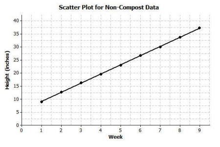
Draw a line that you think fits the data reasonably well.
Answer:
Engage NY Math Grade 8 Module 6 Lesson 12 Exercise Answer Key 4

Exercise 3.
Find the rate of change of your line. Interpret the rate of change in terms of growth (in height) over time.
Answer:
Most students should have a rate of change of approximately 3.5 inches per week. A rate of change of 3.5 means that the median height of the eight dahlias increased by about 3.5 inches each week.

Exercise 4.
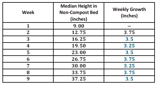
Describe the growth (change in height) from week to week by subtracting the previous week’s height from the current height. Record the weekly growth in the third column in the table below. The median growth for the dahlias from Week 1 to Week 2 was 3.75 inches (i.e., 12.75-9.00=3.75).
Engage NY Math Grade 8 Module 6 Lesson 12 Exercise Answer Key 5
Answer:
Engage NY Math Grade 8 Module 6 Lesson 12 Exercise Answer Key 6

Exercise 5.
As the number of weeks increases, describe how the weekly growth is changing.
Answer:
The growth each week remains about the same—approximately 3.5 inches.

Exercise 6.
How does the growth each week compare to the slope of the line that you drew?
Answer:
The amount of growth per week varies from 3.25 to 3.75 but centers around 3.5, which is the slope of the line.

Exercise 7.
Estimate the median height of the dahlias at 8 \(\frac{1}{2}\) weeks. Explain how you made your estimate.
Answer:
An estimate is 35.5 inches. Students can use the graph, the table, or the equation of their line.

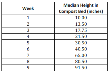
The table below shows the results of the experiment for the dahlias grown in compost beds.
Engage NY Math Grade 8 Module 6 Lesson 12 Exercise Answer Key 7

Exercise 8.
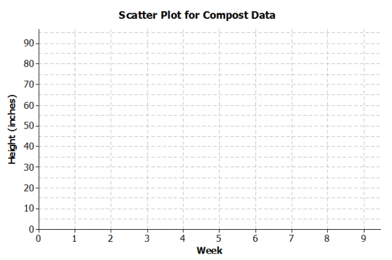
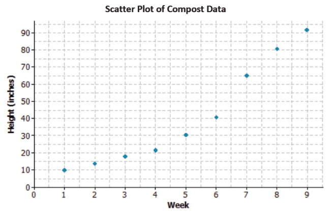
Construct a scatter plot of height versus week on the grid below.
Engage NY Math Grade 8 Module 6 Lesson 12 Exercise Answer Key 8
Answer:
Engage NY Math Grade 8 Module 6 Lesson 12 Exercise Answer Key 9

Exercise 9.
Do the data appear to form a linear pattern?
Answer:
No, the pattern in the scatter plot is curved.

Exercise 10.
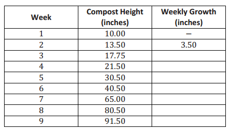
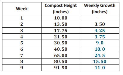
Describe the growth from week to week by subtracting the height from the previous week from the current height. Record the weekly growth in the third column in the table below. The median weekly growth for the dahlias from Week 1 to Week 2 is 3.5 inches. (i.e., 13.5-10=3.5).
Engage NY Math Grade 8 Module 6 Lesson 12 Exercise Answer Key 10
Answer:
Engage NY Math Grade 8 Module 6 Lesson 12 Exercise Answer Key 11

Exercise 11.
As the number of weeks increases, describe how the growth changes.
Answer:
The amount of growth per week varies from week to week. In Weeks 1 through 4, the growth is around 4 inches each week. From Weeks 5 to 7, the amount of growth increases, and then the growth slows down for Weeks 8
and 9.

Exercise 12.
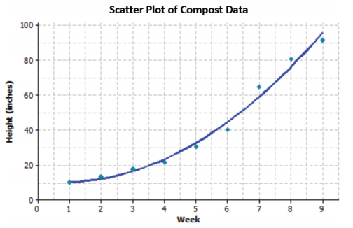
Sketch a curve through the data. When sketching a curve, do not connect the ordered pairs, but draw a smooth curve that you think reasonably describes the data.
Answer:
Engage NY Math Grade 8 Module 6 Lesson 12 Exercise Answer Key 12

Exercise 13.
Use the curve to estimate the median height of the dahlias at 8 1\(\frac{1}{2}\) weeks. Explain how you made your estimate.
Answer:
Answers will vary. A reasonable estimate of the median height at 8 1\(\frac{1}{2}\) weeks is approximately 85 inches. Starting at 8 1\(\frac{1}{2}\) on the x-axis, move up to the curve and then over to the y-axis for the estimate of the height.

Exercise 14.
How does the weekly growth of the dahlias in the compost beds compare to the weekly growth of the dahlias in the non-compost beds?
Answer:
The growth in the non-compost is about the same each week. The growth in the compost starts the same as the non-compost, but after four weeks, the dahlias begin to grow at a faster rate.

Exercise 15.
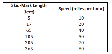
When there is a car accident, how do the investigators determine the speed of the cars involved? One way is to measure the skid marks left by the cars and use these lengths to estimate the speed.
The table below shows data collected from an experiment with a test car. The first column is the length of the skid mark (in feet), and the second column is the speed of the car (in miles per hour).
Engage NY Math Grade 8 Module 6 Lesson 12 Exercise Answer Key 13
Data Source: http://forensicdynamics.com/stopping-braking-distance-calculator
(Note: Data has been rounded.)
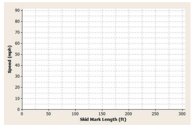
a. Construct a scatter plot of speed versus skid-mark length on the grid below.
Engage NY Math Grade 8 Module 6 Lesson 12 Exercise Answer Key 14
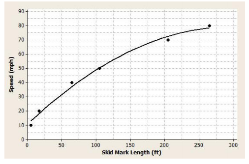
Answer:
Engage NY Math Grade 8 Module 6 Lesson 12 Exercise Answer Key 15

b. The relationship between speed and skid-mark length can be described by a curve. Sketch a curve through the data that best represents the relationship between skid-mark length and the speed of the car. Remember to draw a smooth curve that does not just connect the ordered pairs.
Answer:
See the plot above.

c. If the car left a skid mark of 60 ft., what is an estimate for the speed of the car? Explain how you determined the estimate.
Answer:
The speed is approximately 38 mph. Using the graph, for a skid mark of 65 ft., the speed was 40 mph, so the estimate is slightly less than 40 mph.

d. A car left a skid mark of 150 ft. Use the curve you sketched to estimate the speed at which the car was traveling.
Answer:
62.5 mph

e. If a car leaves a skid mark that is twice as long as another skid mark, was the car going twice as fast? Explain.
Answer:
No. When the skid mark was 105 ft. long, the car was traveling 50 mph. When the skid mark was 205 ft. long (about twice the 105 ft.), the car was traveling 70 mph, which is not twice as fast.

Eureka Math Grade 8 Module 6 Lesson 12 Problem Set Answer Key

Question 1.
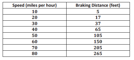
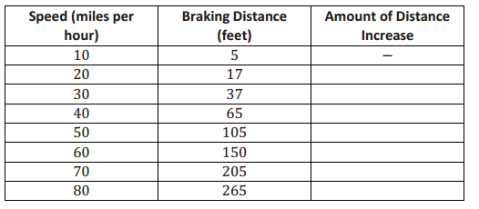
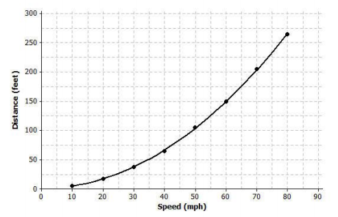
Once the brakes of the car have been applied, the car does not stop immediately. The distance that the car travels after the brakes have been applied is called the braking distance. The table below shows braking distance (how far the car travels once the brakes have been applied) and the speed of the car.
Eureka Math 8th Grade Module 6 Lesson 12 Problem Set Answer Key 1
Data Source: http://forensicdynamics.com/stopping-braking-distance-calculator
(Note: Data has been rounded.)
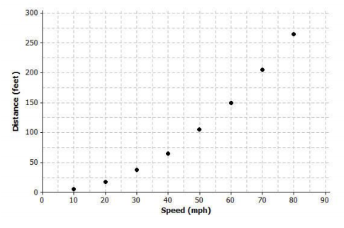
a. Construct a scatter plot of braking distance versus speed on the grid below.
Eureka Math 8th Grade Module 6 Lesson 12 Problem Set Answer Key 2
Answer:
Eureka Math 8th Grade Module 6 Lesson 12 Problem Set Answer Key 3

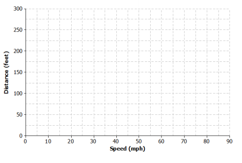
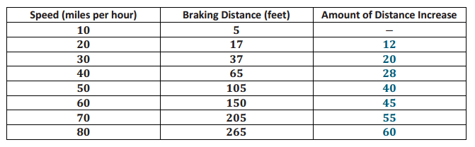
b. Find the amount of additional distance a car would travel after braking for each speed increase of 10 mph. Record your answers in the table below.
Eureka Math 8th Grade Module 6 Lesson 12 Problem Set Answer Key 4
Answer:
Eureka Math 8th Grade Module 6 Lesson 12 Problem Set Answer Key 5

c. Based on the table, do you think the data follow a linear pattern? Explain your answer.
Answer:
No. If the relationship is linear, the values in the Amount of Distance Increase column would be approximately equal.

d. Describe how the distance it takes a car to stop changes as the speed of the car increases.
Answer:
As the speed of the car increases, the distance it takes the car to stop also increases.

e. Sketch a smooth curve that you think describes the relationship between braking distance and speed.
Answer:
Eureka Math 8th Grade Module 6 Lesson 12 Problem Set Answer Key 6

f. Estimate braking distance for a car traveling at 52 mph. Estimate braking distance for a car traveling at 75 mph. Explain how you made your estimates.
Answer:
For 52 mph, the braking distance is about 115 ft.
For 75 mph, the braking distance is about 230 ft.
Both estimates can be made by starting on the x-axis, moving up to the curve, and then moving over to the y-axis.

Question 2.
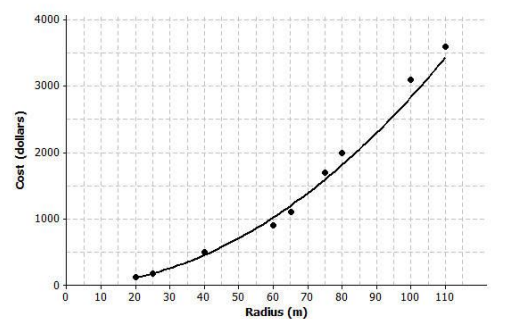
The scatter plot below shows the relationship between cost (in dollars) and radius length (in meters) of fertilizing different-sized circular fields. The curve shown was drawn to describe the relationship between cost and radius.
Eureka Math 8th Grade Module 6 Lesson 12 Problem Set Answer Key 7
a. Is the curve a good fit for the data? Explain.
Answer:
Yes, the curve fits the data very well. The data points lie close to the curve.

b. Use the curve to estimate the cost for fertilizing a circular field of radius 30 m. Explain how you made your estimate.
Answer:
Using the curve drawn on the graph, the cost is approximately $200 – $250.

c. Estimate the radius of the field if the fertilizing cost was $2,500. Explain how you made your estimate.
Answer:
Using the curve, an estimate for the radius is approximately 94 m. Locate the approximate cost of $2,500. The approximate radius for that point is 94 m.

Question 3.
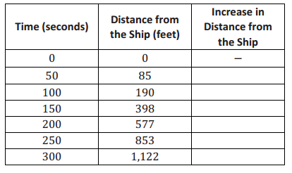
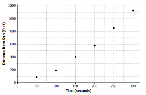
Suppose a dolphin is fitted with a GPS that monitors its position in relationship to a research ship. The table below contains the time (in seconds) after the dolphin is released from the ship and the distance (in feet) the dolphin is from the research ship.
Eureka Math 8th Grade Module 6 Lesson 12 Problem Set Answer Key 8
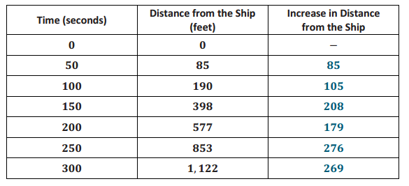
Answer:
Eureka Math 8th Grade Module 6 Lesson 12 Problem Set Answer Key 9

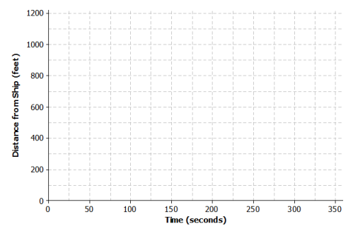
a. Construct a scatter plot of distance versus time on the grid below.
Eureka Math 8th Grade Module 6 Lesson 12 Problem Set Answer Key 10
Answer:
Eureka Math 8th Grade Module 6 Lesson 12 Problem Set Answer Key 11

b. Find the additional distance the dolphin traveled for each increase of 50 seconds. Record your answers in the table above.
Answer:
See the table above.

c. Based on the table, do you think that the data follow a linear pattern? Explain your answer.
Answer:
No, the change in distance from the ship is not constant.

d. Describe how the distance that the dolphin is from the ship changes as the time increases.
Answer:
As the time away from the ship increases, the distance the dolphin is from the ship is also increasing. The farther the dolphin is from the ship, the faster it is swimming.

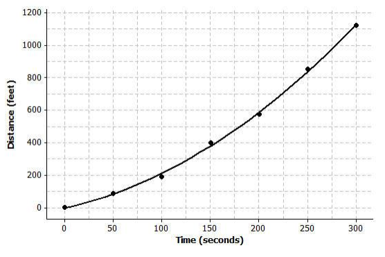
e. Sketch a smooth curve that you think fits the data reasonably well.
Answer:
Eureka Math 8th Grade Module 6 Lesson 12 Problem Set Answer Key 12

f. Estimate how far the dolphin will be from the ship after 180 seconds. Explain how you made your estimate.
Answer:
About 500 ft. Starting on the x-axis at approximately 180 seconds, move up to the curve and then over to the y-axis to find an estimate of the distance.

Eureka Math Grade 8 Module 6 Lesson 12 Exit Ticket Answer Key

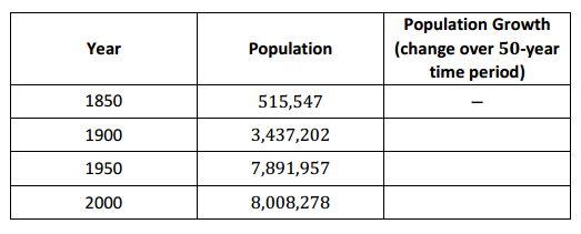
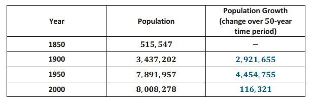
The table shows the population of New York City from 1850 to 2000 for every 50 years.
Eureka Math Grade 8 Module 6 Lesson 12 Exit Ticket Answer Key 1
Data Source: www.census.gov
Answer:
Eureka Math Grade 8 Module 6 Lesson 12 Exit Ticket Answer Key 2

Question 1.
Find the growth of the population from 1850 to 1900. Write your answer in the table in the row for the year 1900.
Answer:
2,921,655

Question 2.
Find the growth of the population from 1900 to 1950. Write your answer in the table in the row for the year 1950.
Answer:
4,454,755

Question 3.
Find the growth of the population from 1950 to 2000. Write your answer in the table in the row for the year 2000.
Answer:
116,321

Question 4.
Does it appear that a linear model is a good fit for the data? Why or why not?
Answer:
No, a linear model is not a good fit for the data. The rate of population growth is not constant; the values in the change in population column are all different.

Question 5.
Describe how the population changes as the years increase.
Answer:
As the years increase, the population increases.

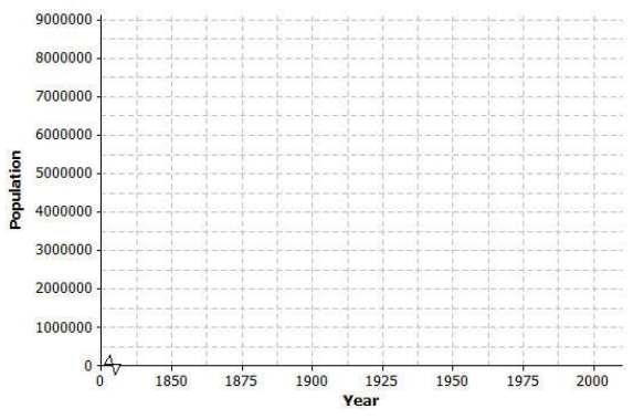
Question 6.
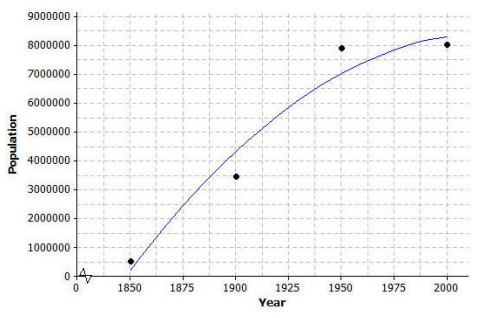
Construct a scatter plot of time versus population on the grid below. Draw a line or curve that you feel reasonably describes the data.
Eureka Math Grade 8 Module 6 Lesson 12 Exit Ticket Answer Key 3
Answer:
Students should sketch a curve. If students use a straight line, point out that the line does not reasonably describe the data, as some of the data points are far away from the line.
Eureka Math Grade 8 Module 6 Lesson 12 Exit Ticket Answer Key 4

Question 7.
Estimate the population of New York City in 1975. Explain how you found your estimate.
Answer:
It is approximately 8,000,000. An estimate can be found by recognizing that the growth of the city did not change very much from 1950 to 2000. The mean of the 1950 population and the 2000 population could also be found.

Eureka Math Grade 8 Module 6 Lesson 10 Answer Key

Engage NY Eureka Math 8th Grade Module 6 Lesson 10 Answer Key

Eureka Math Grade 8 Module 6 Lesson 10 Exercise Answer Key

Example 1.
Predicting the value of a numerical dependent (response) variable based on the value of a given numerical independent variable has many applications in statistics. The first step in the process is to identify the dependent (predicted) variable and the independent (predictor) variable.
There may be several independent variables that might be used to predict a given dependent variable. For example, suppose you want to predict how well you are going to do on an upcoming statistics quiz. One possible independent variable is how much time you spent studying for the quiz. What are some other possible numerical independent variables that could relate to how well you are going to do on the quiz?

Exercises 1–2

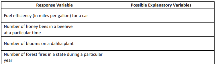
Exercise 1.
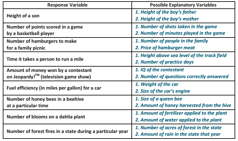
For each of the following dependent (response) variables, identify two possible numerical independent (explanatory) variables that might be used to predict the value of the dependent variable.
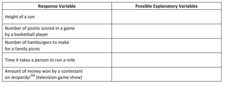
Engage NY Math Grade 8 Module 6 Lesson 10 Exercise Answer Key 1
Engage NY Math Grade 8 Module 6 Lesson 10 Exercise Answer Key 2
Answer:
Engage NY Math Grade 8 Module 6 Lesson 10 Exercise Answer Key 3

Exercise 2.
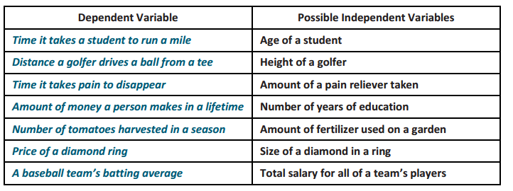
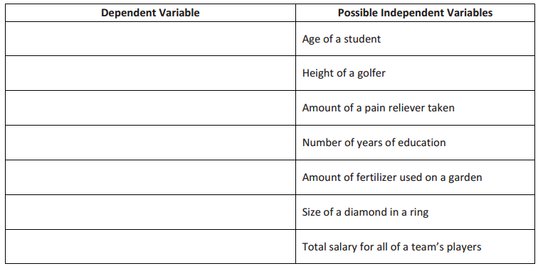
Now, reverse your thinking. For each of the following numerical independent variables, write a possible numerical dependent variable.
Engage NY Math Grade 8 Module 6 Lesson 10 Exercise Answer Key 4
Answer:
Engage NY Math Grade 8 Module 6 Lesson 10 Exercise Answer Key 5

Example 2.
A cell phone company offers the following basic cell phone plan to its customers: A customer pays a monthly fee of $40.00. In addition, the customer pays $0.15 per text message sent from the cell phone. There is no limit to the number of text messages per month that could be sent, and there is no charge for receiving text messages.

Exercises 3–11

Exercise 3.
Determine the following:

a. Justin never sends a text message. What would be his total monthly cost?
Answer:
Justin’s monthly cost would be $40.00.

b. During a typical month, Abbey sends 25 text messages. What is her total cost for a typical month?
Answer:
Abbey’s monthly cost would be $40.00 + $0.15(25), or $43.75.

c. Robert sends at least 250 text messages a month. What would be an estimate of the least his total monthly cost is likely to be?
Answer:
Robert’s monthly cost would be $40.00 + $0.15(250), or $77.50.

Exercise 4.
Use descriptive words to write a linear model describing the relationship between the number of text messages sent and the total monthly cost.
Answer:
Total monthly cost = $40.00 + (number of text messages) $0.15

Exercise 5.
Is the relationship between the number of text messages sent and the total monthly cost linear? Explain your answer.
Answer:
Yes. For each text message, the total monthly cost goes up by $0.15. From our previous work with linear functions, this would indicate a linear relationship.

Exercise 6.
Let x represent the independent variable and y represent the dependent variable. Use the variables x and y to write the function representing the relationship you indicated in Exercise 4.
Answer:
Students show the process in developing a model of the relationship between the two variables.
y = 0.15x + 40 or y = 40 + 0.15x

Exercise 7.
Explain what $0.15 represents in this relationship.
Answer:
$0.15 represents the slope of the linear relationship, or the change in the total monthly cost is $0.15 for an increase of one text message. (Students need to clearly explain that slope is the change in the dependent variable for a
1 – unit increase in the independent variable.)

Exercise 8.
Explain what $40.00 represents in this relationship.
Answer:
$40.00 represents the fixed monthly fee or the y – intercept of this relationship. This is the value of the total monthly cost when the number of text messages is 0.

Exercise 9.
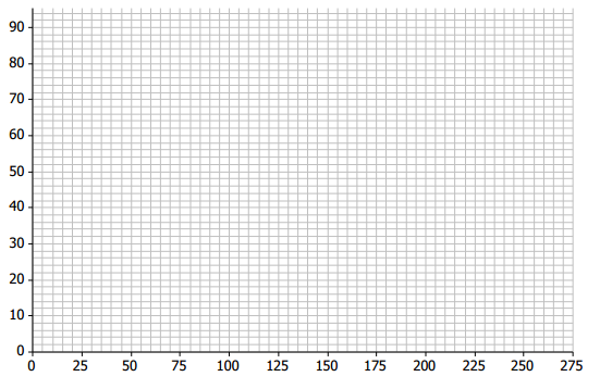
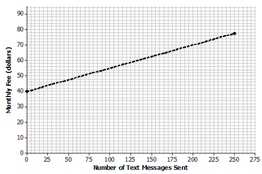
Sketch a graph of this relationship on the following coordinate grid. Clearly label the axes, and include units in the labels.
Engage NY Math Grade 8 Module 6 Lesson 10 Exercise Answer Key 6
Answer:
Anticipated response: Students label the x – axis as the number of text messages. They label the y – axis as the total monthly cost. Students use any two points they derived in Exercise 3. The following graph uses the point of (0,40) for Justin and the point (250,77.5) for Robert. Highlight the intercept of (0,40), along with the slope of the line they sketched. Also, point out that the line students draw should be a dotted line (and not a solid line). The number of text messages can only be whole numbers, and as a result, the line representing this relationship should indicate that values in between the whole numbers representing the text messages are not part of the data.
Engage NY Math Grade 8 Module 6 Lesson 10 Exercise Answer Key 7

Exercise 10.
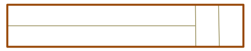
LaMoyne needs four more pieces of lumber for his Scout project. The pieces can be cut from one large piece of lumber according to the following pattern.
Engage NY Math Grade 8 Module 6 Lesson 10 Exercise Answer Key 8
The lumberyard will make the cuts for LaMoyne at a fixed cost of $2.25 plus an additional cost of 25 cents per cut. One cut is free.
a. What is the functional relationship between the total cost of cutting a piece of lumber and the number of cuts required? What is the equation of this function? Be sure to define the variables in the context of this problem.
Answer:
As students uncover the information in this problem, they should realize that the functional relationship between the total cost and number of cuts is linear. Noting that one cut is free, the equation could be written in one of the following ways:
Total cost for cutting = 2.25 + (0.25)(number of cuts – 1)
y = 2.25 + (0.25)(x – 1), where x is the number of cuts and y is the total cost for cutting
Total cost for cutting = 2 + (0.25)(number of cuts)
y = 2 + 0.25x, where x is the number of cuts and y is the total cost for cutting
Total cost for cutting = 2.25 + (0.25)(number of paid cuts)
y = 2.25 + 0.25x, where x is the number of paid cuts and y is the total cost for cutting

b. Use the equation to determine LaMoyne’s total cost for cutting.
Answer:
LaMoyne requires three cuts, one of which is free. Using any of the three forms given in part (a) yields a total cost for cutting of $2.75.

c. In the context of this problem, interpret the slope of the equation in words.
Answer:
Using any of the three forms, each additional cut beyond the free one adds $0.25 to the total cost for cutting.

d. Interpret the y – intercept of your equation in words in the context of this problem. Does interpreting the intercept make sense in this problem? Explain.
Answer:
If no cuts are required, then there is no fixed cost for cutting. So, it does not make sense to interpret the intercept in the context of this problem.

Exercise 11.
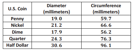
Omar and Olivia were curious about the size of coins. They measured the diameter and circumference of several coins and found the following data.
Engage NY Math Grade 8 Module 6 Lesson 10 Exercise Answer Key 9
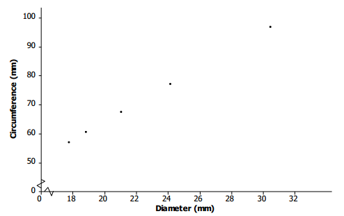
a. Wondering if there was any relationship between diameter and circumference, they thought about drawing a picture. Draw a scatter plot that displays circumference in terms of diameter.
Answer:
Students may need some help in deciding which is the independent variable and which is the dependent variable. Hopefully, they have seen from previous problems that whenever one variable, say variable A, is to be expressed in terms of some variable B, then variable A is the dependent variable, and variable B is the independent variable. So, circumference is being taken as the dependent variable in this problem, and diameter is being taken as the independent variable.
Engage NY Math Grade 8 Module 6 Lesson 10 Exercise Answer Key 10

b. Do you think that circumference and diameter are related? Explain.
Answer:
It may be necessary to point out to students that because the data are rounded to one decimal place, the points on the scatter plot may not fall exactly on a line; however, they should. Circumference and diameter are linearly related.

c. Find the equation of the function relating circumference to the diameter of a coin.
Answer:
Again, because of a rounding error, equations that students find may be slightly different depending on which points they choose to do their calculations. Hopefully, they all arrive at something close to a circumference equal to 3.14, or π, multiplied by diameter.
For example, the slope of the line containing points (19,59.7) and (30.6,96.1) is \(\frac{96.1 – 59.7}{30.6 – 19}\) = 3.1379, which rounds to 3.14.
The intercept may be found using 59.7 = a + (3.14)(19.0), which yields a = 0.04, which rounds to 0.
Therefore, C = 3.14d + 0 = 3.14d.

d. The value of the slope is approximately equal to the value of π. Explain why this makes sense.
Answer:
The slope is identified as being approximately equal to π. (Note: Most students have previously studied the relationship between circumference and diameter of a circle. However, if students have not yet seen this result, discuss the interesting result that if the circumference of a circle is divided by its diameter, the result is a constant, namely, 3.14 rounded to two decimal places, no matter what circle is being considered.)

e. What is the value of the y – intercept? Explain why this makes sense.
Answer:
If the diameter of a circle is 0 (a point), then according to the equation, its circumference is 0. That is true, so interpreting the intercept of 0 makes sense in this problem.

Eureka Math Grade 8 Module 6 Lesson 10 Problem Set Answer Key

Question 1.
The Mathematics Club at your school is having a meeting. The advisor decides to bring bagels and his award – winning strawberry cream cheese. To determine his cost, from past experience he figures 1.5 bagels per student.
A bagel costs 65 cents, and the special cream cheese costs $3.85 and will be able to serve all of the anticipated students attending the meeting.
a. Find an equation that relates his total cost to the number of students he thinks will attend the meeting.
Answer:
Encourage students to write a problem in words in its context. For example, the advisor’s total cost = cream cheese fixed cost + cost of bagels. The cost of bagels depends on the unit cost of a bagel times the number of bagels per student times the number of students. So, with symbols, if c denotes the total cost in dollars and n denotes the number of students, then c = 3.85 + (0.65)(1.5)(n), or c = 3.85 + 0.975n.

b. In the context of the problem, interpret the slope of the equation in words.
Answer:
For each additional student, the cost goes up by 0.975 dollar, or 97.5 cents.

c. In the context of the problem, interpret the y – intercept of the equation in words. Does interpreting the intercept make sense? Explain.
Answer:
If there are no students, the total cost is $3.85. Students could interpret this by saying that the meeting was called off before any bagels were bought, but the advisor had already made his award – winning cream cheese, so the cost is $3.85. The intercept makes sense. Other students might argue otherwise.

Question 2.
John, Dawn, and Ron agree to walk/jog for 45 minutes. John has arthritic knees but manages to walk 1 \(\frac{1}{2}\) miles. Dawn walks 2 \(\frac{1}{4}\) miles, while Ron manages to jog 6 miles.
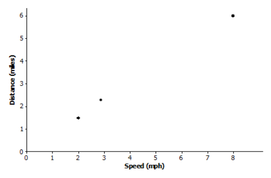
a. Draw an appropriate graph, and connect the points to show that there is a linear relationship between the distance that each traveled based on how fast each traveled (speed). Note that the speed for a person who travels 3 miles in 45 minutes, or \(\frac{3}{4}\) hour, is found using the expression 3 ÷ \(\frac{3}{4}\), which is 4 miles per hour.
Answer:
John’s speed is 2 miles per hour because 1 \(\frac{1}{2}\) ÷ \(\frac{3}{4}\) = 2. Dawn’s speed is 3 miles per hour because 2 \(\frac{1}{4}\) ÷ \(\frac{3}{4}\) = 3. Ron’s speed is 8 miles per hour because 6 ÷ \(\frac{3}{4}\) = 8. Students may draw the scatter plot incorrectly. Note that distance is to be expressed in terms of speed so that distance is the dependent variable on the vertical axis, and speed is the independent variable on the horizontal axis.
Eureka Math 8th Grade Module 6 Lesson 10 Problem Set Answer Key 1

b. Find an equation that expresses distance in terms of speed (how fast one goes).
Answer:
The slope is \(\frac{6 – 1.5}{8 – 2}\) = 0.75, so the equation of the line through these points is
distance = a + (0.75)(speed).
Next, find the intercept. For example, solve 6 = a + (0.75)(8) for a, which yields a = 0.
So, the equation is distance = 0.75(speed).

c. In the context of the problem, interpret the slope of the equation in words.
Answer:
If someone increases her speed by 1 mile per hour, then that person travels 0.75 additional mile in 45 minutes.

d. In the context of the problem, interpret the y – intercept of the equation in words. Does interpreting the intercept make sense? Explain.
Answer:
The intercept of 0 makes sense because if the speed is 0 miles per hour, then the person is not moving.
So, the person travels no distance.

Question 3.
Simple interest is money that is paid on a loan. Simple interest is calculated by taking the amount of the loan and multiplying it by the rate of interest per year and the number of years the loan is outstanding. For college, Jodie’s older brother has taken out a student loan for $4,500 at an annual interest rate of 5.6%, or 0.056. When he graduates in four years, he has to pay back the loan amount plus interest for four years. Jodie is curious as to how much her brother has to pay.
a. Jodie claims that her brother has to pay a total of $5,508. Do you agree? Explain. As an example, a $1,200 loan has an 8% annual interest rate. The simple interest for one year is $96 because (0.08)(1,200) = 96. The simple interest for two years would be $192 because (2)(96) = 192.
Answer:
The total cost to repay = amount of the loan + interest on the loan.
Interest on the loan is the annual interest times the number of years the loan is outstanding.
The annual interest amount is (0.056)($4,500) = $252.
For four years, the simple interest amount is 4($252) = $1,008.
So, the total cost to repay the loan is $4,500 + $1,008 = $5,508. Jodie is right.

b. Write an equation for the total cost to repay a loan of $P if the rate of interest for a year is r (expressed as a decimal) for a time span of t years.
Answer:
Note: Work with students in identifying variables to represent the values discussed in this exercise. For example, the total cost to repay a loan is the amount of the loan plus the simple interest, or P + I, where P represents the amount of the loan and I represents the simple interest over t years.
The amount of interest per year is P times the annual interest. Let r represent the interest rate per year as a decimal.

The amount of interest per year is the amount of the loan, P, multiplied by the annual interest rate as a decimal, r (e.g., 5% is 0.05). The simple interest for t years, I, is the amount of interest per year multiplied by the number of years: I = (rt)P.
The total cost to repay the loan, c, is the amount of the loan plus the amount of simple interest; therefore, c = P + (rt)P.

c. If P and r are known, is the equation a linear equation?
Answer:
If P and r are known, then the equation should be written as c = P + (rP)t, which is the linear form where c is the dependent variable and t is the independent variable.

d. In the context of this problem, interpret the slope of the equation in words.
Answer:
For each additional year that the loan is outstanding, the total cost to repay the loan is increased by $rP.
As an example, consider Jodie’s brother’s equation for t years: c = 4500 + (0.056)(4500)t, or c = 4500 + 252t. For each additional year that the loan is not paid off, the total cost increases by $252.

e. In the context of this problem, interpret the y – intercept of the equation in words. Does interpreting the intercept make sense? Explain.
Answer:
The y – intercept is the value where t = 0. In this problem, it is the cost of the loan at the time that the loan was taken out. This makes sense because after 0 years, the cost to repay the loan would be $4,500, which is the amount of the original loan.

Eureka Math Grade 8 Module 6 Lesson 10 Exit Ticket Answer Key

Suppose that a cell phone monthly rate plan costs the user 5 cents per minute beyond a fixed monthly fee of $20.
This implies that the relationship between monthly cost and monthly number of minutes is linear.
Question 1.
Write an equation in words that relates total monthly cost to monthly minutes used. Explain how you found your answer.
Answer:
The equation is given by total monthly cost = 20 + 0.05 (number of minutes used for a month).
The y – intercept in the equation is the fixed monthly cost, $20.
The slope is the amount paid per minute of cell phone usage, or $0.05 per minute.
The linear form is total monthly cost = fixed cost + cost per minute (number of minutes used for a month).

Question 2.
Write an equation in symbols that relates the total monthly cost in dollars (y) to monthly minutes used (x).
Answer:
The equation is y = 20 + 0 .05x, where y is the total cost for a month in dollars and x is cell phone usage for the month in minutes.

Question 3.
What is the cost for a month in which 182 minutes are used? Express your answer in words in the context of this problem.
Answer:
20 + (0.05)(182) = 29.10
The total monthly cost in a month using 182 minutes would be $29.10.
Eureka Math Grade 8 Module 6 Lesson 11 Answer Key

Engage NY Eureka Math 8th Grade Module 6 Lesson 11 Answer Key

Eureka Math Grade 8 Module 6 Lesson 11 Exercise Answer Key

Exercise 1.
Old Faithful is a geyser in Yellowstone National Park. The following table offers some rough estimates of the length of an eruption (in minutes) and the amount of water (in gallons) in that eruption.
Engage NY Math Grade 8 Module 6 Lesson 11 Exercise Answer Key 1
This data is consistent with actual eruption and summary statistics that can be found at the following links:
http://geysertimes.org/geyser.php?id = OldFaithful and http://www.yellowstonepark.com/2011/07/about – old – faithful/
a. Chang wants to predict the amount of water in an eruption based on the length of the eruption. What should he use as the dependent variable? Why?
Answer:
Since Chang wants to predict the amount of water in an eruption, the time length (in minutes) is the predictor, and the amount of water is the dependent variable.

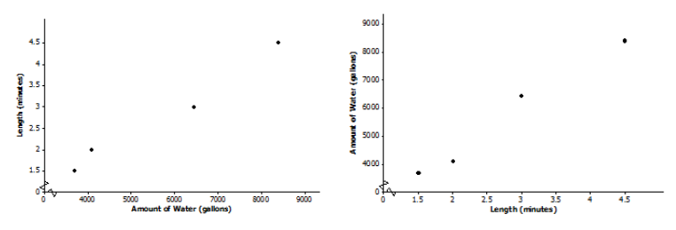
b. Which of the following two scatter plots should Chang use to build his prediction model? Explain.
Engage NY Math Grade 8 Module 6 Lesson 11 Exercise Answer Key 2
Answer:
The predicted variable goes on the vertical axis with the predictor on the horizontal axis. So, the amount of water goes on the y – axis. The plot on the graph on the right should be used.

c. Suppose that Chang believes the variables to be linearly related. Use the first and last data points in the table to create a linear prediction model.
Answer:
m = \(\frac{84000 – 3700}{4.5 – 1.5}\)≈1,566.7
So, y = a + (1,566.7)x.
Using either (1.5,3700) or (4.5,8400) allows students to solve for the intercept. For example, solving 3,700 = a + (1,566.7)(1.5) for a yields a = 1,349.95, or rounded to 1,350.0 gallons. Be sure students talk through the units in each step of the calculations.
The (informal) linear prediction model is y = 1,350.0 + 1,566.7x. The amount of water (y) is in gallons, and the length of the eruption (x) is in minutes.

d. A friend of Chang’s told him that Old Faithful produces about 3,000 gallons of water for every minute that it erupts. Does the linear model from part (c) support what Chang’s friend said? Explain.
Answer:
This question requires students to interpret slope. An additional minute in eruption length results in a prediction of an additional 1,566.7 gallons of water produced. So, Chang’s friend who claims Old Faithful produces 3,000 gallons of water a minute must be thinking of a different geyser.

e. Using the linear model from part (c), does it make sense to interpret the y – intercept in the context of this problem? Explain.
Answer:
No, it doesn’t make sense because if the length of an eruption is 0, then it cannot produce 1,350 gallons of water. (Convey to students that some linear models have y – intercepts that do not make sense within the context of a problem.)

Exercise 2.
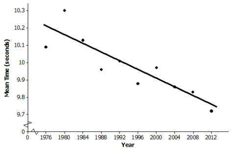
The following table gives the times of the gold, silver, and bronze medal winners for the men’s 100 – meter race (in seconds) for the past 10 Olympic Games.
Engage NY Math Grade 8 Module 6 Lesson 11 Exercise Answer Key 3
Data Source: https://en.wikipedia.org/wiki/100_metres_at_the_Olympics#Men

a. If you wanted to describe how mean times change over the years, which variable would you use as the independent variable, and which would you use as the dependent variable?
Answer:
Mean medal time (dependent variable) is being predicted based on year (independent variable).

b. Draw a scatter plot to determine if the relationship between mean time and year appears to be linear. Comment on any trend or pattern that you see in the scatter plot.
Answer:
The scatter plot indicates a negative trend, meaning that, in general, the mean race times have been decreasing over the years even though there is not a perfect linear pattern.
Engage NY Math Grade 8 Module 6 Lesson 11 Exercise Answer Key 4

c. One reasonable line goes through the 1992 and 2004 data. Find the equation of that line.
Answer:
The slope of the line through (1992,10.01) and (2004,9.86) is \(\frac{10.01 – 9.86}{1992 – 2004}\) = – 0.0125.
To find the intercept using (1992,10.01), solve 10.01 = a + ( – 0.0125)(1992) for a, which yields
a = 34.91.
The equation that predicts the mean medal race time for an Olympic year is y = 34.91 + ( – 0.0125)x.
The mean medal race time (y) is in seconds, and the time (x) is in years.

Note to Teacher: In Algebra I, students learn a formal method called least squares for determining a “best – fitting” line. For comparison, the least squares prediction line is y = 34.3562 + ( – 0.0122)x.

d. Before he saw these data, Chang guessed that the mean time of the three Olympic medal winners decreased by about 0.05 second from one Olympic Game to the next. Does the prediction model you found in part (c) support his guess? Explain.
Answer:
The slope – 0.0125 means that from one calendar year to the next, the predicted mean race time for the top three medals decreases by 0.0125 second. So, between successive Olympic Games, which occur every four years, the predicted mean race time is reduced by 0.05 second because 4(0.0125) = 0.05.

e. If the trend continues, what mean race time would you predict for the gold, silver, and bronze medal winners in the 2016 Olympic Games? Explain how you got this prediction.
Answer:
If the linear pattern were to continue, the predicted mean time for the 2016 Olympics is 9.71 seconds because 34.91 – (0.0125)(2016) = 9.71.

f. The data point (1980,10.3) appears to have an unusually high value for the mean race time (10.3). Using your library or the Internet, see if you can find a possible explanation for why that might have happened.
Answer:
The mean race time in 1980 was an unusually high 10.3 seconds. In their research of the 1980 Olympic Games, students find that the United States and several other countries boycotted the games, which were held in Moscow. Perhaps the field of runners was not the typical Olympic quality as a result. Atypical points in a set of data are called outliers. They may influence the analysis of the data.

Eureka Math Grade 8 Module 6 Lesson 11 Problem Set Answer Key

Question 1.
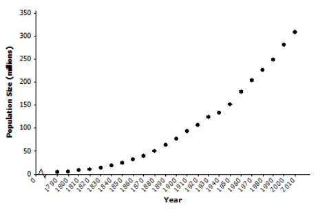
From the United States Bureau of Census website, the population sizes (in millions of people) in the United States for census years 1790–2010 are as follows.
Eureka Math 8th Grade Module 6 Lesson 11 Problem Set Answer Key 1
a. If you wanted to be able to predict population size in a given year, which variable would be the independent variable, and which would be the dependent variable?
Answer:
Population size (dependent variable) is being predicted based on year (independent variable).

b. Draw a scatter plot. Does the relationship between year and population size appear to be linear?
Answer:
The relationship between population size and year of birth is definitely nonlinear. Note that investigating nonlinear relationships is the topic of the next two lessons.
Eureka Math 8th Grade Module 6 Lesson 11 Problem Set Answer Key 2

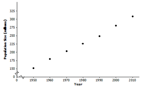
c. Consider the data only from 1950 to 2010. Does the relationship between year and population size for these years appear to be linear?
Answer:
Drawing a scatter plot using the 1950–2010 data indicates that the relationship between population size and year of birth is approximately linear, although some students may say that there is a very slight curvature to the data.
Eureka Math 8th Grade Module 6 Lesson 11 Problem Set Answer Key 3

d. One line that could be used to model the relationship between year and population size for the data from 1950 to 2010 is y = – 4875.021 + 2.578x. Suppose that a sociologist believes that there will be negative consequences if population size in the United States increases by more than 2 \(\frac{3}{4}\) million people annually. Should she be concerned? Explain your reasoning.
Answer:
This problem is asking students to interpret the slope. Some students will no doubt say that the sociologist need not be concerned, since the slope of 2.578 million births per year is smaller than her threshold value of 2.75 million births per year. Other students may say that the sociologist should be concerned, since the difference between 2.578 and 2.75 is only 172,000 births per year.

e. Assuming that the linear pattern continues, use the line given in part (d) to predict the size of the population in the United States in the next census.
Answer:
The next census year is 2020.
– 4875.021 + (2.578)(2020) = 332.539
The given line predicts that the population then will be 332.539 million people.
Question 2.
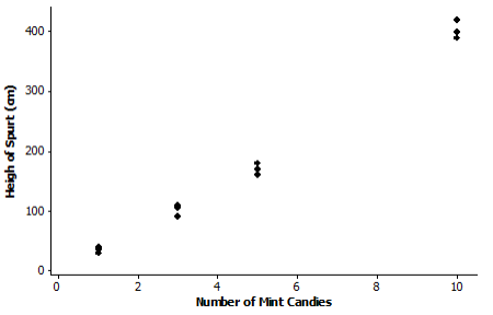
In search of a topic for his science class project, Bill saw an interesting YouTube video in which dropping mint candies into bottles of a soda pop caused the soda pop to spurt immediately from the bottle. He wondered if the height of the spurt was linearly related to the number of mint candies that were used. He collected data using 1, 3, 5, and 10 mint candies. Then, he used two – liter bottles of a diet soda and measured the height of the spurt in centimeters. He tried each quantity of mint candies three times. His data are in the following table.
Eureka Math 8th Grade Module 6 Lesson 11 Problem Set Answer Key 4
a. Identify which variable is the independent variable and which is the dependent variable.
Answer:
Height of spurt is the dependent variable, and number of mint candies is the independent variable because height of spurt is being predicted based on number of mint candies used.

b. Draw a scatter plot that could be used to determine whether the relationship between height of spurt and number of mint candies appears to be linear.
Answer:
Eureka Math 8th Grade Module 6 Lesson 11 Problem Set Answer Key 5

c. Bill sees a slight curvature in the scatter plot, but he thinks that the relationship between the number of mint candies and the height of the spurt appears close enough to being linear, and he proceeds to draw a line.
Answer:
His eyeballed line goes through the mean of the three heights for three mint candies and the mean of the three heights for 10 candies. Bill calculates the equation of his eyeballed line to be
y = – 27.617 + (43.095)x,
where the height of the spurt (y) in centimeters is based on the number of mint candies (x). Do you agree with this calculation? He rounded all of his calculations to three decimal places. Show your work.
Yes, Bill’s equation is correct.
The slope of the line through (3,101.667) and (10,403.333) is \(\frac{403.333 – 101.667}{10 – 3}\) = 43.095.
The intercept could be found by solving 403.333 = a + (43.095)(10) for a, which yields
a = – 27.617.
So, a possible prediction line is y = – 27.617 + (43.095)x.

d. In the context of this problem, interpret in words the slope and intercept for Bill’s line. Does interpreting the intercept make sense in this context? Explain.
Answer:
The slope is 43.095, which means that for every mint candy dropped into the bottle of soda pop, the height of the spurt increases by 43.095 cm.
The y – intercept is (0, – 27.617). This means that if no mint candies are dropped into the bottle of soda pop, the height of the spurt is – 27.617 ft. This does not make sense within the context of the problem.

e. If the linear trend continues for greater numbers of mint candies, what do you predict the height of the spurt to be if 15 mint candies are used?
Answer:
– 27.617 + (43.095)(15) = 618.808
The predicted height would be 618.808 cm, which is slightly over 20 ft.

Eureka Math Grade 8 Module 6 Lesson 11 Exit Ticket Answer Key

Question 1.
According to the Bureau of Vital Statistics for the New York City Department of Health and Mental Hygiene, the life expectancy at birth (in years) for New York City babies is as follows.
Eureka Math Grade 8 Module 6 Lesson 11 Exit Ticket Answer Key 1
Data Source: http://www.nyc.gov/html/om/pdf/2012/pr465 – 12_charts.pdf
a. If you are interested in predicting life expectancy for babies born in a given year, which variable is the independent variable, and which is the dependent variable?
Answer:
Year of birth is the independent variable, and life expectancy in years is the dependent variable.
Eureka Math Grade 8 Module 6 Lesson 11 Exit Ticket Answer Key 2

b. Draw a scatter plot to determine if there appears to be a linear relationship between the year of birth and life expectancy.
Answer:
Life expectancy and year of birth appear to be linearly related.

c. Fit a line to the data. Show your work.
Answer:
Answers will vary. For example, the line through (2001,77.9) and (2009,80.6) is y = – 597.438 + (0.3375)x, where life expectancy (y) is in years, and the time (x) is in years.
Note to Teacher: The formal least squares line (Algebra I) is y = – 612.458 + (0.345)x.

d. Based on the context of the problem, interpret in words the intercept and slope of the line you found in part (c).
Answer:
Answers will vary based on part (c). The intercept says that babies born in New York City in Year 0 should expect to live around – 597 years! Be sure students actually say that this is an unrealistic result and that interpreting the intercept is meaningless in this problem. Regarding the slope, for an increase of 1 in the year of birth, predicted life expectancy increases by 0.3375 year, which is a little over four months.

e. Use your line to predict life expectancy for babies born in New York City in 2010.
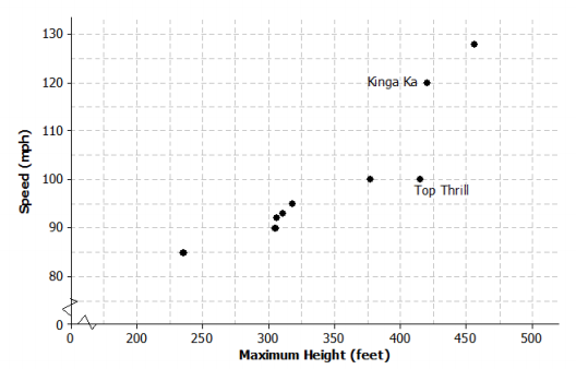
Answer:
Answers will vary based on part (c).
– 597.438 + (0.3375)(2010) = 80.9
Using the line calculated in part (c), the predicted life expectancy for babies born in New York City in 2010 is 80.9 years, which is also the value given on the website.

Eureka Math Grade 8 Module 6 Lesson 9 Answer Key

Engage NY Eureka Math 8th Grade Module 6 Lesson 9 Answer Key

Eureka Math Grade 8 Module 6 Lesson 9 Exercise Answer Key

Example 1: Crocodiles and Alligators
Scientists are interested in finding out how different species adapt to finding food sources. One group studied crocodilians to find out how their bite force was related to body mass and diet. The table below displays the information they collected on body mass (in pounds) and bite force (in pounds).
Engage NY Math Grade 8 Module 6 Lesson 9 Exercise Answer Key 1
Data Source: http://journals.plos.org/plosone/article?id = 10.1371/journal.pone.0031781#pone – 0031781 – t001
(Note: Body mass and bite force have been converted to pounds from kilograms and newtons, respectively.)
As you learned in the previous lesson, it is a good idea to begin by looking at what a scatter plot tells you about the data. The scatter plot below displays the data on body mass and bite force for the crocodilians in the study.
Engage NY Math Grade 8 Module 6 Lesson 9 Exercise Answer Key 2

Exercises 1–6

Exercise 1.
Describe the relationship between body mass and bite force for the crocodilians shown in the scatter plot.
Answer:
As the body mass increases, the bite force tends to also increase.

Exercise 2.
Draw a line to represent the trend in the data. Comment on what you considered in drawing your line.
Answer:
The line should be as close as possible to the points in the scatter plot. Students explored this idea in Lesson 8.

Exercise 3.
Based on your line, predict the bite force for a crocodilian that weighs 220 pounds. How does this prediction compare to the actual bite force of the 220 – pound crocodilian in the data set?
Answer:
Answers will vary. A reasonable prediction is around 650 to 700 pounds. The actual bite force was 1,000 pounds, so the prediction based on the line was not very close for this crocodilian.

Exercise 4.
Several students decided to draw lines to represent the trend in the data. Consider the lines drawn by Sol, Patti, Marrisa, and Taylor, which are shown below.
Engage NY Math Grade 8 Module 6 Lesson 9 Exercise Answer Key 3
For each student, indicate whether or not you think the line would be a good line to use to make predictions.
Explain your thinking.
a. Sol’s line
Answer:
In general, it looks like Sol’s line overestimates the bite force for heavier crocodilians and underestimates the bite force for crocodilians that do not weigh as much.

b. Patti’s line
Answer:
Patti’s line looks like it fits the data well, so it would probably produce good predictions. The line goes through the middle of the points in the scatter plot, and the points are fairly close to the line.

c. Marrisa’s line
Answer:
It looks like Marrisa’s line overestimates the bite force because almost all of the points are below the line.

d. Taylor’s line
Answer:
It looks like Taylor’s line tends to underestimate the bite force. There are many points above the line.

Exercise 5.
What is the equation of your line? Show the steps you used to determine your line. Based on your equation, what is your prediction for the bite force of a crocodilian weighing 200 pounds?
Answer:
Answers will vary. Students have learned from previous modules how to find the equation of a line. Anticipate students to first determine the slope based on two points on their lines. Students then use a point on the line to obtain an equation in the form y = mx + b (or y = a + bx). Students use their lines to predict a bite force for a crocodilian that weighs 200 pounds. A reasonable answer would be around 800 pounds.

Exercise 6.
Patti drew vertical line segments from two points to the line in her scatter plot. The first point she selected was for a dwarf crocodile. The second point she selected was for an Indian gharial crocodile.
Engage NY Math Grade 8 Module 6 Lesson 9 Exercise Answer Key 4
a. Would Patti’s line have resulted in a predicted bite force that was closer to the actual bite force for the dwarf crocodile or for the Indian gharial crocodile? What aspect of the scatter plot supports your answer?
Answer:
The prediction would be closer to the actual bite force for the dwarf crocodile. That point is closer to the line (the vertical line segment connecting it to the line is shorter) than the point for the Indian gharial crocodile.

b. Would it be preferable to describe the trend in a scatter plot using a line that makes the differences in the actual and predicted values large or small? Explain your answer.
Answer:
It would be better for the differences to be as small as possible. Small differences are closer to the line.

Exercise 7: Used Cars

Exercise 7.
Suppose the plot below shows the age (in years) and price (in dollars) of used compact cars that were advertised in a local newspaper.
Engage NY Math Grade 8 Module 6 Lesson 9 Exercise Answer Key 5
a. Based on the scatter plot above, describe the relationship between the age and price of the used cars.
Answer:
The older the car, the lower the price tends to be.

b. Nora drew a line she thought was close to many of the points and found the equation of the line. She used the points (13,6000) and (7,12000) on her line to find the equation. Explain why those points made finding the equation easy.
Engage NY Math Grade 8 Module 6 Lesson 9 Exercise Answer Key 6
Answer:
The points are at the intersection of the grid lines in the graph, so it is easy to determine the coordinates of these points.

c. Find the equation of Nora’s line for predicting the price of a used car given its age. Summarize the trend described by this equation.
Answer:
Using the points, the equation is y = – 1000x + 19000, or Price = – 1000(age) + 19000. The slope of the line is negative, so the line indicates that the price of used cars decreases as cars get older.
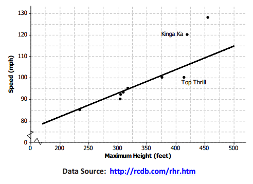
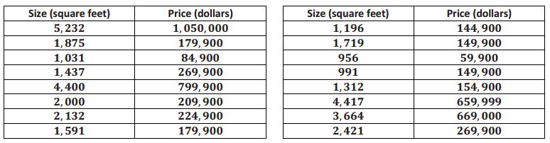
d. Based on the line, for which car in the data set would the predicted value be farthest from the actual value? How can you tell?
Answer:
It would be farthest for the car that is 10 years old. It is the point in the scatter plot that is farthest from the line.

e. What does the equation predict for the cost of a 10 – year – old car? How close was the prediction using the line to the actual cost of the 10 – year – old car in the data set? Given the context of the data set, do you think the difference between the predicted price and the actual price is large or small?
Answer:
The line predicts a 10 – year – old car would cost about $9,000. – 1000(10) + 19000 = 9000. Compared to $4,040 for the 10 – year – old car in the data set, the difference would be $4,960. The prediction is off by about $5,000, which seems like a lot of money, given the prices of the cars in the data set.

f. Is $5,000 typical of the differences between predicted prices and actual prices for the cars in this data set? Justify your answer.
Answer:
No, most of the differences would be much smaller than $5,000. Most of the points are much closer to the line, and most predictions would be within about $1,000 of the actual value.

Eureka Math Grade 8 Module 6 Lesson 9 Problem Set Answer Key

Question 1.
The Monopoly board game is popular in many countries. The scatter plot below shows the distance from “Go” to a property (in number of spaces moving from “Go” in a clockwise direction) and the price of the properties on the Monopoly board. The equation of the line is P = 8x + 40, where P represents the price (in Monopoly dollars) and x represents the distance (in number of spaces).
Eureka Math 8th Grade Module 6 Lesson 9 Problem Set Answer Key 1
Price of Property Versus Distance from “Go” in Monopoly
Eureka Math 8th Grade Module 6 Lesson 9 Problem Set Answer Key 2
a. Use the equation to find the difference (observed value – predicted value) for the most expensive property and for the property that is 35 spaces from “Go.”
Answer:
The most expensive property is 39 spaces from “Go” and costs $400. The price predicted by the line would be 8(39) + 40, or $352. Observed price – predicted price would be $400 – $352 = $48. The price predicted for 35 spaces from “Go” would be 8(35) + 40, or $320. Observed price – predicted price would be $200 – $320 = – $120.

b. Five of the points seem to lie in a horizontal line. What do these points have in common? What is the equation of the line containing those five points?
Answer:
These points all have the same price. The equation of the horizontal line through those points would be
P = 200.

c. Four of the five points described in part (b) are the railroads. If you were fitting a line to predict price with distance from “Go,” would you use those four points? Why or why not?
Answer:
Answers will vary. Because the four points are not part of the overall trend in the price of the properties, I would not use them to determine a line that describes the relationship. I can show this by finding the total error to measure the fit of the line.

Question 2.
The table below gives the coordinates of the five points shown in the scatter plots that follow. The scatter plots show two different lines.
Eureka Math 8th Grade Module 6 Lesson 9 Problem Set Answer Key 3
a. Find the predicted response values for each of the two lines.
Eureka Math 8th Grade Module 6 Lesson 9 Problem Set Answer Key 4
Answer:
Eureka Math 8th Grade Module 6 Lesson 9 Problem Set Answer Key 5

b. For which data points is the prediction based on Line 1 closer to the actual value than the prediction based on Line 2?
Answer:
It is only for data point A. For data point C, both lines are off by the same amount.

c. Which line (Line 1 or Line 2) would you select as a better fit? Explain.
Answer:
Line 2 is a better fit because it is closer to more of the data points.

Question 3.
The scatter plots below show different lines that students used to model the relationship between body mass (in pounds) and bite force (in pounds) for crocodilians.
Match each graph to one of the equations below, and explain your reasoning. Let B represent bite force (in pounds) and W represent body mass (in pounds).
Equation 1
B = 3.28W + 126

Equation 2
B = 3.04W + 351

Equation 3
B = 2.16W + 267

Equation:
Eureka Math 8th Grade Module 6 Lesson 9 Problem Set Answer Key 6
Answer:
Equation: 3
The intercept of 267 appears to match the graph, which has the second largest intercept.

Equation:
Eureka Math 8th Grade Module 6 Lesson 9 Problem Set Answer Key 7
Answer:
Equation: 2
The intercept of Equation 2 is larger, so it matches Line 2, which has a y – intercept closer to 400.

Equation:
Eureka Math 8th Grade Module 6 Lesson 9 Problem Set Answer Key 8
Answer:
Equation: 1
The intercept of Equation 1 is the smallest, which seems to match the graph.

b. Which of the lines would best fit the trend in the data? Explain your thinking.
Answer:
Answers will vary. Line 3 would be better than the other two lines. Line 1 is not a good fit for larger weights, and Line 2 is above nearly all of the points and pretty far away from most of them. It looks like Line 3 would be closer to most of the points.

Question 4.
Comment on the following statements:
a. A line modeling a trend in a scatter plot always goes through the origin.
Answer:
Some trend lines go through the origin, but others may not. Often, the value (0, 0) does not make sense for the data.

b. If the response variable increases as the independent variable decreases, the slope of a line modeling the trend is negative.
Answer:
If the trend is from the upper left to the lower right, the slope for the line is negative because for each unit increase in the independent variable, the response decreases.

Eureka Math Grade 8 Module 6 Lesson 9 Exit Ticket Answer Key

Question 1.
The scatter plot below shows the height and speed of some of the world’s fastest roller coasters. Draw a line that you think is a good fit for the data.
Eureka Math Grade 8 Module 6 Lesson 9 Exit Ticket Answer Key 1
Answer:
Students would draw a line based on the goal of a best fit for the given scatter plot. A possible line is drawn below.
Eureka Math Grade 8 Module 6 Lesson 9 Exit Ticket Answer Key 2

Question 2.
Find the equation of your line. Show your steps.
Answer:
Answers will vary based on the line drawn. Let S equal the speed of the roller coaster and H equal the maximum height of the roller coaster.
m = \(\frac{115 – 85}{500 – 225}\) ≈ 0.11
S = 0.11H + b
85 = 0.11(225) + b
b ≈ 60
Therefore, the equation of the line drawn in Problem 1 is S = 0.11H + 60.

Question 3.
For the two roller coasters identified in the scatter plot, use the line to find the approximate difference between the observed speeds and the predicted speeds.
Answer:
Answers will vary depending on the line drawn by a student or the equation of the line. For the Top Thrill, the maximum height is about 415 feet and the speed is about 100 miles per hour. The line indicated in Problem 2 predicts a speed of 106 miles per hour, so the difference is about 6 miles per hour over the actual speed. For the Kinga Ka, the maximum height is about 424 feet with a speed of 120 miles per hour. The line predicts a speed of about 107 miles per hour, for a difference of 13 miles per hour under the actual speed. (Students can use the graph or the equation to find the predicted speed.)

Eureka Math Grade 8 Module 6 Lesson 8 Answer Key

Engage NY Eureka Math 8th Grade Module 6 Lesson 8 Answer Key

Eureka Math Grade 8 Module 6 Lesson 8 Exercise Answer Key

Example 1: Housing Costs
Let’s look at some data from one midwestern city that indicate the sizes and sale prices of various houses sold in this city.
Engage NY Math Grade 8 Module 6 Lesson 8 Exercise Answer Key 1
Data Source: http://www.trulia.com/for_sale/Milwaukee,WI/5_p, accessed in 2013
A scatter plot of the data is given below.
Engage NY Math Grade 8 Module 6 Lesson 8 Exercise Answer Key 2

Exercises 1–6

Exercise 1.
What can you tell about the price of large homes compared to the price of small homes from the table?
Answer:
Answers will vary. Students should make the observation that, overall, the larger homes cost more, and the smaller homes cost less. However, it is hard to generalize because one of the smaller homes costs nearly $150,000.

Exercise 2.
Use the scatter plot to answer the following questions.
a. Does the scatter plot seem to support the statement that larger houses tend to cost more? Explain your thinking.
Answer:
Yes, because the trend is positive, the larger the size of the house, the more the house tends to cost.

b. What is the cost of the most expensive house, and where is that point on the scatter plot?
Answer:
The house with a size of 5,232 square feet costs $1,050,000, which is the most expensive. It is in the upper right corner of the scatter plot.

c. Some people might consider a given amount of money and then predict what size house they could buy. Others might consider what size house they want and then predict how much it would cost. How would you use the scatter plot in Example 1?
Answer:
Answers will vary. Since the size of the house is on the horizontal axis and the price is on the vertical axis, the scatter plot is set up with price as the dependent variable and size as the independent variable. This is the way you would set it up if you wanted to predict price based on size. Although various answers are appropriate, move the discussion along using size to predict price.

d. Estimate the cost of a 3,000-square-foot house.
Answer:
Answers will vary. Reasonable answers range between $300,000 and $600,000.

e. Do you think a line would provide a reasonable way to describe how price and size are related? How could you use a line to predict the price of a house if you are given its size?
Answer:
Answers will vary; however, use this question to develop the idea that a line would provide a way to estimate the cost given the size of a house. The challenge is how to make that line. Note: Students are encouraged in the next exercise to first make a line and then evaluate whether or not it fits the data. This will provide a reasonable estimate of the cost of a house in relation to its size.

Exercise 3.
Draw a line in the plot that you think would fit the trend in the data.
Answer:
Answers will vary. Discuss several of the lines students have drawn by encouraging students to share their lines with the class. At this point, do not evaluate the lines as good or bad. Students may want to know a precise procedure or process to draw their lines. If that question comes up, indicate to students that a procedure will be developed in their future work (Algebra I) with statistics. For now, the goal is to simply draw a line that can be used to describe the relationship between the size of a home and its cost. Indicate that strategies for drawing a line will be explored in Exercise 5. Use the lines provided by students to evaluate the predictions in the following exercise. These predictions are used to develop a strategy for drawing a line. Use the line drawn by students to highlight their understanding of the data.

Exercise 4.
Use your line to answer the following questions:
a. What is your prediction of the price of a 3,000-square-foot house?
Answer:
Answers will vary. A reasonable prediction is around $500,000.

b. What is the prediction of the price of a 1,500-square-foot house?
Answer:
Answers will vary. A reasonable prediction is around $200,000.

Exercise 5.
Consider the following general strategies students use for drawing a line. Do you think they represent a good strategy for drawing a line that fits the data? Explain why or why not, or draw a line for the scatter plot using the strategy that would indicate why it is or why it is not a good strategy.
a. Laure thought she might draw her line using the very first point (farthest to the left) and the very last point (farthest to the right) in the scatter plot.
Answer:
Answers will vary. This may work in some cases, but those points might not capture the trend in the data. For example, the first point in the lower left might not be in line with the other points.

b. Phil wants to be sure that he has the same number of points above and below the line.
Answer:
Answers will vary. You could draw a nearly horizontal line that has half of the points above and half below, but that might not represent the trend in the data at all. Note: For many students just starting out, this seems like a reasonable strategy, but it often can result in lines that clearly do not fit the data. As indicated, drawing a nearly horizontal line is a good way to indicate that this is not a good strategy.

c. Sandie thought she might try to get a line that had the most points right on it.
Answer:
Answers will vary. That might result in, perhaps, three points on the line (knowing it only takes two to make a line), but the others could be anywhere. The line might even go in the wrong direction. Note: For students just beginning to think of how to draw a line, this seems like a reasonable goal; however, point out that this strategy may result in lines that are not good for predicting price.

d. Maree decided to get her line as close to as many of the points as possible.
Answer:
Answers will vary. If you can figure out how to do this, Maree’s approach seems like a reasonable way to find a line that takes all of the points into account.

Exercise 6.
Based on the strategies discussed in Exercise 5, would you change how you draw a line through the points? Explain your answer.
Answer:
Answers will vary based on how a student drew his original line. Summarize that the goal is to draw a line that is as close as possible to the points in the scatter plot. More precise methods are developed in Algebra I.

Example 2: Deep Water
Does the current in the water go faster or slower when the water is shallow? The data on the depth and velocity of the Columbia River at various locations in Washington State listed below can help you think about the answer.
Engage NY Math Grade 8 Module 6 Lesson 8 Exercise Answer Key 3
Data Source: www.seattlecentral.edu/qelp/sets/011/011.html
a. What can you tell about the relationship between the depth and velocity by looking at the numbers in the table?
Answer:
Answers will vary. According to the table, as the depth increases, the velocity appears to decrease.

b. If you were to make a scatter plot of the data, which variable would you put on the horizontal axis, and why?
Answer:
Answers will vary. It might be easier to measure the depth and use that information to predict the velocity of the water, so the depth should go on the horizontal axis.

Exercises 7–9

Exercise 7.
A scatter plot of the Columbia River data is shown below.
Engage NY Math Grade 8 Module 6 Lesson 8 Exercise Answer Key 4
a. Choose a data point in the scatter plot, and describe what it means in terms of the context.
Answer:
Answers will vary. For example, (4.6,1.39) would represent a place in the river that was 4.6 feet deep and had a velocity of 1.39 ft/sec.

b. Based on the scatter plot, describe the relationship between velocity and depth.
Answer:
The deeper the water, the slower the current velocity tends to be.

c. How would you explain the relationship between the velocity and depth of the water?
Answer:
Answers will vary. Sample response: Velocity may be a result of the volume of water. Shallow water has less volume, and as a result, the water runs faster. Note: Students may have several explanations. For example, they may say that depth is a result of less water runoff; therefore, water depth increases.

d. If the river is two feet deep at a certain spot, how fast do you think the current would be? Explain your reasoning.
Answer:
Answers will vary. Based on the data, it could be around 1.11 ft/sec, or it could be closer to 1.42 ft/sec, which is more in line with the pattern for the other points.

Exercise 8.
Consider the following questions:
a. If you draw a line to represent the trend in the plot, would it make it easier to predict the velocity of the water if you know the depth? Why or why not?
Answer:
Answers will vary. A line will help you determine a better prediction for 1.5 ft. or 5 ft., where the points are a bit scattered.

b. Draw a line that you think does a reasonable job of modeling the trend on the scatter plot in Exercise 7. Use the line to predict the velocity when the water is 8 feet deep.
Answer:
Answers will vary. A line is drawn in the following graph. Using this line, when the water is 8 ft. deep, the velocity is predicted to be 0.76 ft/sec.
Engage NY Math Grade 8 Module 6 Lesson 8 Exercise Answer Key 5

Exercise 9.
Use the line to predict the velocity for a depth of 8.6 feet. How far off was your prediction from the actual observed velocity for the location that had a depth of 8.6 feet?
Answer:
Answers will vary. Sample response: The current would be moving at a velocity of 0.68 ft/sec. The observed velocity was 0.59 ft/sec, so the line predicted a velocity that was 0.09 ft/sec faster than the observed value.

Eureka Math Grade 8 Module 6 Lesson 8 Problem Set Answer Key

Question 1.
The table below shows the mean temperature in July and the mean amount of rainfall per year for 14 cities in the Midwest.
Eureka Math 8th Grade Module 6 Lesson 8 Problem Set Answer Key 1
Data Source: http://countrystudies.us/united-states/weather/
a. What do you observe from looking at the data in the table?
Answer:
Answers will vary. Many of the temperatures were in the 70’s, and many of the mean inches of rain were in the 30’s. It also appears that, in general, as the rainfall increased, the mean temperature also increased.

b. Look at the scatter plot below. A line is drawn to fit the data. The plot in the Exit Ticket had the mean July temperatures for the cities on the horizontal axis. How is this plot different, and what does it mean for the way you think about the relationship between the two variables—temperature and rain?
Eureka Math 8th Grade Module 6 Lesson 8 Problem Set Answer Key 2
Answer:
This scatter plot has the labels on the axes reversed: (mean inches of rain, mean temperature). This is the scatter plot I would use if I wanted to predict the mean temperature in July knowing the mean amount of rain per year.

c. The line has been drawn to model the relationship between the amount of rain and the temperature in those Midwestern cities. Use the line to predict the mean July temperature for a Midwestern city that has a mean of 32 inches of rain per year.
Answer:
Answers will vary. For 32 in. of rain per year, the line indicates a mean July temperature of approximately 70°F.

d. For which of the cities in the sample does the line do the worst job of predicting the mean temperature? The best? Explain your reasoning with as much detail as possible.
Answer:
Answers will vary. I looked for points that were really close to the line and ones that were far away. The line prediction for temperature would be farthest off for Minneapolis. For 29.41 in. of rain in Minneapolis, the line predicted approximately 67°F, whereas the actual mean temperature in July was 73.2°F. The line predicted very well for Milwaukee.

For 32.95 in. of rain in Milwaukee, the line predicted approximately 73°F, whereas the actual mean temperature in July was 72°F and was only off by about 1°F. The line was also close for Marquette. For 34.81 in. of rain in Marquette, the line predicted approximately 71°F, whereas the actual mean temperature in July was 71.6°F and was only off by about 1°F.

Question 2.
The scatter plot below shows the results of a survey of eighth-grade students who were asked to report the number of hours per week they spend playing video games and the typical number of hours they sleep each night.
Mean Hours Sleep per Night Versus Mean Hours Playing Video Games per Week
Eureka Math 8th Grade Module 6 Lesson 8 Problem Set Answer Key 3
a. What trend do you observe in the data?
Answer:
The more hours that students play video games, the fewer hours they tend to sleep.

b. What was the fewest number of hours per week that students who were surveyed spent playing video games? The most?
Answer:
Two students spent 0 hours, and one student spent 32 hours per week playing games.

c. What was the fewest number of hours per night that students who were surveyed typically slept? The most?
Answer:
The fewest hours of sleep per night was around 5 hours, and the most was around 10 hours.

d. Draw a line that seems to fit the trend in the data, and find its equation. Use the line to predict the number of hours of sleep for a student who spends about 15 hours per week playing video games.
Answer:
Answers will vary. A student who spent 15 hours per week playing games would get about 7 hours of sleep per night.
Eureka Math 8th Grade Module 6 Lesson 8 Problem Set Answer Key 4

Question 3.
Scientists can take very good pictures of alligators from airplanes or helicopters. Scientists in Florida are interested in studying the relationship between the length and the weight of alligators in the waters around Florida.
a. Would it be easier to collect data on length or weight? Explain your thinking.
Answer:
Answers will vary. You could measure the length from the pictures, but you would have to actually have the alligators to weigh them.

b. Use your answer to decide which variable you would want to put on the horizontal axis and which variable you might want to predict.
Answer:
You would probably want to predict the weight of the alligator knowing the length; therefore, the length would go on the horizontal axis and the weight on the vertical axis.

Question 4.
Scientists captured a small sample of alligators and measured both their length (in inches) and weight (in pounds). Torre used their data to create the following scatter plot and drew a line to capture the trend in the data. She and Steve then had a discussion about the way the line fit the data. What do you think they were discussing, and why?
Alligator Length (inches) and Weight (pounds)
Eureka Math 8th Grade Module 6 Lesson 8 Problem Set Answer Key 5
Data Source: James Landwehr and Ann Watkins, Exploring Data, Quantitative Literacy Series (Dale Seymour, 1987).
Answer:
Answers will vary. Sample response: The pattern in the scatter plot is curved instead of linear. All of the data points in the middle of the scatter plot fall below the line, and the line does not really capture the pattern in the scatter plot. A line does not pass through the cluster of points between 60 to 80 in. in length that fit the other points. A model other than a line might be a better fit.

Eureka Math Grade 8 Module 6 Lesson 8 Exit Ticket Answer Key

The plot below is a scatter plot of mean temperature in July and mean inches of rain per year for a sample of midwestern cities. A line is drawn to fit the data.
Eureka Math Grade 8 Module 6 Lesson 8 Exit Ticket Answer Key 1
Data Source: http://countrystudies.us/united-states/weather/
Question 1.
Choose a point in the scatter plot, and explain what it represents.
Answer:
Answers will vary. Sample response: The point at about (72,35) represents a Midwestern city where the mean temperature in July is about 72°F and where the rainfall per year is about 35 inches.

Question 2.
Use the line provided to predict the mean number of inches of rain per year for a city that has a mean temperature of 70°F in July.
Answer:
Predicted rainfall is 33 inches of rain per year. (Some students will state approximately 33.5 inches of rain.)

Question 3.
Do you think the line provided is a good one for this scatter plot? Explain your answer.
Answer:
Yes. The line follows the general pattern in the scatter plot, and it does not look like there is another area in the scatter plot where the points would be any closer to the line.

Eureka Math Grade 8 Module 6 Lesson 7 Answer Key

Engage NY Eureka Math 8th Grade Module 6 Lesson 7 Answer Key

Eureka Math Grade 8 Module 6 Lesson 7 Exercise Answer Key

Example 1.
In the previous lesson, you learned that scatter plots show trends in bivariate data.
When you look at a scatter plot, you should ask yourself the following questions:
a. Does it look like there is a relationship between the two variables used to make the scatter plot?
b. If there is a relationship, does it appear to be linear?
c. If the relationship appears to be linear, is the relationship a positive linear relationship or a negative linear relationship?

To answer the first question, look for patterns in the scatter plot. Does there appear to be a general pattern to the points in the scatter plot, or do the points look as if they are scattered at random? If you see a pattern, you can answer the second question by thinking about whether the pattern would be well described by a line. Answering the third question requires you to distinguish between a positive linear relationship and a negative linear relationship. A positive linear relationship is one that is described by a line with a positive slope. A negative linear relationship is one that is described by a line with a negative slope.

Exercises 1–9
Take a look at the following five scatter plots. Answer the three questions in Example 1 for each scatter plot.

Exercise 1.
Scatter Plot 1
Engage NY Math Grade 8 Module 6 Lesson 7 Exercise Answer Key 1
Is there a relationship?
Answer:
Yes

If there is a relationship, does it appear to be linear?
Answer:
Yes

If the relationship appears to be linear, is it a positive or a negative linear relationship?
Answer:
Negative

Exercise 2.
Scatter Plot 2
Engage NY Math Grade 8 Module 6 Lesson 7 Exercise Answer Key 2
Is there a relationship?
Answer:
Yes

If there is a relationship, does it appear to be linear?
Answer:
Yes

If the relationship appears to be linear, is it a positive or a negative linear relationship?
Answer:
Positive

Exercise 3.
Scatter Plot 3
Engage NY Math Grade 8 Module 6 Lesson 7 Exercise Answer Key 3
Is there a relationship?
Answer:
No

If there is a relationship, does it appear to be linear?
Answer:
Not applicable

If the relationship appears to be linear, is it a positive or a negative linear relationship?
Answer:
Not applicable

Exercise 4.
Scatter Plot 4
Engage NY Math Grade 8 Module 6 Lesson 7 Exercise Answer Key 4
Is there a relationship?
Answer:
Yes

If there is a relationship, does it appear to be linear?
Answer:
No

If the relationship appears to be linear, is it a positive or a negative linear relationship?
Answer:
Not applicable

Exercise 5.
Scatter Plot 5
Engage NY Math Grade 8 Module 6 Lesson 7 Exercise Answer Key 5
Is there a relationship?
Answer:
Yes

If there is a relationship, does it appear to be linear?
Answer:
Yes

If the relationship appears to be linear, is it a positive or a negative linear relationship?
Answer:
Negative

Exercise 6.
Below is a scatter plot of data on weight in pounds (x) and fuel efficiency in miles per gallon (y) for 13 cars. Using the questions at the beginning of this lesson as a guide, write a few sentences describing any possible relationship between x and y.
Engage NY Math Grade 8 Module 6 Lesson 7 Exercise Answer Key 6
Answer:
Possible response: There appears to be a negative linear relationship between fuel efficiency and weight. Students may note that this is a fairly strong negative relationship. The cars with greater weight tend to have lesser fuel efficiency.

Exercise 7.
Below is a scatter plot of data on price in dollars (x) and quality rating (y) for 14 bike helmets. Using the questions at the beginning of this lesson as a guide, write a few sentences describing any possible relationship between x and y.
Engage NY Math Grade 8 Module 6 Lesson 7 Exercise Answer Key 7
Answer:
Possible response: There does not appear to be a relationship between quality rating and price. The points in the scatter plot appear to be scattered at random, and there is no apparent pattern in the scatter plot.

Exercise 8.
Below is a scatter plot of data on shell length in millimeters (x) and age in years (y) for 27 lobsters of known age. Using the questions at the beginning of this lesson as a guide, write a few sentences describing any possible relationship between x and y.
Engage NY Math Grade 8 Module 6 Lesson 7 Exercise Answer Key 8
Answer:
Possible response: There appears to be a relationship between shell length and age, but the pattern in the scatter plot is curved rather than linear. Age appears to increase as shell length increases, but the increase is not at a constant rate.

Exercise 9.
Below is a scatter plot of data from crocodiles on body mass in pounds (x) and bite force in pounds (y). Using the questions at the beginning of this lesson as a guide, write a few sentences describing any possible relationship between x and y.
Engage NY Math Grade 8 Module 6 Lesson 7 Exercise Answer Key 9
Data Source: http://journals.plos.org/plosone/article?id=10.1371/journal.pone.0031781#pone-0031781-t001
(Note: Body mass and bite force have been converted to pounds from kilograms and newtons, respectively.)
Answer:
Possible response: There appears to be a positive linear relationship between bite force and body mass. For crocodiles, the greater the body mass, the greater the bite force tends to be. Students may notice that this is a positive relationship but not quite as strong as the relationship noted in Exercise 6.

Example 2: Clusters and Outliers
In addition to looking for a general pattern in a scatter plot, you should also look for other interesting features that might help you understand the relationship between two variables. Two things to watch for are as follows:
CLUSTERS: Usually, the points in a scatter plot form a single cloud of points, but sometimes the points may form two or more distinct clouds of points. These clouds are called clusters. Investigating these clusters may tell you something useful about the data.
OUTLIERS: An outlier is an unusual point in a scatter plot that does not seem to fit the general pattern or that is far away from the other points in the scatter plot.
The scatter plot below was constructed using data from a study of Rocky Mountain elk (“Estimating Elk Weight from Chest Girth,” Wildlife Society Bulletin, 1996). The variables studied were chest girth in centimeters (x) and weight in kilograms (y).
Engage NY Math Grade 8 Module 6 Lesson 7 Exercise Answer Key 10

Exercises 10–12

Exercise 10.
Do you notice any point in the scatter plot of elk weight versus chest girth that might be described as an outlier? If so, which one?
Answer:
Possible response: The point in the lower left-hand corner of the plot corresponding to an elk with a chest girth of about 96 cm and a weight of about 100 kg could be described as an outlier. There are no other points in the scatter plot that are near this one.

Exercise 11.
If you identified an outlier in Exercise 10, write a sentence describing how this data observation differs from the others in the data set.
Answer:
Possible response: This point corresponds to an observation for an elk that is much smaller than the other elk in the data set, both in terms of chest girth and weight.

Exercise 12.
Do you notice any clusters in the scatter plot? If so, how would you distinguish between the clusters in terms of chest girth? Can you think of a reason these clusters might have occurred?
Answer:
Possible response: Other than the outlier, there appear to be three clusters of points. One cluster corresponds to elk with chest girths between about 105 cm and 115 cm. A second cluster includes elk with chest girths between about 120 cm and 145 cm. The third cluster includes elk with chest girths above 150 cm. It may be that age and sex play a role. Maybe the cluster with the smaller chest girths includes young elk. The two other clusters might correspond to females and males if there is a difference in size for the two sexes for Rocky Mountain elk. If we had data on age and sex, we could investigate this further.

Eureka Math Grade 8 Module 6 Lesson 7 Problem Set Answer Key

Question 1.
Suppose data was collected on size in square feet (x) of several houses and price in dollars (y). The data was then used to construct the scatterplot below. Write a few sentences describing the relationship between price and size for these houses. Are there any noticeable clusters or outliers?
Eureka Math 8th Grade Module 6 Lesson 7 Problem Set Answer Key 1
Answer:
Answers will vary. Possible response: There appears to be a positive linear relationship between size and price. Price tends to increase as size increases. There appear to be two clusters of houses—one that includes houses that are less than 3,000 square feet in size and another that includes houses that are more than 3,000 square feet
in size.

Question 2.
The scatter plot below was constructed using data on length in inches (x) of several alligators and weight in pounds (y). Write a few sentences describing the relationship between weight and length for these alligators. Are there any noticeable clusters or outliers?
Eureka Math 8th Grade Module 6 Lesson 7 Problem Set Answer Key 2
Data Source: Exploring Data, Quantitative Literacy Series, James Landwehr and Ann Watkins, 1987.
Answer:
Answers will vary. Possible response: There appears to be a positive relationship between length and weight, but the relationship is not linear. Weight tends to increase as length increases. There are three observations that stand out as outliers. These correspond to alligators that are much bigger in terms of both length and weight than the other alligators in the sample. Without these three alligators, the relationship between length and weight would look linear. It might be possible to use a line to model the relationship between weight and length for alligators that have lengths of fewer than 100 inches.

Question 3.
Suppose the scatter plot below was constructed using data on age in years (x) of several Honda Civics and price in dollars (y). Write a few sentences describing the relationship between price and age for these cars. Are there any noticeable clusters or outliers?
Eureka Math 8th Grade Module 6 Lesson 7 Problem Set Answer Key 3
Answer:
Answers will vary. Possible response: There appears to be a negative linear relationship between price and age. Price tends to decrease as age increases. There is one car that looks like an outlier—the car that is 10 years old. This car has a price that is lower than expected based on the pattern of the other points in the scatter plot.

Question 4.
Samples of students in each of the U.S. states periodically take part in a large-scale assessment called the National Assessment of Educational Progress (NAEP). The table below shows the percent of students in the northeastern states (as defined by the U.S. Census Bureau) who answered Problems 7 and 15 correctly on the 2011 eighth-grade test. The scatter plot shows the percent of eighth-grade students who got Problems 7 and 15 correct on the 2011 NAEP.
Eureka Math 8th Grade Module 6 Lesson 7 Problem Set Answer Key 4
Eureka Math 8th Grade Module 6 Lesson 7 Problem Set Answer Key 5
a. Why does it appear that there are only eight points in the scatter plot for nine states?
Answer:
Two of the states, New Hampshire and Rhode Island, had exactly the same percent correct on each of the questions, (29,52).

b. What is true of the states represented by the cluster of five points in the lower left corner of the graph?
Answer:
Answers will vary; those states had lower percentages correct than the other three states in the upper right.

c. Which state did the best on these two problems? Explain your reasoning.
Answer:
Answers will vary; some students might argue that Massachusetts at (35,56) did the best. Even though Vermont actually did a bit better on Problem 15, it was lower on Problem 7.

d. Is there a trend in the data? Explain your thinking.
Answer:
Answers will vary; there seems to be a positive linear trend, as a large percent correct on one question suggests a large percent correct on the other, and a low percent on one suggests a low percent on the other.

Question 5.
The plot below shows the mean percent of sunshine during the year and the mean amount of precipitation in inches per year for the states in the United States.
Eureka Math 8th Grade Module 6 Lesson 7 Problem Set Answer Key 6
Data source: www.currentresults.com/Weather/US/average-annual-state-sunshine.php
www.currentresults.com/Weather/US/average-annual-state-precipitation.php
a. Where on the graph are the states that have a large amount of precipitation and a small percent of sunshine?
Answer:
Those states will be in the lower right-hand corner of the graph.

b. The state of New York is the point (46,41.8). Describe how the mean amount of precipitation and percent of sunshine in New York compare to the rest of the United States.
Answer:
New York has a little over 40 inches of precipitation per year and is sunny about 45% of the time. It has a smaller percent of sunshine over the year than most states and is about in the middle of the states in terms of the amount of precipitation, which goes from about 10 to 65 inches per year.

c. Write a few sentences describing the relationship between mean amount of precipitation and percent of sunshine.
Answer:
There is a negative relationship, or the more precipitation, the less percent of sun. If you took away the three states at the top left with a large percent of sun and very little precipitation, the trend would not be as pronounced. The relationship is not linear.

Question 6.
At a dinner party, every person shakes hands with every other person present.
a. If three people are in a room and everyone shakes hands with everyone else, how many handshakes take place?
Answer:
Three handshakes

b. Make a table for the number of handshakes in the room for one to six people. You may want to make a diagram or list to help you count the number of handshakes.
Eureka Math 8th Grade Module 6 Lesson 7 Problem Set Answer Key 7
Answer:
Eureka Math 8th Grade Module 6 Lesson 7 Problem Set Answer Key 8

c. Make a scatter plot of number of people (x) and number of handshakes (y). Explain your thinking.
Eureka Math 8th Grade Module 6 Lesson 7 Problem Set Answer Key 9
Answer:
Eureka Math 8th Grade Module 6 Lesson 7 Problem Set Answer Key 10

d. Does the trend seem to be linear? Why or why not?
Answer:
The trend is increasing, but it is not linear. As the number of people increases, the number of handshakes also increases. It does not increase at a constant rate.

Eureka Math Grade 8 Module 6 Lesson 7 Exit Ticket Answer Key

Question 1.
Which of the following scatter plots shows a negative linear relationship? Explain how you know.
Eureka Math Grade 8 Module 6 Lesson 7 Exit Ticket Answer Key 1
Answer:
Only Scatter Plot 3 shows a negative linear relationship because the y-values tend to decrease as the value of x increases.

Question 2.
The scatter plot below was constructed using data from eighth-grade students on number of hours playing video games per week (x) and number of hours of sleep per night (y). Write a few sentences describing the relationship between sleep time and time spent playing video games for these students. Are there any noticeable clusters or outliers?
Eureka Math Grade 8 Module 6 Lesson 7 Exit Ticket Answer Key 2
Answer:
Answers will vary. Sample response: There appears to be a negative linear relationship between the number of hours per week a student plays video games and the number of hours per night the student sleeps. As video game time increases, the number of hours of sleep tends to decrease. There is one observation that might be considered an outlier—the point corresponding to a student who plays video games 32 hours per week. Other than the outlier, there are two clusters—one corresponding to students who spend very little time playing video games and a second corresponding to students who play video games between about 10 and 25 hours per week.

Question 3.
In a scatter plot, if the values of y tend to increase as the value of x increases, would you say that there is a positive relationship or a negative relationship between x and y? Explain your answer.
Answer:
There is a positive relationship. If the value of y increases as the value of x increases, the points go up on the scatter plot from left to right.

Eureka Math Grade 8 Module 6 Lesson 6 Answer Key

Engage NY Eureka Math 8th Grade Module 6 Lesson 6 Answer Key

Eureka Math Grade 8 Module 6 Lesson 6 Example Answer Key

Example 1.
A bivariate data set consists of observations on two variables. For example, you might collect data on 13 different car models. Each observation in the data set would consist of an (x,y) pair.
x: weight (in pounds, rounded to the nearest 50 pounds)
and
y: fuel efficiency (in miles per gallon, mpg)
The table below shows the weight and fuel efficiency for 13 car models with automatic transmissions manufactured in 2009 by Chevrolet.
Engage NY Math 8th Grade Module 6 Lesson 6 Example Answer Key 1

Eureka Math Grade 8 Module 6 Lesson 6 Exercise Answer Key

Exercises 1–8

Exercise 1.
In the Example 1 table, the observation corresponding to Model 1 is (3200,23). What is the fuel efficiency of this car? What is the weight of this car?
Answer:
The fuel efficiency is 23 miles per gallon, and the weight is 3,200 pounds.

Exercise 2.
Add the points corresponding to the other 12 observations to the scatter plot.
Engage NY Math Grade 8 Module 6 Lesson 6 Exercise Answer Key 1
Answer:
Engage NY Math Grade 8 Module 6 Lesson 6 Exercise Answer Key 2

Exercise 3.
Do you notice a pattern in the scatter plot? What does this imply about the relationship between weight (x) and fuel efficiency (y)?
Answer:
There does seem to be a pattern in the plot. Higher weights tend to be paired with lesser fuel efficiencies, so it looks like heavier cars generally have lower fuel efficiency.

Is there a relationship between price and the quality of athletic shoes? The data in the table below are from the Consumer Reports website.
x: price (in dollars)
and
y: Consumer Reports quality rating
The quality rating is on a scale of 0 to 100, with 100 being the highest quality.
Engage NY Math Grade 8 Module 6 Lesson 6 Exercise Answer Key 3

Exercise 4.
One observation in the data set is (110,57). What does this ordered pair represent in terms of cost and quality?
Answer:
The pair represents a shoe that costs $110 with a quality rating of 57.

Exercise 5.
To construct a scatter plot of these data, you need to start by thinking about appropriate scales for the axes of the scatter plot. The prices in the data set range from $30 to $110, so one reasonable choice for the scale of the x-axis would range from $20 to $120, as shown below. What would be a reasonable choice for a scale for the y-axis?
Engage NY Math Grade 8 Module 6 Lesson 6 Exercise Answer Key 4
Answer:
Sample response: The smallest y-value is 51, and the largest y-value is 71. So, the y-axis could be scaled from 50 to 75.
Engage NY Math Grade 8 Module 6 Lesson 6 Exercise Answer Key 5

Exercise 6.
Add a scale to the y-axis. Then, use these axes to construct a scatter plot of the data.

Exercise 7.
Do you see any pattern in the scatter plot indicating that there is a relationship between price and quality rating for athletic shoes?
Answer:
Answers will vary. Students may say that they do not see a pattern, or they may say that they see a slight downward trend.

Exercise 8.
Some people think that if shoes have a high price, they must be of high quality. How would you respond?
Answer:
Answers will vary. The data do not support this. Students will either respond that there does not appear to be a relationship between price and quality, or if they saw a downward trend in the scatter plot, they might even indicate that the higher-priced shoes tend to have lower quality. Look for consistency between the answer to this question and how students answered the previous question.

Exercises 9–10

Exercise 9.
Data were collected on
x: shoe size
and
y: score on a reading ability test
for 29 elementary school students. The scatter plot of these data is shown below. Does there appear to be a statistical relationship between shoe size and score on the reading test?
Engage NY Math Grade 8 Module 6 Lesson 6 Exercise Answer Key 6
Answer:
Possible response: The pattern in the scatter plot appears to follow a line. As shoe sizes increase, the reading scores also seem to increase. There does appear to be a statistical relationship because there is a pattern in the scatter plot.

Exercise 10.
Explain why it is not reasonable to conclude that having big feet causes a high reading score. Can you think of a different explanation for why you might see a pattern like this?
Answer:
Possible response: You cannot conclude that just because there is a statistical relationship between shoe size and reading score that one causes the other. These data were for students completing a reading test for younger elementary school children. Older children, who would have bigger feet than younger children, would probably tend to score higher on a reading test for younger students.

Eureka Math Grade 8 Module 6 Lesson 6 Problem Set Answer Key

Question 1.
The table below shows the price and overall quality rating for 15 different brands of bike helmets.
Data source: www.consumerreports.org
Eureka Math 8th Grade Module 6 Lesson 6 Problem Set Answer Key 1
Construct a scatter plot of price (x) and quality rating (y). Use the grid below.
Eureka Math 8th Grade Module 6 Lesson 6 Problem Set Answer Key 2
Answer:
Eureka Math 8th Grade Module 6 Lesson 6 Problem Set Answer Key 3

Question 2.
Do you think that there is a statistical relationship between price and quality rating? If so, describe the nature of the relationship.
Answer:
Sample response: No. There is no pattern visible in the scatter plot. There does not appear to be a relationship between price and the quality rating for bike helmets.

Question 3.
Scientists are interested in finding out how different species adapt to finding food sources. One group studied crocodilian species to find out how their bite force was related to body mass and diet. The table below displays the information they collected on body mass (in pounds) and bite force (in pounds).
Eureka Math 8th Grade Module 6 Lesson 6 Problem Set Answer Key 4
Data Source: http://journals.plos.org/plosone/article?id=10.1371/journal.pone.0031781#pone-0031781-t001
(Note: Body mass and bite force have been converted to pounds from kilograms and newtons, respectively.)
Construct a scatter plot of body mass (x) and bite force (y). Use the grid below, and be sure to add an appropriate scale to the axes.
Eureka Math 8th Grade Module 6 Lesson 6 Problem Set Answer Key 5
Answer:
Eureka Math 8th Grade Module 6 Lesson 6 Problem Set Answer Key 6

Question 4.
Do you think that there is a statistical relationship between body mass and bite force? If so, describe the nature of the relationship.
Answer:
Sample response: Yes, because it looks like there is an upward pattern in the scatter plot. It appears that alligators with larger body mass also tend to have greater bite force.

Question 5.
Based on the scatter plot, can you conclude that increased body mass causes increased bite force? Explain.
Answer:
Sample response: No. Just because there is a statistical relationship between body mass and bite force does not mean that there is a cause-and-effect relationship.

Eureka Math Grade 8 Module 6 Lesson 6 Exit Ticket Answer Key

Energy is measured in kilowatt-hours. The table below shows the cost of building a facility to produce energy and the ongoing cost of operating the facility for five different types of energy.
Eureka Math Grade 8 Module 6 Lesson 6 Exit Ticket Answer Key 1
Question 1.
Construct a scatter plot of the cost to build the facility in dollars per kilowatt-hour (x) and the cost to operate the facility in cents per kilowatt-hour (y). Use the grid below, and be sure to add an appropriate scale to the axes.
Eureka Math Grade 8 Module 6 Lesson 6 Exit Ticket Answer Key 2
Answer:
Eureka Math Grade 8 Module 6 Lesson 6 Exit Ticket Answer Key 3

Question 2.
Do you think that there is a statistical relationship between building cost and operating cost? If so, describe the nature of the relationship.
Answer:
Answers may vary. Sample response: Yes, because it looks like there is a downward pattern in the scatter plot. It appears that the types of energy that have facilities that are more expensive to build are less expensive to operate.

Question 3.
Based on the scatter plot, can you conclude that decreased building cost is the cause of increased operating cost? Explain.
Answer:
Sample response: No. Just because there may be a statistical relationship between cost to build and cost to operate does not mean that there is a cause-and-effect relationship.

Eureka Math Grade 8 Module 6 Lesson 5 Answer Key

Engage NY Eureka Math 8th Grade Module 6 Lesson 5 Answer Key

Eureka Math Grade 8 Module 6 Lesson 5 Exercise Answer Key

Exercises 1–2

Exercise 1.
In your own words, describe what is happening as Aleph is running during the following intervals of time.
a. 0 to 15 minutes
Answer:
Aleph runs 2 miles in 15 minutes.

b. 15 to 30 minutes
Answer:
Aleph runs another 2 miles in 15 minutes for a total of 4 miles.

c. 30 to 45 minutes
Answer:
Aleph runs another 2 miles in 15 minutes for a total of 6 miles.

d. 45 to 60 minutes
Answer:
Aleph runs another 2 miles in 15 minutes for a total of 8 miles.

Exercise 2.
In your own words, describe what is happening as Shannon is running during the following intervals of time.
a. 0 to 15 minutes
Answer:
Shannon runs 1.5 miles in 15 minutes.

b. 15 to 30 minutes
Answer:
Shannon runs another 0.6 mile in 15 minutes for a total of 2.1 miles.

c. 30 to 45 minutes
Answer:
Shannon runs another 0.5 mile in 15 minutes for a total of 2.6 miles.

d. 45 to 60 minutes
Answer:
Shannon runs another 0.4 mile in 15 minutes for a total of 3.0 miles.

Exercises 3–5

Exercise 3.
Different breeds of dogs have different growth rates. A large breed dog typically experiences a rapid growth rate from birth to age 6 months. At that point, the growth rate begins to slow down until the dog reaches full growth around 2 years of age.
a. Sketch a graph that represents the weight of a large breed dog from birth to 2 years of age.
Engage NY Math Grade 8 Module 6 Lesson 5 Exercise Answer Key 1
Answer:
Answers will vary.
Engage NY Math Grade 8 Module 6 Lesson 5 Exercise Answer Key 2

b. Is the function represented by the graph linear or nonlinear? Explain.
Answer:
The function is nonlinear because the growth rate is not constant.

c. Is the function represented by the graph increasing or decreasing? Explain.
Answer:
The function is increasing but at a decreasing rate. There is rapid growth during the first 6 months, and then the growth rate decreases.

Exercise 4.
Nikka took her laptop to school and drained the battery while typing a research paper. When she returned home, Nikka connected her laptop to a power source, and the battery recharged at a constant rate.
a. Sketch a graph that represents the battery charge with respect to time.
Engage NY Math Grade 8 Module 6 Lesson 5 Exercise Answer Key 3
Answer:
Answers will vary.
Engage NY Math Grade 8 Module 6 Lesson 5 Exercise Answer Key 4

b. Is the function represented by the graph linear or nonlinear? Explain.
Answer:
The function is linear because the battery is recharging at a constant rate.

c. Is the function represented by the graph increasing or decreasing? Explain.
Answer:
The function is increasing because the battery is being recharged.

Exercise 5.
The long jump is a track-and-field event where an athlete attempts to leap as far as possible from a given point. Mike Powell of the United States set the long jump world record of 8.95 meters (29.4 feet) during the 1991 World Championships in Tokyo, Japan.
a. Sketch a graph that represents the path of a high school athlete attempting the long jump.
Engage NY Math Grade 8 Module 6 Lesson 5 Exercise Answer Key 5
Answer:
Answers will vary
Engage NY Math Grade 8 Module 6 Lesson 5 Exercise Answer Key 6

b. Is the function represented by the graph linear or nonlinear? Explain.
Answer:
The function is nonlinear. The rate of change is not constant.

c. Is the function represented by the graph increasing or decreasing? Explain.
Answer:
The function both increases and decreases over different intervals. The function increases as the athlete begins the jump and reaches a maximum height. The function decreases after the athlete reaches maximum height and begins descending back toward the ground.

Exercises 6–9

Exercise 6.
Use the graph from Example 3 to answer the following questions.
a. Is the function represented by the graph linear or nonlinear?
Answer:
The function is nonlinear. The rate of change is not constant.

b. Where is the function increasing? What does this mean within the context of the problem?
Answer:
The function is increasing during the following intervals of time: 0 to 4 seconds, 8 to 12 seconds, 16 to 20 seconds, 24 to 28 seconds, and 32 to 36 seconds. It means that Lamar and his sister are rising in the air.

c. Where is the function decreasing? What does this mean within the context of the problem?
Answer:
The function is decreasing during the following intervals of time: 4 to 8 seconds, 12 to 16 seconds, 20 to 24 seconds, 28 to 32 seconds, and 36 to 40 seconds. Lamar and his sister are traveling back down toward the ground.

Exercise 7.
How high above the ground is the platform for passengers to get on the Ferris wheel? Explain your reasoning.
Answer:
The lowest point on the graph, which is at 5 feet, can represent the platform where the riders get on the Ferris wheel.

Exercise 8.
Based on the graph, how many revolutions does the Ferris wheel complete during the 40-second time interval? Explain your reasoning.
Answer:
The Ferris wheel completes 5 revolutions. The lowest points on the graph can represent Lamar and his sister at the beginning of a revolution or at the entrance platform of the Ferris wheel. So, one revolution occurs between 0 and 8 seconds, 8 and 16 seconds, 16 and 24 seconds, 24 and 32 seconds, and 32 and 40 seconds.

Exercise 9.
What is the diameter of the Ferris wheel? Explain your reasoning.
Answer:
The diameter of the Ferris wheel is 40 feet. The lowest point on the graph represents the base of the Ferris wheel, and the highest point on the graph represents the top of the Ferris wheel. The difference between the two values is 40 feet, which is the diameter of the wheel.

Eureka Math Grade 8 Module 6 Lesson 5 Problem Set Answer Key

Question 1.
Read through the following scenarios, and match each to its graph. Explain the reasoning behind your choice.
a. This shows the change in a smartphone battery charge as a person uses the phone more frequently.
b. A child takes a ride on a swing.
c. A savings account earns simple interest at a constant rate.
d. A baseball has been hit at a youth baseball game.
Scenario: ____
Eureka Math 8th Grade Module 6 Lesson 5 Problem Set Answer Key 1
Answer:
Scenario: c

The savings account is earning interest at a constant rate, which means that the function is linear.

Scenario: ____
Eureka Math 8th Grade Module 6 Lesson 5 Problem Set Answer Key 2
Answer:
Scenario: d

The baseball is hit into the air, reaches a maximum height, and falls back to the ground at a variable rate.

Scenario: ____
Eureka Math 8th Grade Module 6 Lesson 5 Problem Set Answer Key 3
Answer:
Scenario: b

The distance from the ground increases as the child swings up into the air and then decreases as the child swings back down toward the ground.

Scenario: ____
Eureka Math 8th Grade Module 6 Lesson 5 Problem Set Answer Key 4
Answer:
Scenario: a

The battery charge is decreasing as a person uses the phone more frequently.

Question 2.
The graph below shows the volume of water for a given creek bed during a 24-hour period. On this particular day, there was wet weather with a period of heavy rain.
Eureka Math 8th Grade Module 6 Lesson 5 Problem Set Answer Key 5
Describe how each part (A, B, and C) of the graph relates to the scenario.
Answer:
A: The rain begins, and the volume of water flowing in the creek bed begins to increase.
B: A period of heavy rain occurs, causing the volume of water to increase.
C: The heavy rain begins to subside, and the volume of water continues to increase.

Question 3.
Half-life is the time required for a quantity to fall to half of its value measured at the beginning of the time period. If there are 100 grams of a radioactive element to begin with, there will be 50 grams after the first half-life, 25 grams after the second half-life, and so on.
a. Sketch a graph that represents the amount of the radioactive element left with respect to the number of half-lives that have passed.
Eureka Math 8th Grade Module 6 Lesson 5 Problem Set Answer Key 6
Answer:
Answers will vary.
Eureka Math 8th Grade Module 6 Lesson 5 Problem Set Answer Key 7

b. Is the function represented by the graph linear or nonlinear? Explain.
Answer:
The function is nonlinear. The rate of change is not constant with respect to time.

c. Is the function represented by the graph increasing or decreasing?
Answer:
The function is decreasing.

Question 4.
Lanae parked her car in a no-parking zone. Consequently, her car was towed to an impound lot. In order to release her car, she needs to pay the impound lot charges. There is an initial charge on the day the car is brought to the lot. However, 10% of the previous day’s charges will be added to the total charge for every day the car remains in the lot.
a. Sketch a graph that represents the total charges with respect to the number of days a car remains in the impound lot.
Eureka Math 8th Grade Module 6 Lesson 5 Problem Set Answer Key 8
Answer:
Answers will vary.
Eureka Math 8th Grade Module 6 Lesson 5 Problem Set Answer Key 9

b. Is the function represented by the graph linear or nonlinear? Explain.
Answer:
The function is nonlinear. The function is increasing.

c. Is the function represented by the graph increasing or decreasing? Explain.
Answer:
The function is increasing. The total charge is increasing as the number of days the car is left in the lot increases.

Question 5.
Kern won a $50 gift card to his favorite coffee shop. Every time he visits the shop, he purchases the same coffee drink.
a. Sketch a graph of a function that can be used to represent the amount of money that remains on the gift card with respect to the number of drinks purchased.
Eureka Math 8th Grade Module 6 Lesson 5 Problem Set Answer Key 10
Answer:
Answers will vary.
Eureka Math 8th Grade Module 6 Lesson 5 Problem Set Answer Key 11

b. Is the function represented by the graph linear or nonlinear? Explain.
Answer:
The function is linear. Since Kern purchases the same drink every visit, the balance is decreasing by the same amount or, in other words, at a constant rate of change.

c. Is the function represented by the graph increasing or decreasing? Explain.
Answer:
The function is decreasing. With each drink purchased, the amount of money on the card decreases.

Question 6.
Jay and Brooke are racing on bikes to a park 8 miles away. The tables below display the total distance each person biked with respect to time.
Eureka Math 8th Grade Module 6 Lesson 5 Problem Set Answer Key 12
a. Which person’s biking distance could be modeled by a nonlinear function? Explain.
Answer:
The distance that Jay biked could be modeled by a nonlinear function because the rate of change is not constant. The distance that Brooke biked could be modeled by a linear function because the rate of change is constant.

b. Who would you expect to win the race? Explain.
Answer:
Jay will win the race. The distance he bikes during each five-minute interval is increasing, while Brooke’s biking distance remains constant. If the trend remains the same, it is estimated that both Jay and Brooke will travel about 7.2 miles in 30 minutes. So, Jay will overtake Brooke during the last 5 minutes to win the race.

Question 7.
Using the axes in Problem 7(b), create a story about the relationship between two quantities.
a. Write a story about the relationship between two quantities. Any quantities can be used (e.g., distance and time, money and hours, age and growth). Be creative! Include keywords in your story such as increase and decrease to describe the relationship.
Answer:
Answers will vary.
A person in a car is at a red stoplight. The light turns green, and the person presses down on the accelerator with increasing pressure. The car begins to move and accelerate. The rate at which the car accelerates is
not constant.

b. Label each axis with the quantities of your choice, and sketch a graph of the function that models the relationship described in the story.
Eureka Math 8th Grade Module 6 Lesson 5 Problem Set Answer Key 13
Answer:
Answers will vary based on the story from part (a).
Eureka Math 8th Grade Module 6 Lesson 5 Problem Set Answer Key 14

Eureka Math Grade 8 Module 6 Lesson 5 Exit Ticket Answer Key

Question 1.
Lamar and his sister continue to ride the Ferris wheel. The graph below represents Lamar and his sister’s distance above the ground with respect to time during the next 40 seconds of their ride.
Eureka Math Grade 8 Module 6 Lesson 5 Exit Ticket Answer Key 1
a. Name one interval where the function is increasing.
Answer:
The function is increasing during the following intervals of time: 40 to 44 seconds, 48 to 52 seconds, 56 to 60 seconds, and 72 to 76 seconds.

b. Name one interval where the function is decreasing.
Answer:
The function is decreasing during the following intervals of time: 44 to 48 seconds, 52 to 56 seconds, 64 to 66 seconds, 70 to 72 seconds, and 76 to 80 seconds.

c. Is the function linear or nonlinear? Explain.
Answer:
The function is both linear and nonlinear during different intervals of time. It is linear from 60 to 64 seconds and from 66 to 70 seconds. It is nonlinear from 40 to 60 seconds and from 70 to 80 seconds.

d. What could be happening during the interval of time from 60 to 64 seconds?
Answer:
The Ferris wheel is not moving during that time, so riders may be getting off or getting on.

e. Based on the graph, how many complete revolutions are made during this 40-second interval?
Answer:
Four revolutions are made during this time period.

Eureka Math Grade 8 Module 6 Lesson 4 Answer Key

Engage NY Eureka Math 8th Grade Module 6 Lesson 4 Answer Key

Eureka Math Grade 8 Module 6 Lesson 4 Exercise Answer Key

Exercise 1.
Read through each of the scenarios, and choose the graph of the function that best matches the situation. Explain the reason behind each choice.
a. A bathtub is filled at a constant rate of 1.75 gallons per minute.
b. A bathtub is drained at a constant rate of 2.5 gallons per minute.
c. A bathtub contains 2.5 gallons of water.
d. A bathtub is filled at a constant rate of 2.5 gallons per minute.
Engage NY Math Grade 8 Module 6 Lesson 4 Exercise Answer Key 1
Scenario:
Explanation:
Answer:
Scenario: c

Explanation: The amount of water in the tub does not change over time; it remains constant at 2.5 gallons.

Engage NY Math Grade 8 Module 6 Lesson 4 Exercise Answer Key 2
Scenario:
Explanation:
Answer:
Scenario: b

Explanation: The bathtub is being drained at a constant rate of 2.5 gallons per minute. So, the amount of water is decreasing, which means that the slope of the line is negative. The graph of the function also shows that there are initially 20 gallons of water in the tub.

Engage NY Math Grade 8 Module 6 Lesson 4 Exercise Answer Key 3
Scenario:
Explanation:
Answer:
Scenario: d

Explanation: The tub is being filled at a constant rate of 2.5 gallons per minute, which implies that the amount of water in the tub is increasing, so the line has a positive slope. Based on the graph, the amount of water is also increasing at a faster rate than in choice (a).

Engage NY Math Grade 8 Module 6 Lesson 4 Exercise Answer Key 4
Scenario:
Explanation:
Answer:
Scenario: d

Explanation: The tub is being filled at a constant rate of 2.5 gallons per minute, which implies that the amount of water in the tub is increasing, so the line has a positive slope. Based on the graph, the amount of water is also increasing at a faster rate than in choice (a).

Exercise 2.
Read through each of the scenarios, and sketch a graph of a function that models the situation.
a. A messenger service charges a flat rate of $4.95 to deliver a package regardless of the distance to the destination.
Answer:
Engage NY Math Grade 8 Module 6 Lesson 4 Exercise Answer Key 5
Answer:
The delivery charge remains constant regardless of the distance to the destination.
Engage NY Math Grade 8 Module 6 Lesson 4 Exercise Answer Key 6

b. At sea level, the air that surrounds us presses down on our bodies at 14.7 pounds per square inch (psi). For every 10 meters that you dive under water, the pressure increases by 14.7 psi.
Engage NY Math Grade 8 Module 6 Lesson 4 Exercise Answer Key 7
Answer:
The initial value is 14.7 psi. The function increases at a rate of 14.7 psi for every 10 meters, or 1.47 psi per meter.
Engage NY Math Grade 8 Module 6 Lesson 4 Exercise Answer Key 8

c. The range (driving distance per charge) of an electric car varies based on the average speed the car is driven. The initial range of the electric car after a full charge is 400 miles. However, the range is reduced by 20 miles for every 10 mph increase in average speed the car is driven.
Engage NY Math Grade 8 Module 6 Lesson 4 Exercise Answer Key 9
Answer:
The initial value of the function is 400. The function is decreasing by 20 miles for every 10 mph increase in speed. In other words, the function decreases by 2 miles for every 1 mph increase in speed.
Engage NY Math Grade 8 Module 6 Lesson 4 Exercise Answer Key 10

Exercise 3.
The graph below represents the total number of smartphones that are shipped to a retail store over the course of 50 days.
Engage NY Math Grade 8 Module 6 Lesson 4 Exercise Answer Key 11
Match each part of the graph (A, B, and C) to its verbal description. Explain the reasoning behind your choice.
i. Half of the factory workers went on strike, and not enough smartphones were produced for normal shipments.
Answer:
C; if half of the workers went on strike, then the number of smartphones produced would be less than normal. The rate of change for C is less than the rate of change for A.

ii. The production schedule was normal, and smartphones were shipped to the retail store at a constant rate.
Answer:
A; if the production schedule is normal, the rate of change of interval A is greater than the rate of change of interval C.

iii. A defective electronic chip was found, and the factory had to shut down, so no smartphones were shipped.
Answer:
B; if no smartphones are shipped to the store, the total number remains constant during that time.

Exercise 4.
The relationship between Jameson’s account balance and time is modeled by the graph below.
Engage NY Math Grade 8 Module 6 Lesson 4 Exercise Answer Key 12
a. Write a story that models the situation represented by the graph.
Answer:
Answers will vary.
Jameson was sick and did not work for almost a whole week. Then, he mowed several lawns over the next few days and deposited the money into his account after each job. It rained several days, so instead of working, Jameson withdrew money from his account each day to go to the movies and out to lunch with friends.

b. When is the function represented by the graph increasing? How does this relate to your story?
Answer:
It is increasing between 6 and 9 days. Jameson earned money mowing lawns and made a deposit to his account each day. The money earned for each day was constant for these days. This is represented by a straight line.

c. When is the function represented by the graph decreasing? How does this relate to your story?
Answer:
It is decreasing between 9 and 14 days. Since Days 9–14 are represented by a straight line, this means that Jameson spent the money constantly over these days. Jameson cannot work because it is raining. Perhaps he withdraws money from his account to spend on different activities each day because he cannot work.

Eureka Math Grade 8 Module 6 Lesson 4 Problem Set Answer Key

Question 1.
Read through each of the scenarios, and choose the graph of the function that best matches the situation. Explain the reason behind each choice.
a. The tire pressure on Regina’s car remains at 30 psi.
b. Carlita inflates her tire at a constant rate for 4 minutes.
c. Air is leaking from Courtney’s tire at a constant rate.
Eureka Math 8th Grade Module 6 Lesson 4 Problem Set Answer Key 1
Scenario:
Explanation:
Answer:
Scenario: c

Explanation: The tire pressure decreases each minute at a constant rate.

Eureka Math 8th Grade Module 6 Lesson 4 Problem Set Answer Key 2
Scenario:
Explanation:
Answer:
Scenario: a

Explanation: The tire pressure remains at 30 psi.

Eureka Math 8th Grade Module 6 Lesson 4 Problem Set Answer Key 3
Scenario:
Explanation:
Answer:
Scenario: b

Explanation: The tire pressure is increasing each minute at a constant rate for 4 minutes.

Question 2.
A home was purchased for $275,000. Due to a recession, the value of the home fell at a constant rate over the next 5 years.
a. Sketch a graph of a function that models the situation.
Eureka Math 8th Grade Module 6 Lesson 4 Problem Set Answer Key 4
Answer:
Graphs will vary; a sample graph is provided.
Eureka Math 8th Grade Module 6 Lesson 4 Problem Set Answer Key 5

b. Based on your graph, how is the home value changing with respect to time?
Answer:
Answers will vary; a sample answer is provided.
The value is decreasing by $25,000 over 5 years or at a constant rate of $5,000 per year.

Question 3.
The graph below displays the first hour of Sam’s bike ride.
Eureka Math 8th Grade Module 6 Lesson 4 Problem Set Answer Key 6
Match each part of the graph (A, B, and C) to its verbal description. Explain the reasoning behind your choice.
i. Sam rides his bike to his friend’s house at a constant rate.
Answer:
A; the distance from home should be increasing as Sam is riding toward his friend’s house.

ii. Sam and his friend bike together to an ice cream shop that is between their houses.
Answer:
C; Sam was at his friend’s house, but as they start biking to the ice cream shop, the distance from Sam’s home begins to decrease.

iii. Sam plays at his friend’s house.
Answer:
B; Sam remains at the same distance from home while he is at his friend’s house.

Question 4.
Using the axes below, create a story about the relationship between two quantities.
a. Write a story about the relationship between two quantities. Any quantities can be used (e.g., distance and time, money and hours, age and growth). Be creative. Include keywords in your story such as increase and decrease to describe the relationship.
Answer:
Answers will vary. Give students the freedom to write a basic linear story or a piecewise story.
A rock climber begins her descent from a height of 50 feet. She slowly descends at a constant rate for 4 minutes. She takes a break for 1 minute; she then realizes she left some of her gear on top of the rock and climbs more quickly back to the top at a constant rate.

b. Label each axis with the quantities of your choice, and sketch a graph of the function that models the relationship described in the story.
Eureka Math 8th Grade Module 6 Lesson 4 Problem Set Answer Key 7
Answer:
Answers will vary based on the story from part (a).
Eureka Math 8th Grade Module 6 Lesson 4 Problem Set Answer Key 8

Eureka Math Grade 8 Module 6 Lesson 4 Exit Ticket Answer Key

Question 1.
The graph below shows the relationship between a car’s value and time.
Eureka Math Grade 8 Module 6 Lesson 4 Exit Ticket Answer Key 1
Match each part of the graph (A, B, and C) to its verbal description. Explain the reasoning behind your choice.
i. The value of the car holds steady due to a positive consumer report on the same model.
Answer:
B; if the value is holding steady, there is no change in the car’s value between years.

ii. There is a shortage of used cars on the market, and the value of the car rises at a constant rate.
Answer:
C; if the value of the car is rising, it represents an increasing function.

iii. The value of the car depreciates at a constant rate.
Answer:
A; if the value depreciates, it represents a decreasing function.

Question 2.
Henry and Roxy both drive electric cars that need to be recharged before use. Henry uses a standard charger at his home to recharge his car. The graph below represents the relationship between the battery charge and the amount of time it has been connected to the power source for Henry’s car.
Eureka Math Grade 8 Module 6 Lesson 4 Exit Ticket Answer Key 2
Answer:
Eureka Math Grade 8 Module 6 Lesson 4 Exit Ticket Answer Key 3
a. Describe how Henry’s car battery is being recharged with respect to time.
Answer:
The battery charge is increasing at a constant rate of 10% every 10 minutes.

b. Roxy has a supercharger at her home that can charge about half of the battery in 20 minutes. There is no remaining charge left when she begins recharging the battery. Sketch a graph that represents the relationship between the battery charge and the amount of time on the axes above. Assume the relationship is linear.
Answer:
See the above graph.

c. Which person’s car will be recharged to full capacity first? Explain.
Answer:
Roxy’s car will be completely recharged first. Her supercharger has a greater rate of change compared to Henry’s charger.

Eureka Math Grade 8 Module 7 Lesson 1 Answer Key

Engage NY Eureka Math 8th Grade Module 7 Lesson 1 Answer Key

Eureka Math Grade 8 Module 7 Lesson 1 Example Answer Key

Example 1.
Write an equation that allows you to determine the length of the unknown side of the right triangle.
Engage NY Math 8th Grade Module 7 Lesson 1 Example Answer Key 1
Answer:
Write an equation that allows you to determine the length of the unknown side of the right triangle.
Note: Students may use a different symbol to represent the unknown side length.
Let b cm represent the unknown side length. Then, 52 + b2 = 132.
Verify that students wrote the correct equation; then, allow them to solve it. Ask them how they knew the correct answer was 12. They should respond that 132-52 = 144, and since 144 is a perfect square, they knew that the unknown side length must be 12 cm.

Example 2.
Write an equation that allows you to determine the length of the unknown side of the right triangle.
Engage NY Math 8th Grade Module 7 Lesson 1 Example Answer Key 2
Answer:
→ Write an equation that allows you to determine the length of the unknown side of the right triangle.
Let c cm represent the length of the hypotenuse. Then, 42 + 92 = c2.

→ There is something different about this triangle. What is the length of the missing side? If you cannot find the length of the missing side exactly, then find a good approximation.
Provide students time to find an approximation for the length of the unknown side. Select students to share their answers and explain their reasoning. Use the points below to guide their thinking as needed.

→ How is this problem different from the last one?
The answer is c2 = 97. Since 97 is not a perfect square, the exact length cannot be represented as an integer.

→ Since 97 is not a perfect square, we cannot determine the exact length of the hypotenuse as an integer; however, we can make an estimate. Think about all of the perfect squares we have seen and calculated in past discussions. The number 97 is between which two perfect squares?
The number 97 is between 81 and 100.
If c2 were 81, what would be the length of the hypotenuse?
The length would be 9 cm.
If c2 were 100, what would be the length of the hypotenuse?
The length would be 10 cm.

→ At this point, we know that the length of the hypotenuse is somewhere between 9 cm and 10 cm. Think about the length to which it is closest. The actual length of the hypotenuse is determined by the equation c2 = 97. To which perfect square number, 100 or 81, is 97 closer?
The number 97 is closer to the perfect square 100 than to the perfect square 81.

→ Now that we know that the length of the hypotenuse of this right triangle is between 9 cm and 10 cm, but closer to 10 cm, let’s try to get an even better estimate of the length. Choose a number between 9 and 10 but closer to 10. Square that number. Do this a few times to see how close you can get to the number 97.

Provide students time to check a few numbers between 9 and 10. Students should see that the length is somewhere between 9.8 cm and 9.9 cm because 9.82 = 96.04 and 9.92 = 98.01. Some students may even check 9.85; 9.852 = 97.0225. This activity shows students that an estimation of the length being between 9 cm and 10 cm is indeed accurate, and it helps students develop an intuitive sense of how to estimate square roots.

Example 3.
Write an equation to determine the length of the unknown side of the right triangle.
Engage NY Math 8th Grade Module 7 Lesson 1 Example Answer Key 3
Answer:
→ Write an equation to determine the length of the unknown side of the right triangle.
Let c cm represent the length of the hypotenuse. Then, 32 + 82 = c2.
Verify that students wrote the correct equation, and then allow them to solve it. Instruct them to estimate the length, if necessary. Then, let them continue to work. When most students have finished, ask the questions below.

→ Could you determine an answer for the length of the hypotenuse as an integer?
No. Since c2 = 73, the length of the hypotenuse is not a perfect square.
Optionally, you can ask, “Can anyone find the exact length of the hypotenuse as a rational number?” It is important that students recognize that no one can determine the exact length of the hypotenuse as a rational number at this point.

→ Since 73 is not a perfect square, we cannot determine the exact length of the hypotenuse as a whole number. Let’s estimate the length. Between which two whole numbers is the length of the hypotenuse? Explain.
Since 73 is between the two perfect squares 64 and 81, we know the length of the hypotenuse must be between 8 cm and 9 cm.
→ Is the length closer to 8 cm or 9 cm? Explain.
The length is closer to 9 cm because 73 is closer to 81 than it is to 64.
→ The length of the hypotenuse is between 8 cm and 9 cm but closer to 9 cm.

Example 4.
In the figure below, we have an equilateral triangle with a height of 10 Inches. What do we know about an equilateral triangle?
Engage NY Math 8th Grade Module 7 Lesson 1 Example Answer Key 4
Answer:
→ In the figure below, we have an equilateral triangle with a height of 10 inches. What do we know about an equilateral triangle?
Equilateral triangles have sides that are all of the same length and angles that are all of the same degree, namely 60°.
Let’s say the length of the sides is x inches. Determine the approximate length of the sides of the triangle.
Engage NY Math 8th Grade Module 7 Lesson 1 Example Answer Key 5
→ What we actually have here are two congruent right triangles.
Trace one of the right triangles on a transparency, and reflect it across the line representing the height of the triangle to convince students that an equilateral triangle is composed of two congruent right triangles.
Engage NY Math 8th Grade Module 7 Lesson 1 Example Answer Key 6
With this knowledge, we need to determine the length of the base of one of the right triangles. If we know that the length of the base of the equilateral triangle is x inches, then what is the length of the base of one of the right triangles? Explain.
Engage NY Math 8th Grade Module 7 Lesson 1 Example Answer Key 7

Eureka Math Grade 8 Module 7 Lesson 1 Exercise Answer Key

Exercise 1.
Use the Pythagorean theorem to find a whole number estimate of the length of the unknown side of the right triangle. Explain why your estimate makes sense.
Engage NY Math Grade 8 Module 7 Lesson 1 Exercise Answer Key 1
Answer:
Let x cm be the length of the unknown side.
62 + x2 = 112
36 + x2 = 121
x2 = 85
The length of the unknown side of the triangle is approximately 9 cm. The number 85 is between the perfect squares 81 and 100. Since 85 is closer to 81 than 100, then the length of the unknown side of the triangle is closer to 9 cm than it is to 10 cm.

Exercise 2.
Use the Pythagorean theorem to find a whole number estimate of the length of the unknown side of the right triangle. Explain why your estimate makes sense.
Engage NY Math Grade 8 Module 7 Lesson 1 Exercise Answer Key 2
Answer:
Let c in. be the length of the hypotenuse.
62 + 102 = c2
36 + 100 = c2
136 = c2
The length of the hypotenuse is approximately 12 in. The number 136 is between the perfect squares 121 and 144. Since 136 is closer to 144 than 121, the length of the unknown side of the triangle is closer to 12 in. than it is to 11 in.

Exercise 3.
Use the Pythagorean theorem to find a whole number estimate of the length of the unknown side of the right triangle. Explain why your estimate makes sense.
Engage NY Math Grade 8 Module 7 Lesson 1 Exercise Answer Key 3
Answer:
Let x mm be the length of the unknown side.
92 + x2 = 112
81 + x2 = 121
x2 = 40
The length of the hypotenuse is approximately 6 mm. The number 40 is between the perfect squares 36 and 49. Since 40 is closer to 36 than 49, then the length of the unknown side of the triangle is closer to 6 mm than it is to 7 mm.

Eureka Math Grade 8 Module 7 Lesson 1 Problem Set Answer Key

Question 1.
Use the Pythagorean theorem to estimate the length of the unknown side of the right triangle. Explain why your estimate makes sense.
Eureka Math 8th Grade Module 7 Lesson 1 Problem Set Answer Key 1
Answer:
Let x in. be the length of the unknown side.
132 + x2 = 152
169 + x2 = 225
x2 = 56
The number 56 is between the perfect squares 49 and 64. Since 56 is closer to 49 than it is to 64, the length of the unknown side of the triangle is closer to 7 in. than it is to 8 in.

Question 2.
Use the Pythagorean theorem to estimate the length of the unknown side of the right triangle. Explain why your estimate makes sense.
Eureka Math 8th Grade Module 7 Lesson 1 Problem Set Answer Key 2
Answer:
Let x cm be the length of the unknown side.
x2 + 122 = 132
x2 + 144 = 169
x2 = 25
x = 5
The length of the unknown side is 5 cm. The Pythagorean theorem led me to the fact that the square of the value of the unknown length is 25. Since 25 is a perfect square, 25 is equal to 52; therefore, x = 5, and the unknown length of the triangle is 5 cm.

Question 3.
Use the Pythagorean theorem to estimate the length of the unknown side of the right triangle. Explain why your estimate makes sense.
Eureka Math 8th Grade Module 7 Lesson 1 Problem Set Answer Key 3
Answer:
Let c in. be the length of the hypotenuse.
42 + 122 = c2
16 + 144 = c2
160 = c2
The number 160 is between the perfect squares 144 and 169. Since 160 is closer to 169 than it is to 144, the length of the hypotenuse of the triangle is closer to 13 in. than it is to 12 in.

Question 4.
Use the Pythagorean theorem to estimate the length of the unknown side of the right triangle. Explain why your estimate makes sense.
Eureka Math 8th Grade Module 7 Lesson 1 Problem Set Answer Key 4
Answer:
Let x cm be the length of the unknown side.
x2 + 112 = 132
x2 + 121 = 169
x2 = 48
The number 48 is between the perfect squares 36 and 49. Since 48 is closer to 49 than it is to 36, the length of the unknown side of the triangle is closer to 7 cm than it is to 6 cm.

Question 5.
Use the Pythagorean theorem to estimate the length of the unknown side of the right triangle. Explain why your estimate makes sense.
Eureka Math 8th Grade Module 7 Lesson 1 Problem Set Answer Key 5
Answer:
Let c in. be the length of the hypotenuse.
62 + 82 = c2
36 + 64 = c2
100 = c2
10 = c
The length of the hypotenuse is 10 in. The Pythagorean theorem led me to the fact that the square of the value of the unknown length is 100. We know 100 is a perfect square, and 100 is equal to 102; therefore, c = 10, and the length of the hypotenuse of the triangle is 10 in.

Question 6.
Determine the length of the unknown side of the right triangle. Explain how you know your answer is correct.
Eureka Math 8th Grade Module 7 Lesson 1 Problem Set Answer Key 6
Answer:
Let c cm be the length of the hypotenuse.
72 + 42 = c2
49 + 16 = c2
65 = c2
The number 65 is between the perfect squares 64 and 81. Since 65 is closer to 64 than it is to 81, the length of the hypotenuse of the triangle is closer to 8 cm than it is to 9 cm.

Question 7.
Use the Pythagorean theorem to estimate the length of the unknown side of the right triangle. Explain why your estimate makes sense.
Eureka Math 8th Grade Module 7 Lesson 1 Problem Set Answer Key 7
Answer:
Let x mm be the length of the unknown side.
32 + x2 = 122
9 + x2 = 144
x2 = 135
The number 135 is between the perfect squares 121 and 144. Since 135 is closer to 144 than it is to 121, the length of the unknown side of the triangle is closer to 12 mm than it is to 11 mm.

Question 8.
The triangle below is an isosceles triangle. Use what you know about the Pythagorean theorem to determine the approximate length of the base of the isosceles triangle.
Eureka Math 8th Grade Module 7 Lesson 1 Problem Set Answer Key 8
Answer:
Let x ft. represent the length of the base of one of the right triangles of the isosceles triangle.
x2 + 72 = 92
x2 + 49 = 81
x2 = 32
Since 32 is between the perfect squares 25 and 36 but closer to 36, the approximate length of the base of the right triangle is 6 ft. Since there are two right triangles, the length of the base of the isosceles triangle is approximately 12 ft.

Question 9.
Give an estimate for the area of the triangle shown below. Explain why it is a good estimate.
Eureka Math 8th Grade Module 7 Lesson 1 Problem Set Answer Key 9
Answer:
Let x cm represent the length of the base of the right triangle.
x2 + 32 = 72
x2 + 9 = 49
x2 = 40
Since 40 is between the perfect squares 36 and 49 but closer to 36, the approximate length of the base is 6 cm.
A = \(\frac{1}{2}\)(6)(3) = 9
So, the approximate area of the triangle is 9 cm2. This is a good estimate because of the approximation of the length of the base. Further, since the hypotenuse is the longest side of the right triangle, approximating the length of the base as 6 cm makes mathematical sense because it has to be shorter than the hypotenuse.

Eureka Math Grade 8 Module 7 Lesson 1 Exit Ticket Answer Key

Question 1.
Determine the length of the unknown side of the right triangle. If you cannot determine the length exactly, then determine which two integers the length is between and the integer to which it is closest.
Eureka Math Grade 8 Module 7 Lesson 1 Exit Ticket Answer Key 1
Answer:
Let x in. be the length of the unknown side.
92 + x2 = 152
81 + x2 = 225
x2 = 144
x = 12
The length of the unknown side is 12 in. The Pythagorean theorem led me to the fact that the square of the value of the unknown length is 144. We know 144 is a perfect square, and 144 is equal to 122; therefore, x = 12, and the unknown length of the triangle is 12 in.

Question 2.
Determine the length of the unknown side of the right triangle. If you cannot determine the length exactly, then determine which two integers the length is between and the integer to which it is closest.
Eureka Math Grade 8 Module 7 Lesson 1 Exit Ticket Answer Key 2
Answer:
Let x mm be the length of the unknown side.
22 + 72 = x2
4 + 49 = x2
53 = x2
The number 53 is between the perfect squares 49 and 64. Since 53 is closer to 49 than 64, the length of the unknown side of the triangle is closer to 7 mm than 8 mm.

Eureka Math Grade 8 Module 5 Lesson 8 Answer Key

Engage NY Eureka Math 8th Grade Module 5 Lesson 8 Answer Key

Eureka Math Grade 8 Module 5 Lesson 8 Exploratory Challenge/Exercise Answer Key

Exercise 1.
Consider the function that assigns to each number x the value x2.
a. Do you think the function is linear or nonlinear? Explain.
Answer:
I think the function is nonlinear. The equation describing the function is not of the form y = mx + b.

b. Develop a list of inputs and outputs for this function. Organize your work using the table below. Then, answer the questions that follow.
Engage NY Math Grade 8 Module 5 Lesson 8 Exercise Answer Key 1
Answer:
Engage NY Math Grade 8 Module 5 Lesson 8 Exercise Answer Key 2

c. Plot the inputs and outputs as ordered pairs defining points on the coordinate plane.
Engage NY Math Grade 8 Module 5 Lesson 8 Exercise Answer Key 3
Answer:
Engage NY Math Grade 8 Module 5 Lesson 8 Exercise Answer Key 4

d. What shape does the graph of the points appear to take?
Answer:
It appears to take the shape of a curve.

e. Find the rate of change using rows 1 and 2 from the table above.
Answer:
\(\frac{25 – 16}{ – 5 – ( – 4)}\) = \(\frac{9}{ – 1}\) = – 9

f. Find the rate of change using rows 2 and 3 from the table above.
Answer:
\(\frac{16 – 9}{ – 4 – ( – 3)} = \) = \(\frac{7}{ – 1}\) = – 7

g. Find the rate of change using any two other rows from the table above.
Answer:
Student work will vary.
\(\frac{16 – 25}{4 – 5}\) = \(\frac{ – 9}{ – 1}\) = 9

h. Return to your initial claim about the function. Is it linear or nonlinear? Justify your answer with as many pieces of evidence as possible.
Answer:
This is definitely a nonlinear function because the rate of change is not a constant for different intervals of inputs. Also, we would expect the graph of a linear function to be a set of points in a line, and this graph is not a line. As was stated before, the expression x2 is nonlinear.

Exercise 2.
Consider the function that assigns to each number x the value x3.
a. Do you think the function is linear or nonlinear? Explain.
Answer:
I think the function is nonlinear. The equation describing the function is not of the form y = mx + b.

b. Develop a list of inputs and outputs for this function. Organize your work using the table below. Then, answer the questions that follow.
Engage NY Math Grade 8 Module 5 Lesson 8 Exercise Answer Key 5
Answer:
Engage NY Math Grade 8 Module 5 Lesson 8 Exercise Answer Key 6

c. Plot the inputs and outputs as ordered pairs defining points on the coordinate plane.
Engage NY Math Grade 8 Module 5 Lesson 8 Exercise Answer Key 7
Answer:
Engage NY Math Grade 8 Module 5 Lesson 8 Exercise Answer Key 8

d. What shape does the graph of the points appear to take?
Answer:
It appears to take the shape of a curve.

e. Find the rate of change using rows 2 and 3 from the table above.
Answer:
\(\frac{ – 8 – ( – 3.375)}{ – 2 – ( – 1.5)}\) = \(\frac{ – 4.625}{ – 0.5}\) = 9.25

f. Find the rate of change using rows 3 and 4 from the table above.
Answer:
\(\frac{ – 3.375 – ( – 1)}{ – 1.5 – ( – 1)}\) = \(\frac{ – 2.375}{ – 0.5}\) = 4.75

g. Find the rate of change using rows 8 and 9 from the table above.
Answer:
\(\frac{1 – 3.375}{1 – 1.5}\) = \(\frac{ – 2.375}{ – 0.5}\) = 4.75

h. Return to your initial claim about the function. Is it linear or nonlinear? Justify your answer with as many pieces of evidence as possible.
Answer:
This is definitely a nonlinear function because the rate of change is not a constant for any interval of inputs. Also, we would expect the graph of a linear function to be a line, and this graph is not a line. As was stated before, the expression x3 is nonlinear.

Exercise 3.
Consider the function that assigns to each positive number x the value \(\frac{1}{x}\).
a. Do you think the function is linear or nonlinear? Explain.
Answer:
I think the function is nonlinear. The equation describing the function is not of the form y = mx + b.

b. Develop a list of inputs and outputs for this function. Organize your work using the table below. Then, answer the questions that follow.
Engage NY Math Grade 8 Module 5 Lesson 8 Exercise Answer Key 9
Answer:
Engage NY Math Grade 8 Module 5 Lesson 8 Exercise Answer Key 10

c. Plot the inputs and outputs as ordered pairs defining points on the coordinate plane.
Engage NY Math Grade 8 Module 5 Lesson 8 Exercise Answer Key 11
Answer:
Engage NY Math Grade 8 Module 5 Lesson 8 Exercise Answer Key 12

d. What shape does the graph of the points appear to take?
Answer:
It appears to take the shape of a curve.

e. Find the rate of change using rows 1 and 2 from the table above.
Answer:
\(\frac{10 – 5}{0.1 – 0.2}\) = \(\frac{5}{ – 0.1}\) = – 50

f. Find the rate of change using rows 2 and 3 from the table above.
Answer:
\(\frac{5 – 2.5}{0.2 – 0.4}\) = \(\frac{2.5}{ – 0.2}\) = – 12.5

g. Find the rate of change using any two other rows from the table above.
Answer:
Student work will vary.
\(\frac{1 – 0.625}{1 – 1.6}\) = \(\frac{0.375}{ – 0.6}\) = – 0.625

h. Return to your initial claim about the function. Is it linear or nonlinear? Justify your answer with as many pieces of evidence as possible.
Answer:
This is definitely a nonlinear function because the rate of change is not a constant for any interval of inputs. Also, we would expect the graph of a linear function to be a line, and this graph is not a line. As was stated before, the expression \(\frac{1}{x}\) is nonlinear.

Exercises 4–10
In each of Exercises 4–10, an equation describing a rule for a function is given, and a question is asked about it. If necessary, use a table to organize pairs of inputs and outputs, and then plot each on a coordinate plane to help answer the question.

Exercise 4.
What shape do you expect the graph of the function described by y = x to take? Is it a linear or nonlinear function?
Answer:
Engage NY Math Grade 8 Module 5 Lesson 8 Exercise Answer Key 13
I expect the shape of the graph to be a line. This function is a linear function described by the linear equation y = x. The graph of this function is a line.

Exercise 5.
What shape do you expect the graph of the function described by y = 2x2 – x to take? Is it a linear or nonlinear function?
Answer:
Engage NY Math Grade 8 Module 5 Lesson 8 Exercise Answer Key 14
I expect the shape of the graph to be something other than a line. This function is nonlinear because its graph is not a line. Also the equation describing the function is not of the form y = mx + b. It is not linear.

Exercise 6.
What shape do you expect the graph of the function described by 3x + 7y = 8 to take? Is it a linear or nonlinear function?
Answer:
Engage NY Math Grade 8 Module 5 Lesson 8 Exercise Answer Key 15
I expect the shape of the graph to be a line. This function is a linear function described by the linear equation 3x + 7y = 8. The graph of this function is a line. (We have y = – \(\frac{3}{7}\) x + \(\frac{8}{7}\).)

Exercise 7.
What shape do you expect the graph of the function described by y = 4x3 to take? Is it a linear or nonlinear function?
Answer:
Engage NY Math Grade 8 Module 5 Lesson 8 Exercise Answer Key 16
I expect the shape of the graph to be something other than a line. This function is nonlinear because its graph is not a line. Also the equation describing the function is not of the form y = mx + b. It is not linear.

Exercise 8.
What shape do you expect the graph of the function described by \(\frac{3}{x}\) = y to take? Is it a linear or nonlinear function? (Assume that an input of x = 0 is disallowed.)
Answer:
Engage NY Math Grade 8 Module 5 Lesson 8 Exercise Answer Key 17
I expect the shape of the graph to be something other than a line. This function is nonlinear because its graph is not a line. Also the equation describing the function is not of the form y = mx + b. It is not linear.

Exercise 9.
What shape do you expect the graph of the function described by \(\frac{4}{x^{2}}\) = y to take? Is it a linear or nonlinear function? (Assume that an input of x = 0 is disallowed.)
Answer:
Engage NY Math Grade 8 Module 5 Lesson 8 Exercise Answer Key 18
I expect the shape of the graph to be something other than a line. This function is nonlinear because its graph is not a line. Also the equation describing the function is not of the form y = mx + b. It is not linear.

Exercise 10.
What shape do you expect the graph of the equation x2 + y2 = 36 to take? Is it a linear or nonlinear function? Is it a function? Explain.
Answer:
Engage NY Math Grade 8 Module 5 Lesson 8 Exercise Answer Key 19
I expect the shape of the graph to be something other than a line. It is nonlinear because its graph is not a line. It is not a function because there is more than one output for any given value of x in the interval ( – 6, 6). For example, at x = 0 the y – value is both 6 and – 6. This does not fit the definition of function because functions assign to each input exactly one output. Since there is at least one instance where an input has two outputs, it is not a function.

Eureka Math Grade 8 Module 5 Lesson 8 Problem Set Answer Key

Question 1.
Consider the function that assigns to each number x the value x2 – 4.
a. Do you think the function is linear or nonlinear? Explain.
Answer:
The equation describing the function is not of the form y = mx + b. It is not linear.

b. Do you expect the graph of this function to be a straight line?
Answer:
No

c. Develop a list of inputs and matching outputs for this function. Use them to begin a graph of the function.
Eureka Math 8th Grade Module 5 Lesson 8 Problem Set Answer Key 1
Answer:
Eureka Math 8th Grade Module 5 Lesson 8 Problem Set Answer Key 2

Question 2.
Consider the function that assigns to each number x greater than – 3 the value \(\frac{1}{x + 3}\).
a. Is the function linear or nonlinear? Explain.
Answer:
The equation describing the function is not of the form y = mx + b. It is not linear.

b. Do you expect the graph of this function to be a straight line?
Answer:
No

c. Develop a list of inputs and matching outputs for this function. Use them to begin a graph of the function.
Eureka Math 8th Grade Module 5 Lesson 8 Problem Set Answer Key 3
Answer:
Eureka Math 8th Grade Module 5 Lesson 8 Problem Set Answer Key 4

d. Was your prediction to (b) correct?
Answer:
Yes, the graph appears to be taking the shape of some type of curve.

Question 3.
a. Is the function represented by this graph linear or nonlinear? Briefly justify your answer.
Eureka Math 8th Grade Module 5 Lesson 8 Problem Set Answer Key 5
Answer:
The graph is clearly not a straight line, so the function is not linear.

b. What is the average rate of change for this function from an input of x = – 2 to an input of x = – 1?
Answer:
\(\frac{ – 2 – 1}{ – 2 – ( – 1)}\) = \(\frac{ – 3}{ – 1}\) = 3

c. What is the average rate of change for this function from an input of x = – 1 to an input of x = 0?
Answer:
\(\frac{1 – 2}{ – 1 – 0}\) = \(\frac{ – 1}{ – 1}\) = 1
As expected, the average rate of change of this function is not constant.
Eureka Math 8th Grade Module 5 Lesson 8 Problem Set Answer Key 6

Eureka Math Grade 8 Module 5 Lesson 8 Exit Ticket Answer Key

Question 1.
The graph below is the graph of a function. Do you think the function is linear or nonlinear? Briefly justify your answer.
Eureka Math Grade 8 Module 5 Lesson 8 Exit Ticket Answer Key 1
Answer:
Student work may vary. The plot of this graph appears to be a straight line, and so the function is linear.

Question 2.
Consider the function that assigns to each number x the value \(\frac{1}{2}\) x2. Do you expect the graph of this function to be a straight line? Briefly justify your answer.
Answer:
The equation is nonlinear (not of the form y = mx + b), so the function is nonlinear. Its graph will not be a straight line.