Eureka Math Grade 6 Module 6 Lesson 16 Answer Key

Engage NY Eureka Math Grade 6 Module 6 Lesson 16 Answer Key

Eureka Math Grade 6 Module 6 Lesson 16 Exercise Answer Key

Exercise 1: Supreme Court Chief Justices

Exercise 1.
The Supreme Court is the highest court of law in the United States, and it makes decisions that affect the whole country. The chief justice is appointed to the court and is a justice the rest of his lite unless he resigns or becomes ill. Some people think that this means that the chief justice serves for a very long time. The first chief justice was appointed in 1789.

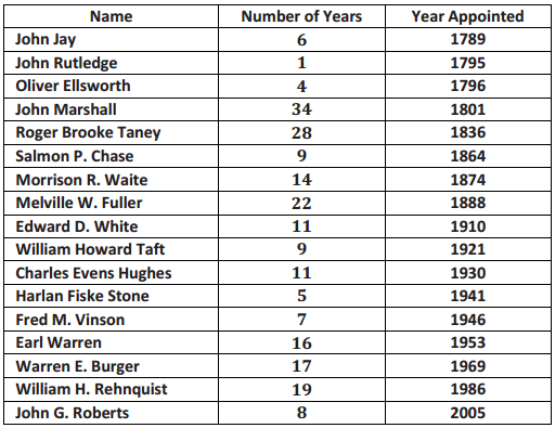
The table shows the years in office for each of the chief justices of the Supreme Court as of 2013:
Eureka Math Grade 6 Module 6 Lesson 16 Example Answer Key 1

Use the table to answer the following:

a. Which chief justice served the longest term, and which served the shortest term? How many years did each of these chief justices serve?
Answer:
John Marshall had the longest term, which was 34 years. He served from 1801 to 1835. John Rutledge served the shortest term, which was 1 year in 1795.

b. What is the median number of years these chief justices have served on the Supreme Court? Explain how you found the median and what it means In terms of the data.
Answer:
First, you have to put the data in order. There are 17 justices, so the median would fall at the 9th value (11 years) counting from the top or from the bottom. The median is 11. Approximately half of the justices served less than or equal to 11 years, and half served greater than or equal to 11 years.

c. Make a box plot of the years the justices served. Describe the shape of the distribution and how the median
and IQR relate to the box plot.
Answer:
The distribution seems to have more justices serving a small number of years (on the lower end). The range (max – mm) is 33 years, from 1 year to 34 years. The IQR is 18 – 6. 5 = 11.5, so about half of the chief justices had terms in the 11.5-year interval from 6.5 to 18 years.

d. Is the median halfway between the least and the most number of years served? Why or why not?
Answer:
The halfway point on the number line between the smallest number of years served, 1, and the greatest number of years served, 34, is 17.5, but because the data are clustered in the lower end of the distribution, the median, 11, is to the left of (smaller than) 17.5. The middle of the interval from the smallest to the largest data value has no connection to the median. The median depends on how the data are spread out over the interval.

Exercises 2 – 3: Downloading Songs

Exercise 2.
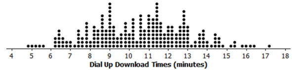
A broadband company timed how long it took to download 232 four-minute songs on a dial-up connection. The dot plot below shows their results.
Eureka Math Grade 6 Module 6 Lesson 16 Exercise Answer Key 2

a. What can you observe about the download times from the dot plot?
Answer:
The smallest time was a little bit less than 5 minutes, and the largest is a little bit more than 17 minutes. Most of the times seem to be between 8 to 13 minutes.

b. Is it easy to tell whether or not 12.5 minutes is in the top quarter of the download times?
Answer:
You cannot easily tell from the dot plot.

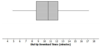
c. The box plot of the data is shown below. Now, answer parts (a) and (b) above using the box plot.
Answer:
Eureka Math Grade 6 Module 6 Lesson 16 Exercise Answer Key 3
Answer for part (a) based on the box plot: About half of the times are above 10.6 minutes. The distribution is roughly symmetric around the median. About half of the times are between 8.7 minutes and 12.2 minutes.
Answer for part (b) based on the box plot: 12.5 is above Q3, so it was in the top quarter of the data.

d. What are the advantages of using a box plot to summarize a large data set? What are the disadvantages?
Answer:
With lots of data, the dots in a dot plot overlap, and while you can see general patterns, it is hard to really get anything quantifiable. The box plot shows at least an approximate value for each of the five-number summary measures and gives a pretty good idea of how the data are spread out.

The disadvantage of box plots is that the specific values in the data set are not given.
Teacher note: It may be useful to have a brief class discussion of the advantages/disadvantages of dot plots and box plots. You can use the dot plot in part (a) and the box plot in part (b) to facilitate this discussion.

Exercise 3.
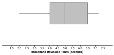
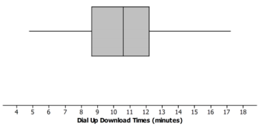
Molly presented the box plots below to argue that using a dial-up connection would be better than using a broadband connection. She argued that the dial-up connection seems to have less variability around the median even though the overall range seems to be about the same for the download times using broadband. What would you say?
Eureka Math Grade 6 Module 6 Lesson 16 Exercise Answer Key 4

Eureka Math Grade 6 Module 6 Lesson 16 Exercise Answer Key 5
Answer:
The scales are different for the two plots, and so are the units, so you cannot just look at the box plots. The time using broadband is centered near seconds to download the song while the median for dial-up is almost minutes for a song. This suggests that broadband is going to be faster than dial-up.

Teacher note:
This is an important point. Make sure that students understand the importance of using the same scale if box plots are being constructed to compare two data distributions.

Exercises 4 – 5: Rainfall

Exercise 4.
Data on the average rainfall for each of the twelve months of the year were used to construct the two-dot plots below.

Eureka Math Grade 6 Module 6 Lesson 16 Exercise Answer Key 6

a. How many data points are in each dot plot? What does each data point represent?
Answer:
There are 12 data points in the St. Louis dot plot. There are also 12 data points in the San Francisco dot plot. Each data point represents the average monthly precipitation in inches for one month.

b. Make a conjecture about which city has the most variability in the average monthly amount of precipitation and how this would be reflected in the lQRs for the data from both cities.
Answer:
San Francisco has the most variability in the average monthly amount of precipitation. It should have the largest IQR of the two cities.

c. Based on the dot plots, what are the approximate values of the interquartile ranges (IQRs) for the average monthly precipitations for each city? Use the lQRs to compare the cities.
Answer:
The answers that follow are based on estimates from the dot plot. Students might get slightly different values. For St. Louis, the IQR is 4.2 – 3.2 = 1; for San Francisco, the IQR is 3.9 – 0.2 = 3.7. About the middle half of the monthly precipitation amounts in St. Louis are within 1 inch of each other. In San Francisco, the middle half of the monthly precipitation amounts are within about 4 inches of each other.

d. In an earlier lesson, the average monthly temperatures were rounded to the nearest degree Fahrenheit. Would it make sense to round the amount of precipitation to the nearest inch? Why or why not?
Answer:
Answers will vary. Possible answers include: It would not make sense because the numbers are pretty close together, or yes, it would make sense because you would still get a good idea of how the precipitation varied.

If you rounded to the nearest inch, the IQR for San Francisco would be 4 because three of the values round to 0, and three of the values round to 5. The IQR for St. Louis would be 1 because most of the values round to 3 or 4. In both cases, that is pretty close to the IQR found in part (c).

Exercise 5.
Use the data from Exercise 4 to answer the following.

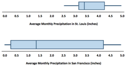
a. Make a box plot of the monthly precipitation amounts for each city using the same scale.

Eureka Math Grade 6 Module 6 Lesson 16 Exercise Answer Key 7

Eureka Math Grade 6 Module 6 Lesson 16 Exercise Answer Key 8
Answer:
Eureka Math Grade 6 Module 6 Lesson 16 Exercise Answer Key 9

b. Compare the percent of months that have above 2 inches of pi-ecipitation for the two cities. Explain your thinking.
Answer:
In St. Louis, the average amount of precipitation each month is always over 2 inches, while this happens, at most, for half of the months In San Francisco because the median amount of precipitation is just above 1 inch.

c. How does the top 25% of the average monthly precipitations compare for the two cities?
Answer:
The top 25% of the precipitation amounts in the two cities are spread over about the same interval (about 4 to 5 inches). St. Louis has a bit more spread; the top 25% in St. Louis are between 4.2 inches and 4.8 inches, while the top 25% in San Francisco are all very close to 4.5 inches.

d. Describe the intervals that contain the smallest 25% of the average monthly precipitation amounts for each city.
Answer:
In St. Louis, the smallest 25% of the monthly averages are between about 2.5 inches and 3.0 inches; in San Francisco, the smallest averages are much lower, ranging from O to 0.2 inches.

e. Think about the dot plots and the box plots. Which representation do you think helps you the most in understanding how the data vary?
Answer:
Answers will vary. Some sample answers are provided below.
The dot plot because we can see individual values.
The box plot because it just shows how the data are spread out in each of the four sections.

Eureka Math Grade 6 Module 6 Lesson 16 Problem Set Answer Key

Question 1.
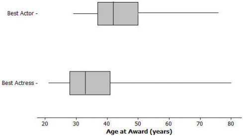
The box plots below summarize the ages at the time of the award for leading actress and leading actor Academy Award winners.
Eureka Math Grade 6 Module 6 Lesson 16 Problem Set Answer Key 10

a. Based on the box plots, do you think it is harder for an older woman to win an Academy Award for a best actress than it is for an older man to win the best actor award? Why or why not?
Answer:
Answers will vary. Students might take either side as long as they give an explanation for why they made the choice they did that is based on the box plots.

b. The oldest female to win an Academy Award was Jessica Tandy in 1990 for Driving Miss Daisy. The oldest actor was Henry Fonda for On Golden Pond in 1982. How old were they when they won the award? How can you tell? Were they a lot older than most of the other winners?
Answer:
Henry Fonda was 76, and Jessica Tandy was 80. I know this because those are the maximum values. You cannot tell if there were actors or actresses that were nearly as old.

c. The 2013 winning actor was Daniel Day-Lewis for Lincoln. He was 55 years old at that time. What can you say about the percent of male award winners who were older than Daniel Day-Lewis when they won their Oscars?
Answer:
He was in the upper quarter and one of the older actors. Fewer than 25% of the male award winners were older than Daniel Day-Lewis.

d. Use the information provided by the box plots to write a paragraph supporting or refuting the claim that fewer older actresses than actors win Academy Awards.
Answer:
Overall, the box plot for actresses starts about 10 years younger than actors and is centered around a lower age than the box plot for- actors. The median age for actresses who won the award is 33, and for actors it is 42. The upper quartile is also lower for actresses, 41, compared to 49 for actors.

The range for actresses’ ages is larger, 80 – 21 = 59, compared to the range for actors, 76 – 29 = 47. About \(\frac{3}{4}\) of the actresses who won the award were younger than the median age for the men.

Question 2.
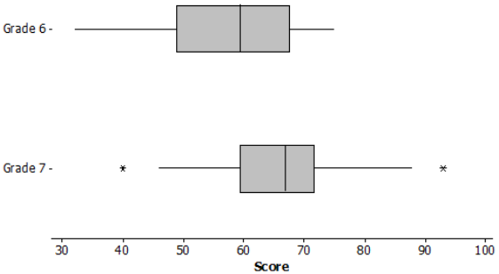
The scores of sixth and seventh graders on a test about polygons and their characteristics are summarized in the box plots below.
Eureka Math Grade 6 Module 6 Lesson 16 Problem Set Answer Key 11

a. In which grade did the students do the best? Explain how you can tell.
Answer:
Three-fourths of the seventh-grade students did better than half of the sixth graders. You can tell by comparing Q1 for Grade 7 to the median for Grade 6. Therefore, the seventh-grade students performed the best.

b. Why do you think two of the data values in Grade 7 are not part of the line segments?
Answer:
The highest and lowest scores were pretty far away from the other scores, so they were marked separately.

c. How do the median scores for the two grades compare? Is this surprising? Why or why not?
Answer:
The median score in Grade 7 was higher than the median in Grade 6. This makes sense because the seventh graders should know more than the sixth graders.

d. How do the lQRs compare for the two grades?
Answer:
The middle half of the Grade 7 scores were close together in a span of about 11 with the median around 66.
The middle half of the Grade 6 scores were spread over a larger span, about 17 points from about 50 to 67.

Question 3.
A formula for the IQR could be written as Q3 – Q1 = IQR. Suppose you knew the IQR and the Q1. How could you find the Q3?
Answer:
Q3 = IQR + Q1. Add the lower quartile to the IQR.

Question 4.
Consider the statement, “Historically, the average length of service as chief justice on the Supreme Court has been less than 15 years; however, since 1969 the average length of service has increased.” Use the data given in Exercise 1 to answer the following questions.

a. Do you agree or disagree with the statement? Explain your thinking.
Answer:
The mean number of years as chief justice overall is about 13. The mean number of years since 1969 is about 14.7. Even though the mean has increased, it does not seem like a big difference because there have only been three justices since then to cover o span of 44 years (and three times 13 is 39, so not enough to really show an increasing trend).

b. Would your answer change if you used the median number of years rather than the mean?
Answer:
The median overall was 11 years; the median since 1969 was 17 years, which is considerably larger. This seems to justify the statement.

Eureka Math Grade 6 Module 6 Lesson 16 Exit Ticket Answer Key

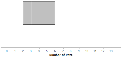
Data on the number of pets per family for students in a sixth-grade class are summarized in the box plot below:
Eureka Math Grade 6 Module 6 Lesson 16 Exit Ticket Answer Key 12

Question 1.
Can you tell how many families have two pets? Explain why or why not.
Answer:
You cannot tell from the box plot. You only know that the lower quartile (Q]) is 2 pets. You do not know how many families are included in the data set.

Question 2.
Given the box plot above, which of the following statements are true? If the statement is false, modify it to make the statement true.

a. Every family has at least one pet.
Answer:
True

b. About one-fourth of the families have six or more pets.
Answer:
True

c. Most of the families have three pets.
Answer:
False, because you cannot determine the number of any specific data value. Revise to “You cannot determine the number of pets most families have.”

d. About half of the families have two or fewer pets.
Answer:
False. Revise to “About half of the families have three or fewer pets.”

e. About three-fourths of the families have two or more pets.
Answer:
True
Eureka Math Grade 6 Module 6 Lesson 15 Answer Key

Engage NY Eureka Math Grade 6 Module 6 Lesson 15 Answer Key

Eureka Math Grade 6 Module 6 Lesson 15 Example Answer Key

Example 1: Tootsie Pops

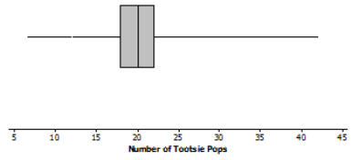
Ninety-four people were asked to grab as many Tootsie Pops as they could hold. Here is a box plot for these data. Are you surprised?
Answer:
Answers will vary. Students might indicate that they are surprised that some people were able to hold as many as 40 Tootsie Pops or that they are surprised at how much person-to-person variability there is. They may also comment on the fact that about half the people were able to hold between 18 and 23 Tootsie Pops.

Eureka Math Grade 6 Module 6 Lesson 15 Example Answer Key 1

Eureka Math Grade 6 Module 6 Lesson 15 Exercise Answer Key

Exercises 1 – 5:

Exercise 1.
What might explain the variability in the number of Tootsie Pops that the 94 people were able to hold?
Answer:
Answers will vary. Possible answers include the size of people’s hands, handspan, and whether a person is flexible in moving his fingers.

Exercise 2.
Use a box plot to estimate the values in the five-number summary.
Answer:
Min = 7, Q1 = 18, Median = 20, Q3 = 22, Max = 42.

Exercise 3.
Describe how the box plot can help you understand differences in the numbers of Tootsie Pops people could hold.
Answer:
The maximum of about 42 and minimum of about 7 indicate that there is o lot of variability in the number of Tootsie Pops that people can hold, with the numbers covering a range of about 35 Tootsie Pops. The “box” port of the box plot shows that about half of the peopk con hold within about 2 Tootsie Pops of the median, which was 20 Tootsie Pops.

Exercise 4.
Here is Jayne’s description of what she sees in the box plot. Do you agree or disagree with her description? Explain your reasoning.
“One person could hold as many as 42 Tootsie Pops. The number of Tootsie Pops people could hold was really different and spread about equally from 7 to 42. About one-half of the people could hold more than 20 Tootsie Pops.”
Answer:
You cannot tell that they are evenly spread—the “box” part of the box plot contains about half of the values for the number of Tootsie Pops. However, the box is only four units long. That means half of the people were bunched over those four numbers.

Exercise 5.
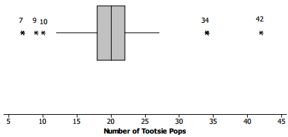
Here is a different box plot of the same data on the number of Tootsie Pops 94 people could hold.
Eureka Math Grade 6 Module 6 Lesson 15 Exercise Answer Key 2

a. Why do you suppose there are five values that are shown as separate points and are labeled?
Answer:
Maybe because they are far away from most of the other values. It shows that more than half ofthe data an from about 12 to 27 Tootsie Pops.

b. Does knowing these data values change anything about your responses to Exercises 1 to 4 above?
Answer:
Not really, except maybe to say that only a few of the people could hold more than 30 Tootsie Pops; the rest held fewer than that. And only a few people could hold 10 or fewer Tootsie Pops.

Exercises 6 – 10: Maximum Speeds

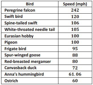
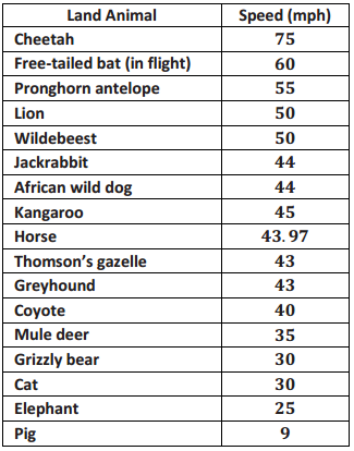
The maximum speeds of selected birds and land animals are given in the tables below.
Eureka Math Grade 6 Module 6 Lesson 15 Exercise Answer Key 3

Eureka Math Grade 6 Module 6 Lesson 15 Exercise Answer Key 4

Exercise 6.
As you look at the speeds, what strikes you as interesting?
Answer:
Answers will vary. Some students might suggest birds are really fast, especially the falcon. Others may notice that only two of the speeds have decimals. The speeds of specific animals might strike students as interesting.

Exercise 7.
Do birds or land animals seem to have the greatest variability in speeds? Explain your reasoning.
Answer:
It looks like the speeds of the birds vary a lot, as they go from 60 mph for some birds to 242 mph for others. The speeds of the land animals vary but not as much; they go from 9 mph to 75 mph.

Exercise 8.
Find the five-number summary for the speeds in each data set. What do the five-number summaries tell you about the distribution of speeds for each data set?
Answer:
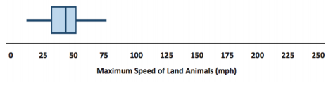
Land animal five-number summary: Min = 9, Q1 = 32.5, Median = 43.97, Q3 = 50, Max = 75
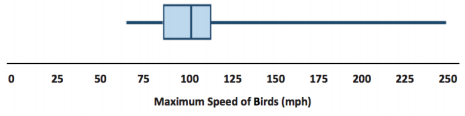
Bird five-number summary: Min = 60, Q1 = 76, Median = 97.5, Q3 = 105.5, Max = 242
The summaries give me a sense of the range or span of the speeds (maximum-minimum speed) and how the speeds are grouped around the median.

Exercise 9.
Use the five-number summaries to make a box plot for each of the two data sets.
Eureka Math Grade 6 Module 6 Lesson 15 Exercise Answer Key 5

Eureka Math Grade 6 Module 6 Lesson 15 Exercise Answer Key 6
Answer:
Eureka Math Grade 6 Module 6 Lesson 15 Exercise Answer Key 7

Eureka Math Grade 6 Module 6 Lesson 15 Exercise Answer Key 8

Exercise 10.
Write several sentences describing the speeds of birds and land animals.
Answer:
Answers will vary. At least one bird flies really fast: the falcon at 242 mph. Three-fourths of the birds fly less than 106 mph, and the slowest bird flies 60 mph. The land animals’ running speeds are slower, ranging from 9 mph to 75 mph. The middle half of the speeds for land animals is between 32.5 mph and 50 mph.

Exercises 11 – 15: What is the Same, and What is Different?

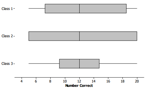
Consider the following box plots, which show the number of correctly answered questions on a 20-question quiz for students in three different classes.

Eureka Math Grade 6 Module 6 Lesson 15 Exercise Answer Key 9

Exercise 11.
Describe the variability in the scores of each of the three classes.
Answer:
The range (max-min) is the same for all three classes, and so is the median, but the intervals that contain the middle half of the scores (the length of the box part of the box plot) are different. The third class has a small box, so the scores in the middle are close together.

In Class 2, the minimum and lower quartile are the same scores, and the maximum and upper quartile are also the same score, so lots of scores are piled at the ends of the range. The middle half of the scores in Class 1 are spread out more than Class 3 but not as much as Class 2.

Teacher Note: The box plot for Class 2 may be difficult for students to interpret at first. If they have trouble, consider discussing the example provided earlier in the teacher flotes that shows how it is possible that the minimum and the lower quartile might be equal and how the upper quartile and the maximum might be equal.

Exercise 12.
a. Estimate the interquartile range for each of the three sets of scores.
Answer:
Class 1 IQR = 10; Class 2 IQR = 15; Class 3 IQR = 6

b. What fraction of students would have scores In the interval that extends from the lower quartile to the upper quartile?
Answer:
About one-half.

c. What does the value of the IQR tell you about how the scores are distributed?
Answer:
For Class 1, half of the scores are spread over an interval of width 10, and for Class 3, half of the scores are bunched together over an interval of width 5. For Class 2, the middle half of the data is spread over an interval of width 15, and in fact, because the quartiles are equal to the minimum and the maximum for Class 2, all of the data values are included in this interval with data values bunched up at the minimum and the maximum.

Exercise 13.
Which class do you believe performed the best? Be sure to use information from the box plots to back up your answer.
Answer:
1. Answers will vary. A few sample answers are provided.
2. Class 3, as it has the smallest IQR. About half of the students scored close to the median score. Scores were more consistent for this class.
3. Approximately 25% of the students in Class 1 scored 18 or higher compared to 25% of the students in Class 3 who scored 15 or higher. Therefore, Class 1 performed the best.
4. In Class 2, several students must have scored near the top in order for the Q3 and maximum to be the same.
Therefore, Class 2 performed the best.

Exercise 14.
a. Find the IQR for the three data sets in the first two examples: maximum speed of birds, maximum speed of
land animals, and number of Tootsie Pops.
Answer:
Land animals: 50 – 32. 5for an IQR of 17.5
Birds: 105.5 – 76 for an IQR of 29.5
Tootsie Pops: 22 – 18 for an IQR of 4

b. Which data set had the highest percentage of data values between the lower quartile and the upper quartile? Explain your thinking.
Answer:
All of the data sets should have about half of the data values between the quartiles.

Exercise 15.
A teacher asked students to draw a box plot with a minimum value at 34 and a maximum value at 64 that had an interquartile range of 10. Jeremy said he could not draw just one because he did not know where to put the box on the number line. Do you agree with Jeremy? Why or why not?
Answer:
Jeremy is correct since a box with a width of 10 could be drawn anywhere between the minimum and maximum values.

Eureka Math Grade 6 Module 6 Lesson 15 Problem Set Answer Key

Question 1.
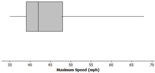
The box plot below summarizes the maximum speeds of certain kinds of fish.
Eureka Math Grade 6 Module 6 Lesson 15 Problem Set Answer Key 10

a. Estimate the values in the five-number summary from the box plot.
Answer:
Answers will vary. Min = 35 mph; Q1 = 39 mph; Median = 42 mph; Q3 = 48 mph; Max = 68 mph

b. The fastest fish is the sailfish at 68 mph, followed by the marlin at 50 mph. What does this tell you about the speed of the fish speeds in the top quarter of the box plot?
Answer:
The Q3 is about 48, so all but one of the fish in the top quarter ore between 48 mph and 50 mph.

c. Use the five-number summary and the IQR to describe the speeds of the fish.
Answer:
The speeds of fish vary from 35 mph to 68 mph. The IQR is 9 mph; the middle half of the speeds are between 39 mph and 48 mph. Half of the speeds are less than 42 mph.

Question 2.
Suppose the interquartile range for the number of hours students spent playing video games during the school week was 10. What do you think about each of the following statements? Explain your reasoning.

a. About half of the students played video games for 10 hours during a school week.
Answer:
This may not be correct, as you know the width of the interval that contains the middle half of the times was 10, but you do not know where it starts or stops. You do not know the lower or upper quartile.

b. All of the students played at least 10 hours of video games during the school week.
Answer:
This may not be correct for the same reason as in part (a).

c. About half of the class could have played video games from 10 to 20 hours a week or from 15 to 25 hours.
Answer:
Either could be correct, as the only information you have is the IQR of 10, and the statement says ‘could be,” not “is.”

Question 3.
Suppose you know the following for a data set: The minimum value is 130, the lower quartile is 142, the IQR is 30, half of the data are less than 168, and the maximum value is 195.

a. Think of a context for which these numbers might make sense.
Answer:
Answers will vary. For example, one possibility is the number of calories in a serving of fruit.

b. Sketch a box plot.
Answer:
Eureka Math Grade 6 Module 6 Lesson 15 Problem Set Answer Key 11

c. Are there more data values above or below the median? Explain your reasoning.
Answer:
The number of data values on either side of the median should be about the same: one-half of all of the data.

Question 4.
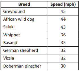
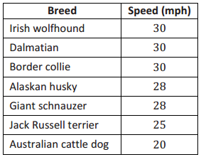
The speeds for the fastest dogs are given in the table below.
Eureka Math Grade 6 Module 6 Lesson 15 Problem Set Answer Key 12

Eureka Math Grade 6 Module 6 Lesson 15 Problem Set Answer Key 13

a. Find the five-number summary for this data set and use it to create a box plot of the speeds.
Answer:
Eureka Math Grade 6 Module 6 Lesson 15 Problem Set Answer Key 14
Min = 20, Q1 = 28, Median = 30, Q3 = 36, Max = 45

b. Why is the median not in the center of the box?
Answer:
The median is not in the center of the box because about \(\frac{1}{4}\) of the speeds are between 30 and 36, and another \(\frac{1}{4}\) are closer together, between 28 and 30.

c. Write a few sentences telling your friend about the speeds of the fastest dogs.
Answer:
Half of the dogs run faster than 30 mph the fastest dog in the list is the greyhound with a speed of 45 mph. The slowest dog in the list is the Australian cattle dog with a speed of 20 mph. The middle 50% of the speeds are between 28 mph and 36 mph.

Eureka Math Grade 6 Module 6 Lesson 15 Exit Ticket Answer Key

Question 1.
Given the following information, create a box plot, and find the IQR.
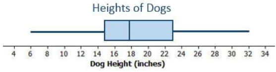
For a large group of dogs, the shortest dog was 6 inches, and the tallest was 32 inches. One-half of the dogs were taller than 18 inches. One-fourth of the dogs were shorter than 15 inches. The upper quartile of the dog heights was 23 inches.

Eureka Math Grade 6 Module 6 Lesson 15 Exit Ticket Answer Key 15
Answer:
Eureka Math Grade 6 Module 6 Lesson 15 Exit Ticket Answer Key 16
IQR = 23 – 15 = 8
The IQR is 8.

Eureka Math Grade 6 Module 6 Lesson 14 Answer Key

Engage NY Eureka Math Grade 6 Module 6 Lesson 14 Answer Key

Eureka Math Grade 6 Module 6 Lesson 14 Example Answer Key

Example 1: Time to Get to School

Consider the statistical question, “What is the typical amount of time it takes for a person in your class to get to school?” The amount of time it takes to get to school in the morning varies for the students in your class. Take a minute to answer the following questions. Your class will use this information to create a dot plot.

Write your name and an estimate of the number of minutes it took you to get to school today on a sticky note.
Answer:
Answers will vary

What were some of the things you had to think about when you made your estimate?
Answer:
Answers will vary. Some examples include: Does it count when you have to wait in the car for your sister? I usually walk, but today I got a ride. Does it matter that we had to go a different way because the road was closed? The bus was late.

Exercises 1 – 4:
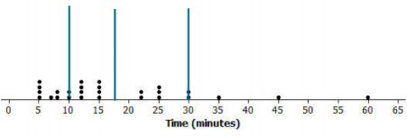
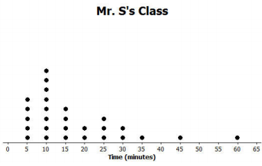
Here is a dot plot of the estimates of the times it took students in Mr. S’s class to get to school one morning.
Mr. S’s Class
Eureka Math Grade 6 Module 6 Lesson 14 Example Answer Key 1

Mr. S’s Class
Eureka Math Grade 6 Module 6 Lesson 14 Example Answer Key 2

Exercise 1.
Put a line on the dot plot that you think separates the times Into two groups – one group representing the longer times and the other group representing the shorter times.
Answer:
Answers may vary. Some might put the dividing line between 15 and 20.

Exercise 2.
Put another line on the dot plot that separates out the times for students who live really close to the school. Add another line that separates out the times for students who take a very long time to get to school.
Answer:
Responses will be different. Some might put a line at 30 and a line at 10.

Exercise 3.
Your dot plot should now be divided into four sections. Record the number of data values in each of the four sections.
Answer:
Answers will vary. Depending on the divisions, 7 or 8 in the lower one, 9 in the next, 5 in the next, and 5 in the upper section.

Exercise 4.
Share your marked-up dot plot with some of your classmates. Compare how each of you divided the dot plot into four sections.
Answer:
Different responses; students should recognize that the divisions might be close but that some are different.

Exercises 5 – 7: Time to Get to School

The times (in minutes) for the students in Mr. S’s class have been put in order from smallest to largest and are shown below.

5 5 5 5 7 8 8 10 10 12 12 12 12 15 15 15 15 22 22 25 25 25 30 30 35 45 60

Exercise 5.
What is the value of the median time to get to school for students in Mr. S’s class?
Answer:
There are 27 times in the data set, so the median is the 14th value in the ordered list. The median is 15.

Exercise 6.
What is the value of the lower quartile? The upper quartile?
Answer:
The lower quartile is the 7th value in the ordered list, and the upper quartile is the 21st value in the ordered list. The lower quartile is 8, and the upper quartile is 25.

Exercise 7.
The lines on the dot plot below indicate the location of the median, the lower quartile, and the upper quartile. These lines divide the data set into four parts. About what fraction of the data values are in each part?
Mr. S’s Class
Eureka Math Grade 6 Module 6 Lesson 14 Example Answer Key 3
Answer:
There are about \(\frac{3}{4}\) of the data values in each part.

Example 2: Making a Box Plot

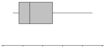
A box plot is a graph made using the following five numbers: the smallest value in the data set, the lower quartile, the median, the upper quartile, and the largest value in the data set.

To make a box plot:
• Find the median of all of the data.
• Find Q1, the median of the bottom half of the data, and Q3, the median of the top half of the data.
• Draw a number line, and then draw a box that goes from Q1 to Q3.
• Draw a vertical line in the box at the value of the median.
• Draw a line segment connecting the minimum value to the box and a line segment that connects the maximum value to the box.

You will end up with a graph that looks something like this:
Eureka Math Grade 6 Module 6 Lesson 14 Example Answer Key 4

Now, use the given number line to make a box plot of the data below.
20, 21, 25, 31, 35, 38, 40, 42, 44
Eureka Math Grade 6 Module 6 Lesson 14 Example Answer Key 5
Min=
Q1=
Median =
Q3=
Max =
Answer:
Eureka Math Grade 6 Module 6 Lesson 14 Example Answer Key 6
The five-number summary is as follows:
Min = 20
Q1 = 23
Median = 35
Q3 = 41
Max = 44

Exercises 8 – 11: A Human Box Plot

Consider again the sticky note that you used to write down the number of minutes it takes you to get to school. If possible, you and your classmates will form a human box plot of the number of minutes it takes students in your class to get to school.

Exercise 8.
Find the median of the group. Does someone represent the median? If not, who is the closest to the median?
Answer:
Answers will vary depending on the data.

Exercise 9.
Find the maximum and minimum of the group. Who are they?
Answer:
Answers will vary depending on the data.

Exercise 10.
Find Q1 and Q3 of the group. Does anyone represent Q1 or Q3? If not, who is the closest to Q1? Who is the closest to Q3?
Answer:
Answers will vary depending on the data.

Exercise 11.
Sketch the box plot for this data set.
Answer:
Answers will vary depending on the data.

Eureka Math Grade 6 Module 6 Lesson 14 Problem Set Answer Key

Question 1.
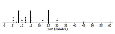
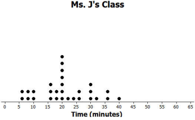
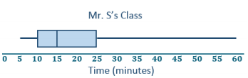
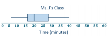
Dot plots for the amount of time it took students in Mr. S’s and Ms. J’s classes to get to school are below.
Eureka Math Grade 6 Module 6 Lesson 14 Problem Set Answer Key 7

Eureka Math Grade 6 Module 6 Lesson 14 Problem Set Answer Key 8

a. Make a box plot of the times for each class.
Answer:
Eureka Math Grade 6 Module 6 Lesson 14 Problem Set Answer Key 9

Eureka Math Grade 6 Module 6 Lesson 14 Problem Set Answer Key 10
Mr. S’s five-number summary: 5, 10, 15, 25, 60
Ms. J’s five-number summary: 5, 16, 20, 28, 40

b. What is one thing you can see in the dot plot that you cannot see in the box plot? What is something that is easier to see In the box plot than in the dot plot?
Answer:
The dot plot shows individual times, which you cannot see in the box plot. The box plot shows the location of the median and of the lower and upper quartiles.

Question 2.
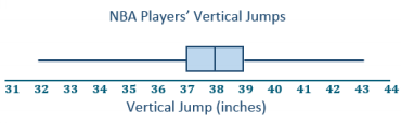
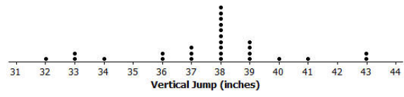
The dot plot below shows the vertical jump of some NBA players. A vertical jump is how high a player can jump from a standstill. Draw a box plot of the heights for the vertical jumps of the NBA players above the dot plot.
Eureka Math Grade 6 Module 6 Lesson 14 Problem Set Answer Key 11
Answer:
Eureka Math Grade 6 Module 6 Lesson 14 Problem Set Answer Key 12

Question 3.
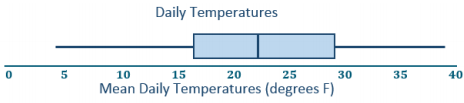
The mean daily temperatures in degrees Fahrenheit for the month of February for a certain city are as follows:
4, 11, 14, 15, 17, 20, 30, 23, 20, 35, 35, 31, 34, 23, 15, 19, 39, 22, 15, 15, 19, 39, 22, 23, 29, 26, 29, 29

a. Make a box plot of the temperatures.
Answer:
Eureka Math Grade 6 Module 6 Lesson 14 Problem Set Answer Key 13
Five number summary: 4, 16, 22.5, 29.5, 39

b. Make a prediction about the part of the United States you think the city might be located in. Explain your reasoning.
Answer:
Answers will vary. The city was probably somewhere in the northern states, either in the Midwest or Northeast, maybe Montana or Wyoming, because the temperatures are typically pretty cold in those regions.

c. Describe the temperature data distribution. Include a description of the center and spread.
Answer:
The IQR is 29. 5°F – 16°F, or 13.5°F. Half of the temperatures were near the middle between 16°F and 29.5°F. The median is 22.5°F. A quarter of the temperatures are less than 16°F but greater than or equal to 4°F. A quarter of the temperatures are greater than 29.5°F and less than or equal to 3 9°F.

Question 4.
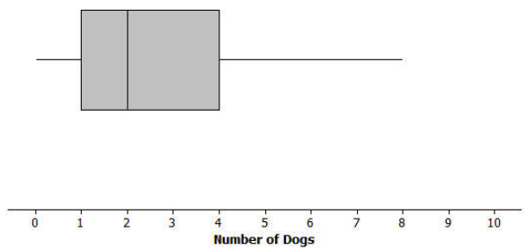
The box plot below summarizes data from a survey of households about the number of dogs they have. Identify each of the following statements is true or false. Explain your reasoning in each case.
Eureka Math Grade 6 Module 6 Lesson 14 Problem Set Answer Key 14

a. The maximum number of dogs per house is 8.
Ans;
True, because the line segment at the top goes to 8.

b. At least of the houses have 2 or more dogs.
Answer:
True, because 2 is the median.

c. All of the houses have dogs.
Answer:
False, because the lower line segment starts at 0, so at least one household does not have a dog as a pet.

d. Half of the houses surveyed have between 2 and 4 dogs.
Answer:
False, because only about 25% of the houses would have between 2 and 4 dogs.

e. Most of the houses surveyed have no dogs.
Answer:
False, because at least \(\frac{3}{4}\) of those surveyed had 1 or more dogs.

Eureka Math Grade 6 Module 6 Lesson 14 Exit Ticket Answer Key

Question 1.
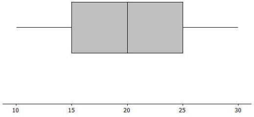
Sulee explained how to make a box plot to her sister as follows:

“First, you find the smallest and largest values and put a mark halfway between them, and then put a mark halfway between that mark and each end. So, if 10 is the smallest value and 30 is the largest value, you would put a mark at 20. Then, another mark belongs halfway between 20 and 10, which would be at 15.

And then one more mark belongs halfway between 20 and 30, which would be at 25. Now, you put a box around the three middle marks, and draw lines from the box to the smallest and largest values.” Here is her box plot. What would you say to Sulee?

Eureka Math Grade 6 Module 6 Lesson 14 Exit Ticket Answer Key 15
Answer:
Sulee is wrong. This is not the correct way to create a box plot. Sulee did not find the median or the quartiles using the data values; she just divided up the length between the smallest and largest numbers into four equal sections. For a box plot, the sections will not always have the same length, but there will be the same number of observations in the sections.

Teacher note: This Exit Ticket problem addresses a very common student misconception about box plots. Make sure students understand how the median and quartiles are used to create the four sections of the box plot.

Eureka Math Grade 6 Module 6 Lesson 13 Answer Key

Engage NY Eureka Math Grade 6 Module 6 Lesson 13 Answer Key

Eureka Math Grade 6 Module 6 Lesson 13 Exercise Answer Key

Exercises 1 – 4: More French Fries

Exercise 1.
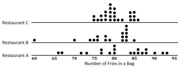
In Lesson 12, you thought about the claim made by a chain restaurant that the typical number of french fries in a large bag was 82. Then, you looked at data on the number of fries in a bag from three of the restaurants.

a. How do you think the data were collected, and what problems might have come up in collecting the data?
Answer:
Answers will vary. They probably went to the restaurants and ordered a bunch of large bags of french fries. Sometimes the fries are broken, so they might have to figure out what to do with those – either count them as a whole, discord them, or put them together to make whole fries.

b. What scenario(s) would give counts that might not be representative of typical bags?
Answer:
Answers will vary. Different workers might put different amounts in a bog, so if you bought the bags at lunch, you might have different numbers than if you did it in the evening. The restaurants might weigh the bags to see that the weight was constant despite the size of the fries, so you could have some weight of fries even though you had different counts for the bags.

Exercise 2.
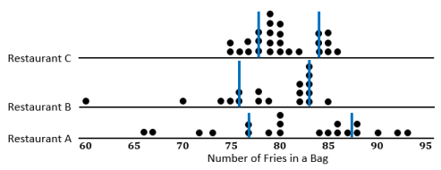
The medians of the top half and the medians of the bottom half of the data for each of the three restaurants are as follows: Restaurant A – 87. 5 and 77; Restaurant B – 83 and 76; Restaurant C – 84 and 78. The difference between the medians of the two halves are called the interquartile range, or IQR.

a. What is the IQR for each of the three restaurants?
Answer:
The IQR for Restaurant A is 87.5 – 77 = 10.5; Restaurant B is 83 – 76 = 7; Restaurant C is 84 – 78 = 6.

b. Which of the restaurants had the smallest IQR, and what does that tell you?
Answer:
Restaurant Chad the smallest IQR. This indicates that the spread around the median number of fries is smaller than for either of the other two restaurants. About half of the data are within a range of 6 fries and near the median, so the median is a pretty good description of what is typical.

c. The median of the bottom half of the data is called the lower quartile (denoted by Q1), and the median of the top half of the data ¡s called the upper quartile (denoted by Q3). About what fraction of the data would be between the lower and upper quartiles? Explain your thinking.
Answer:
About \(\frac{1}{2}\), or 50%, of the counts would be between the quartiles because about \(\frac{1}{4}\) of the counts are between the median and \(\frac{1}{4}\) of the lower quartile, and of the counts are between the median and the upper quartile.

Exercise 3.
Why do you think that the median of the top half of the data is called the upper quartile and the median of the bottom half of the data is called the lower quartile?
Answer:
Answers will vary. Students might say that quartile is related to quarter, and the lower quartile, the median, and the upper quartile divide the data into four sections with about one fourth, or a quarter, of the data values in each section.

Exercise 4.

a. Mark the quartiles for each restaurant on the graphs below.
Eureka Math Grade 6 Module 6 Lesson 13 Exercise Answer Key 1
Answer:
Eureka Math Grade 6 Module 6 Lesson 13 Exercise Answer Key 2

b. Does the IQR help you decide which of the three restaurants seems most likely to really have 82 fries in a typical large bag? Explain your thinking.
Answer:
The IQR does help decide which restaurant is most likely to have 82 fries in a typical large bag because the IQR explains the variability of the data. Because Restaurant Chas the smallest IQR, the middle half of the counts of the number of fries in a bag is really close to the median. In addition, Restaurant C also has the smallest range.

Exercise 5: When Should You Use the IQR?

Exercise 5.
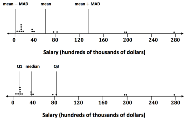
When should you use the IQR? The data for the 2012 salaries for the Lakers basketball team are given in the two plots below. (See Problem 5 in the Problem Set from Lesson 12.)
Eureka Math Grade 6 Module 6 Lesson 13 Exercise Answer Key 6

a. The data are given in hundreds of thousands of dollars. What would a salary of 40 hundred thousand dollars be?
Answer:
The salary would be $4, 000,000.

b. The vertical lines on the top plot show the mean and the mean plus and minus the MAD. The bottom plot shows the median and the IQR. Which interval is a better picture of the typical salaries? Explain your thinking.
Answer:
The median and the IQR seem to represent the typical salaries better than the mean plus or minus the MAD. The mean salary is above all but five of the salaries. Both the mean and the MAD are affected by the three unusually large salaries in the data set.

Exercise 6: On Your Own with IQRs

Exercise 6.
Create three different examples where you might collect data and where that data might have an IQR of 20. Define a median in the context of each example. Be specific about how the data might have been collected and the units involved. Be ready to describe what the median and IQR mean in each context.
Answer:
It may be difficult for students to get started on the exercise. if students struggle, consider a class discussion of one of the examples that follow. Student answers will vary.

Some examples that could be included in this exercise are as follows: number of books read by students during a school year (some students read a lot of books, while other students may not read as many), number of movies viewed at a theater during the lost year by students in a class, number of text messages students receive during a specific day (for example, on Monday), number of commercials on TV during a specific time period that are about buying a car, number of different states students have visited, number of healthy trees on certain blocks of a city, and number of students in each classroom of a school during a specific time period.

Remind students that the goal is to have them think of data that if collected might have an IQR of approximately 20, meaning that the middle half of the data would spread out over an interval of length 20. These ideas also allow students to start thinking of the process of actually collecting data that are needed later.

Eureka Math Grade 6 Module 6 Lesson 13 Example Answer Key

Example 1: Finding the IQR

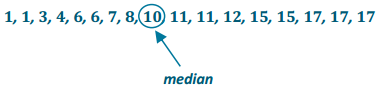
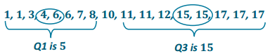
Read through the following steps. If something does not make sense to you, make a note, and raise it during class discussion. Consider the data: 1, 1,3,4,6,6,7,8, 10, 11, 11, 12, 15, 15, 17, 17, 17

Creating an IQR:

a. Put the data in order from smallest to largest.
Answer:
The data are already ordered.
1, 1,3,4,6,6,7,8, 10,11, 11, 12, 15, 15, 17,17, 17.

b. Find the minimum and maximum.
Answer:
The minimum data point is 1, and the maximum is 17.
Eureka Math Grade 6 Module 6 Lesson 13 Example Answer Key 3

c. Find the median.
Answer:
There are 17 data points, so the ninth one from the smallest or the largest is the median.
Eureka Math Grade 6 Module 6 Lesson 13 Example Answer Key 4

d. Find the lower quartile and upper quartile.
Answer:
The lower quartile (Q1) is halfway between the 4th and 5th data points (the average of 4 and 6), or 5, and the upper quartile (Q3) is halfway between the 13th and the 14th data points (the average of 15 and 15), or 15.
Eureka Math Grade 6 Module 6 Lesson 13 Example Answer Key 5

e. Calculate the IQR by finding the difference between Q3 and Q1.
Answer:
IQR = 15 – 5 = 10.

Eureka Math Grade 6 Module 6 Lesson 13 Problem Set Answer Key

Question 1.
The average monthly high temperatures (in degrees Fahrenheit) for St. Louis and San Francisco are given in the table below.
Eureka Math Grade 6 Module 6 Lesson 13 Problem Set Answer Key 7

a. How do you think the data might have been collected?
Answer:
Someone at a park or the airport or someplace probably records the temperature every hour of every day and then takes oil of the highest daily temperatures and finds the mean.

b. Do you think it would be possible for \(\frac{1}{4}\) of the temperatures in the month of July for St. Louis to be 95°F or above? Why or why not?
Answer:
Yes, it is possible. The mean temperature in St. Louis for July is 89° F. There are 31 days in July, s0 \(\frac{1}{4}\) of the days would be about 8 days. Student answers should have 8 or more temperatures that are above 95 °F, and then the other values could be anything that would result in an overall mean of 89 °F.

For example, if the temperature was 95°F for 5 days, 100°Ffor 3 days, and 86°F for all of the rest of the days, there would be 8 days with temperatures of 95 °F or higher, and the mean for the month would be 89°F.

c. Make a prediction about how the values of the IQR for the temperatures for each city compare. Explain your thinking.
Answer:
San Francisco probably has the smaller IQR because those temperatures do not seem to vary as much as the St. Louis temperatures.

d. Find the IQR for the average monthly high temperature for each city. How do the results compare to what you predicted?
Answer:
The IQRs for San Francisco and St. Louis are 6.5°F and 33°F, respectively. This result matches my prediction in part (c).

Question 2.
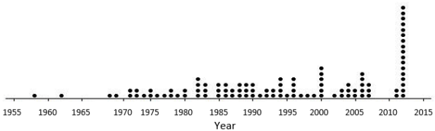
The plot below shows the years in which each of 100 pennies were made.
Eureka Math Grade 6 Module 6 Lesson 13 Problem Set Answer Key 8

a. What does the stack of 17 dots at 2012 representing 17 pennies tell you about the age of these pennies in 2014?
Answer:
17 pennies were made in 2012, and they would be 2 years old in 2014.

b. Here is some information about the sample of 100 pennies. The mean year they were made is 1994; the first
year any of the pennies were made was 1958; the newest pennies were made in 2012; Q1 is 1984, the median is 1994, and Q3 is 2006; the MAD is 11.5 years. Use the information to indicate the years in which the middle half of the pennies were made.
Answer:
In this case, the IQR is 22 years, so the middle half of the pennies was mode over an interval 22 years.

Question 3.

In each of parts (a) – (c), create a data set with at least 6 values such that it has the following properties:

a. A small IQR and a big range (maximum-minimum)
Answer:
Answers will vary. One example is (0, 100, 50, 50, 50, 50, 50) where the range is 100 and the IQR is 0.

b. An IQR equal to the range
Answer:
Answers will vary. One example is (10, 10, 10, 15, 20, 20, 20).

c. The lower quartile is the same as the median.
Answer:
Answers will vary. One example is (1, 1, 1, 1, 1, 5, 6.7).

Question 4.
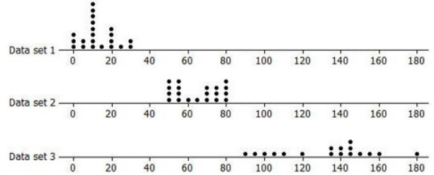
Rank the following three data sets by the value of the IQR.
Eureka Math Grade 6 Module 6 Lesson 13 Problem Set Answer Key 9
Answer:
Data set 1 has the smallest IQR at about 14 data; set 2 has the next smallest IQR at about 22 and data set 3 has the largest IQR at about 41.

Question 5.
Here are the number of fries in each of the bags from Restaurant A:
80, 72, 77, 80, 90, 85, 93, 79, 84, 73, 87, 67, 80, 86, 92, 88, 86, 88, 66, 77

a. Suppose one bag of fries had been overlooked and that bag had only 50 fries. If that value is added to the data set, would the IQR change? Explain your reasoning.
Answer:
The IQR would be larger, 12.5, because the median number of fries would be at 80 now instead of 82, which would make the lower quartile at 75 instead of 77.

b. Will adding another data value always change the IQR? Give an example to support your answer.
Answer:
No. It depends on how many values you have in the data set and what value is added. For example, if the set of data is (2,2,2,6,9,9,9), the IQR is 9 – 2 = 7. If you add another 6, the IQR would stay at 7.

Eureka Math Grade 6 Module 6 Lesson 13 Exit Ticket Answer Key

Question 1.
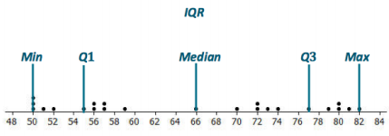
On the dot plot below, insert the following words in approximately the correct position. Maximum Minimum IQR Median Lower Quartile (Q1) Upper Quartile (Q3)
Eureka Math Grade 6 Module 6 Lesson 13 Exit Ticket Answer Key 10
Answer:
Eureka Math Grade 6 Module 6 Lesson 13 Exit Ticket Answer Key 11

Question 2.
Estimate the IQR for the data set shown in the dot plot.
Answer:
The IQR is approximately 22.

Eureka Math Grade 6 Module 6 Lesson 12 Answer Key

Engage NY Eureka Math Grade 6 Module 6 Lesson 12 Answer Key

Eureka Math Grade 6 Module 6 Lesson 12 Example Answer Key

Suppose a chain restaurant (Restaurant A) advertises that a typical number of french fries in a large bag is 82. The dot plot shows the number of french fries in a sample of twenty large bags from Restaurant A.

Eureka Math Grade 6 Module 6 Lesson 12 Example Answer Key 1

Sometimes it is useful to know what point separates a data distribution into two equal parts, where one part represents the upper half of the data values and the other part represents the lower half of the data values. This point is called the median. When the data are arranged in order from smallest to largest, the same number of values will be above the median point as below the median.

Exercises 1 – 3:

Exercise 1.
You just bought a large bag of fries from the restaurant. Do you think you have exactly 82 french fries? Why or why not?
Answer:
The number of fries in a bag seems to wary greatly from bag to bag. No bag had exactly 82 fries, so mine probably will not. The bags that were in the sample had from 66 to 93 french fries.

Exercise 2.
How many bags were in the sample?
Answer:
20 bags were port of the sample.

Exercise 3.
Which of the following statement(s) would seem to be true for the given data? Explain your reasoning.
a. Half of the bags had more than 82 fries in them.
b. Half of the bags had fewer than 82 fries in them.
c. More than half of the bags had more than 82 fries in them.
d. More than half of the bags had fewer than 82 fries in them.
e. If you got a random bag of fries, you could get as many as 93 fries.
Answer:
Statements (a) and (b) are true because there are 10 bags above 82 fries and 10 bags below 82 fries. Also, statement (e) is true because that happened once, so ¡t could probably happen again.

Example 2:
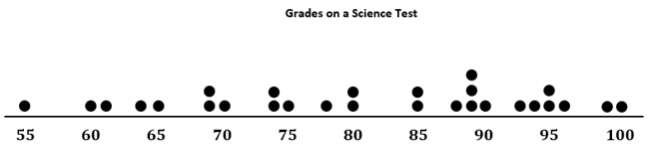
Examine the dot plot below.

Eureka Math Grade 6 Module 6 Lesson 12 Example Answer Key 2

a. How many data values are represented on the dot plot above?
Answer:
There are 28 data values on the dot plot.

b. How many data values should be located above the median? How many below the median? Explain.
Answer:
There should be 14 data values above the median and 14 data values below the median because the median represents the middle value in o sorted data set.

c. For this data set, 14 values are 80 or smaller, and 14 values are 85 or larger, so the median should be between 80 and 85. When the median falls between two values in a data set, we use the average of the two middle values. For this example, the two middle values are 80 and 85. What is the median of the data presented on the dot plot?
Answer:
The median of the dot plot is 82.5.

d. What does this information tell us about the data?
Answer:
The median tells us half of the students in the class scored below an 82. 5 on the science test, and the other half of the students scored above 82.5 on the science test.

Example 3:

Use the information from the dot plot In Example 2.

a. What percentage of students scored higher than the median? Lower than the median?
Answer:
50% of the students scored higher than the median, and 50% of the students scored lower than the median.

b. Suppose the teacher made a mistake, and the student who scored a 65 actually scored a 71. Would the median change? Why or why not?
Answer:
The median would not change because there would still be 14 scores below 82 5 and 14 scores above 82.5.

c. Suppose the student who scored a 65 actually scored an 89. Would the median change? Why or why not?
Answer:
The median would change because now there would be 13 scores below 82. 5 and 15 scores above 82.5, so 82.5 would not be the median.

Example 4:

A grocery store usually has three checkout lines open on Saturday afternoons. One Saturday afternoon, the store manager decided to count how many customers were waiting to check out at 10 different times. She calculated the median of her ten data values to be 8 customers.

a. Why might the median be an important number for the store manager to consider?
Answer:
Answers will vary. For example, students might point out that this means that half the time there were mœe than 8 customers waiting to check out. if there are only 3 checkout lines open, there would be a lot of people waiting to check out. She might want to consider having more checkout lines open on Saturday afternoons.

b. Give another example of when the median of a data set might provide useful information. Explain your thinking.
Answer:
Answers will vary.
Possible responses: When the data are about how much time students spend doing homework, it would be interesting to know the amount of time that more than half of the students spend on homework. If you are looking at the number of points earned in a competition, it would be good to know what number separates the top half of the competitors from the bottom half.

Exercises 4 – 5: A Skewed Distribution

Exercise 4.
The owner of the chain decided to check the number of french fries at another restaurant in the chain. Here are the data for Restaurant B: 82, 83, 83, 79, 85. 82, 78, 76, 76, 75, 78, 74, 70, 60, 82, 82, 83, 83, 83

a. How many bags of fries were counted?
Answer:
19 bags of fries were counted.

b. Sallee claims the median is 75 because she sees that 75 is the middle number in the data set listed on the previous page. She thinks half of the bags had fewer than 75 fries because there are 9 data values that come before 75 in the list, and there are 9 data values that come after 75 in the list. Do you think she would change her mind if the data were plotted in a dot plot? Why or why not?
Answer:
Yes. You cannot find the median unless the data are organized from least to greatest. Plotting the number of fries in each bag on a dot plot would order the data correctly. You would probably get a different halfway point because the data above are not ordered from least to greatest.

c. Jake said the median was 83. What would you say to Jake?
Answer:
83 is the most common number of fries in the bags (5 bags had 83 fries), but It is not in the middle of the data.

d. Betse argued that the median was halfway between 60 and 85, or 72.5. Do you think she is right? Why or why not?
Answer:
She is wrong because the median is not calculated from the distance between the largest and smallest value in the data set. This is not the same as finding a point that separates the ordered data into two ports with the same number of values in each part.

e. Chris thought the median was 82. Do you agree? Why or why not?
Answer:
Chris is correct because ¡f you order the numbers, the middle number will be the 10th number in the ordered list, with at most 9 bags that have more than 82 fries and at most 9 bogs that have fewer than 82 fries.

Exercise 5.
Calculate the mean, and compare it to the median. What do you observe about the two values? If the mean and median are both measures of center, why do you think one of them is smaller than the other?
Answer:
The mean is 78.6, and the median is 82. The bag with only 60 fries decreased the value of the mean.

Exercises 6 – 8: Finding Medians from Frequency Tables

Exercise 6.
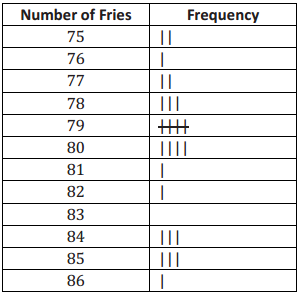
A third restaurant (Restaurant C) tallied the number of fries for a sample of bags of french fries and found the results below.
Eureka Math Grade 6 Module 6 Lesson 12 Example Answer Key 3

a. How many bags of fries did they count?
Answer:
They counted 26 bags of fries.

b. What is the median number of fries for the sample of bags from this restaurant? Describe how you found your answer.
Answer:
79.5; I took half of 26, which is 13, and then counted 13 tallies from 86 to reach 80. I also counted 13 tallies from 75 to reach 79. The point halfway between 79 and 80 is the median.

Exercise 7.
Robere wanted to look more closely at the data for bags of fries that contained a smaller number of fries and bags that contained a larger number of fries. He decided to divide the data into two parts. He first found the median of the whole data set and then divided the data set into the bottom half (the values in the ordered list that are before the median) and the top half (the values in the ordered list that are after the median).

a. List the 13 values in the bottom half. Find the median of these 13 values.
Answer:
75 75 76 77 77 78 78 78 79 79 79 79 79
The median of the lower half is 78.

b. List the 13 values of the top half. Find the median of these 13 values.
Answer:
80 80 80 80 81 82 84 84 84 85 85 85 86
The median of the top half is 84.

Exercise 8.
Which of the three restaurants seems most likely to really have 82 fries in a typical bag? Explain your thinking.
Answer:
Answers will vary. The data sets for Restaurants A and B both have a median of 82. Look for answers that consider how much the data values vary around 82. Restaurant B seems to have the most bogs closest to a count of 82. The data set for Restaurant C has a median of 79.5, but the data values are not very spread out, and most are close to 82, so some students might make a case for Restaurant C.

Eureka Math Grade 6 Module 6 Lesson 12 Problem Set Answer Key

Question 1.
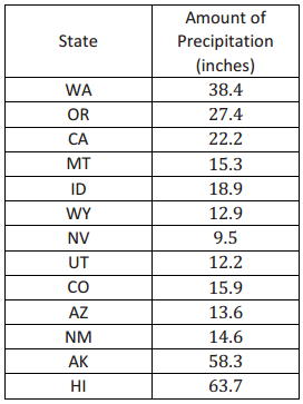
The amount of precipitation in each of the western states in the United States is given in the table as well as the dot plot.
Eureka Math Grade 6 Module 6 Lesson 12 Problem Set Answer Key 4

Eureka Math Grade 6 Module 6 Lesson 12 Problem Set Answer Key 5

a. How do the amounts vary across the states?
Answer:
Answers will vary. The spread is pretty large: 54.2 inches. Nevada has the lowest precipitation at 9.5 inches per year. Hawaii, Alaska, and Washington have more rain than most of the states. Hawaii has the most precipitation with 63.7 inches, followed by Alaska at 58.3 inches.

b. Find the median. What does the median tell you about the amount of precipitation?
Answer:
The median is 15.9 inches. Half of the western states have more than 15.9 inches of precipitation per year, and half have less.

c. Do you think the mean or median would be a better description of the typical amount of precipitation? Explain your thinking.
Answer:
The mean at 24.8 inches reflects the extreme values, while the median seems more typical at 15.9 inches.

Question 2.
Identify the following as true or false. If a statement is false, give an example showing why.

a. The median is always equal to one of the values in the data set.
Answer:
False. If the middle two values in the ordered data set are 1 and 5, the median is 3, and 3 is not in the set.

b. The median is halfway between the least and greatest values in the data set.
Answer:
False. For example, looking at the number of french fries per bog for Restaurant A in Example 1, the median is 82, which is not halfway between 66 and 93 (79.5).

c. At most, half of the values in a data set have values less than the median.
Answer:
True
d. In a data set with 25 different values, if you change the two smallest values in the data set to smaller values, the median will not be changed.
Answer:
True
e. If you add 10 to every value in a data set, the median will not change.

Answer:
False. The median will increase by 10 as well. If the data set is 1, 2, 3, 4, 5, the median is 3. For the data set 11, 12, 13, 14,15, the median is 13.

Question 3.
Make up a data set such that the following is true:

a. The data set has 11 different values, and the median is 5.
Answer:
Answers will vary. If the numbers are whole numbers, the set would be 0, 1, 2, 3, 4, 5, 6, 7, 8, 9, 10.

b. The data set has 10 values, and the median is 25.
Answer:
Answers will vary. One answer is to have ten values that are all 25’s.

c. The data set has 7 values, and the median is the same as the least value.
Answer:
Answers will vary. One answer is to have 1, 1, 1, 1, 2, 3, 4.

Question 4.
The dot plot shows the number of landline phones that a sample of people have in their homes.
Eureka Math Grade 6 Module 6 Lesson 12 Problem Set Answer Key 6

a. How many people were in the sample?
Answer:
There are 25 people in the sample.

b. Why do you think three people have no landline phones in their homes?
Answer:
Possible answers: Some people might only have cell phones or some people may not be able to afford a phone or may not want a phone.

c. Find the median number of phones for the people in the sample.
Answer:
The median number of phones per home is 2.

Question 5.
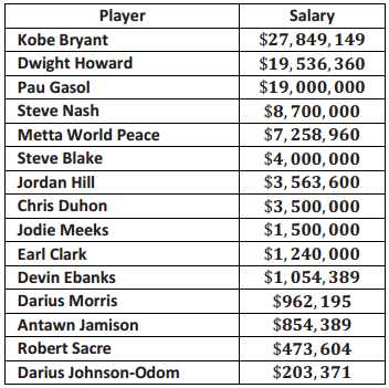
The salaries of the Los Angeles Lakers for the 2012 – 2013 basketball season are given below. The salaries in the table are ordered from largest to smallest.
Eureka Math Grade 6 Module 6 Lesson 12 Problem Set Answer Key 7

a. Just looking at the data, what do you notice about the salaries?
Answer:
Possible answer: A few of the salaries for the big stars like Kobe Bryant are really big, while others are very small in comparison.

b. Find the median salary, and explain what it tells you about the salaries.
Answer:
The median salary ¡s $3, 500,000 for Chris Duhon. Half of the players make more than $3, 500,000, and half of the players make less than $3, 500, 000.

c. Find the median of the lower half of the salaries and the median of the upper half of the salaries.
Answer:
$962, 195 is the median for the bottom half of the salaries. $8, 700,000 is the median for the top half of the salaries.

d. Find the width of each of the following intervals. What do you notice about the size of the interval widths, and what does that tell you about the salaries?

i. Minimum salary to the median of the lower half:
Answer:
$758, 824

ii. Median of the lower half to the median of the whole data set:
Answer:
$2,537,805

iii. Median of the whole data set to the median of the upper half:
Answer:
$5, 200, 000

iv. Median of the upper half to the highest salary:
Answer:
$19,149,149

The largest width is from the median of the upper half to the highest salary. The smaller salaries are closer together than the larger ones.

Question 6.
Use the salary table from the previous page to answer the following.

a. If you were to find the mean salary, how do you think it would compare to the median? Explain your reasoning.
Answer:
Possible answer: The mean will be a lot larger than the median because when you add in the really big salaries, the size of the mean will increase a lot.

b. Which measure do you think would give a better picture nf a typical salary for the Lakers, the mean or the median? Explain your thinking.
Answer:
Possible answer: The median seems better, os ¡t ¡s more typical of most of the salaries.

Eureka Math Grade 6 Module 6 Lesson 12 Exit Ticket Answer Key

Question 1.
What is the median age for the following data set representing the ages of students requesting tickets for a summer band concert? Explain your reasoning.
13 14 15 15 16 16 17 18 18
Answer:
The median is the 5th value in the ordered list, or 16 years, as there are 4 values less than 16 and 4 values greater than or equal to 16 (excluding the 5 value).


Question 2.
What ¡s the median number of diseased trees from a data set representing the numbers of diseased trees on each of 12 city blocks? Explain your reasoning.
11 3 3 4 6 12 9 3 8 8 8 1
Answer:
To find the median, the values first need to be ordered: 1 3 3 3 4 6 8 8 8 9 11 12.
Because there are an even number of data values, the median would be the mean of the 6th and 7th values: \(\frac{6+8}{2}\) or 7 diseased trees.

Question 3.
Describe how you would find the median for a set of data that has 35 values. How would this be different if there were 36 values?
Answer:
Answers will vary. First, you would order the data from kast to greatest. Because there are 35 values, you would look for the 18th value from the top or bottom in the ordered list. This would be the median with 17 values above and 17 values below, if the set hod 36 values, you would find the average of the middle two data values, which would be the average of the 18th and the 19th values in the ordered list.

Eureka Math Grade 6 Module 6 Lesson 11 Answer Key

Engage NY Eureka Math Grade 6 Module 6 Lesson 11 Answer Key

Eureka Math Grade 6 Module 6 Lesson 11 Example Answer Key

Example 1: Comparing Distributions with the Same Mean

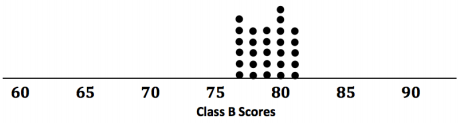
In Lesson 10, data distribution was characterized mainly by its center (mean) and variability (MAD). How these measures help us make a decision often depends on the context of the situation. For example, suppose that two classes of students took the same test, and their grades (based on loo points) are shown in the following dot plots. The mean score for each distribution is 79 points. Would you rather be in Class A or Class B if you had a score of 79?

Eureka Math Grade 6 Module 6 Lesson 11 Example Answer Key 1

Eureka Math Grade 6 Module 6 Lesson 11 Example Answer Key 2

Exercises 1 – 6:

Exercise 1.
Looking at the dot plots, which class has the greater MAD? Explain without actually calculating the MAD.
Answer:
Class A. The data for Class A have a much wider spread. Thus, it has greater variability and a larger MAD.

Exercise 2.
If Liz had one of the highest scores in her class, in which class would she rather be? Explain your reasoning.
Answer:
She would rather be in Class A. This doss had higher scores in the 90’s, whereas Class B had a high score of only 81.

Exercise 3.
If Logan scored below average, in which class would he rather be? Explain your reasoning.
Answer:
Logan would rather be in Class B. The low scores in Class B were in the 70 ‘s, whereas Class A had low scores in the 60’s.

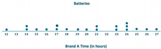
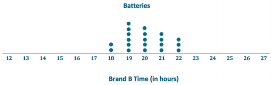
Your little brother asks you to replace the battery in his favorite remote control car. The car is constructed so that it is difficult to replace its battery. Your research of the lifetimes (in hours) of two different battery brands (A and B) shows the following lifetimes for 20 batteries from each brand:

Eureka Math Grade 6 Module 6 Lesson 11 Example Answer Key 3

Exercise 4.
To help you decide which battery to purchase, start by drawing a dot plot of the lifetimes for each brand.
Answer:
Eureka Math Grade 6 Module 6 Lesson 11 Example Answer Key 4

Eureka Math Grade 6 Module 6 Lesson 11 Example Answer Key 5

Exercise 5.
Find the mean battery lifetime for each brand, and compare them.
Answer:
The mean of Brand A is 20 hours.
The mean of Brand B is 20 hours.
Both Brand A and Brand B have the same mean lifetime.

Exercise 6.
Looking at the variability in the dot plot for each data set, give one reason you might choose Brand A. What is one reason you might choose Brand B? Explain your reasoning.
Answer:
Answers will vary.
If I choose Brand A, I might get a battery that lasts a lot longer than 20 hours, on might get a battery that has a much shorter lifetime. If I choose Brand B, I would always geta battery that lasts approximately 20 hours.

Example 2: Comparing Distributions with Different Means

You have been comparing distributions that have the same mean but different variability. As you have seen, deciding whether large variability or small variability is best depends on the context and on what is being asked. If two data distributions have different means, do you think that variability will still play a part in making decisions?
Answer:
Yes, because considering variability in addition to center provides us with more information about the distributions and allows us to make more informed decisions.

Exercises 7 – 9:

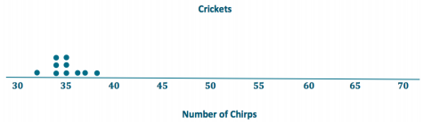
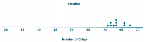
Suppose that you wanted to answer the following question: Are field crickets better predictors of air temperature than katydids? Both species of insect make chirping sounds by rubbing their front wings together.

The following data are the number of chirps (per minute) for 10 insects of each type. All the data were taken on the same evening at the same time.

Eureka Math Grade 6 Module 6 Lesson 11 Example Answer Key 6

Exercise 7.
Draw dot plots for these two data distributions using the same scale, going from 30 to 70. Visually, what conclusions can you draw from the dot plots?
Answer:
Eureka Math Grade 6 Module 6 Lesson 11 Example Answer Key 7

Eureka Math Grade 6 Module 6 Lesson 11 Example Answer Key 8

Visually, you can see that the value for the mean number of chirps is higher for the katydids. The variability looks to be similar.

Exercise 8.
Calculate the mean and MAD for each distribution.
Answer:
Crickets: The mean is 35 chirps per minute.
The sum of all the distances from the mean is 12 because 0 + 3 + 0 + 2 + 1 + 1 + 3 + 0 + 1 + 1 = 12. Therefore, the MAD is 1.2 chirps per minute because \(\frac{12}{10}\) = 1. 2.

Katydids: The mean is 64 chirps per minute.

The sum of all the distances from the mean is 16 because 2 + 2 + 3 + 0 + 1 + 2 + 4 + 0 + 2 + 0 = 16. Therefore, the MAD is 1.6 chirps per minute because \(\frac{16}{10}\) = 1.6.

Exercise 9.
The outside temperature T, in degrees Fahrenheit, can be predicted by using two different formulas. The formulas include the mean number of chirps per minute made by crickets or katydids.

a. For crickets, T is predicted by adding 40 to the mean number of chirps per minute. What value of T is being predicted by the crickets?
Answer:
The predicted temperature is 35 + 40, or 75 degrees.

b. For katydids, T is predicted by adding 161 to the mean number of chirps per minute and then dividing the sum by 3. What value of T is being predicted by the katydids?
Answer:
The predicted temperature is \(\frac{(64+161)}{3}\), or 75 degrees.

c. The temperature was 75 degrees Fahrenheit when these data were recorded, so using the mean from each data set gave an accurate prediction of temperature. If you were going to use the number of chirps from a single cricket or a single katydid to predict the temperature, would you use a cricket of a katydid? Explain how variability in the distributions of number of chirps played a role in your decision.
Answer:
The crickets had a smaller MAD. This indicates that an indiuidual cricket is more likely to have a number of chirps that is close to the mean.

Eureka Math Grade 6 Module 6 Lesson 11 Problem Set Answer Key

Question 1.
Two classes took the same mathematics test. Summary measures for the two classes are as follows:

MeanMAD
Class A782
Class B7810

a. Suppose that you received the highest score in your class. Would your score have been higher if you were in Class A or Class B? Explain your reasoning.
Answer:
My score would have been higher if I had been in Class B because the means are the same, and the variability,
as measured by the MAD, is higher in that class than it is in Class A.

b. Suppose that your score was below the mean score. In which class would you prefer to have been? Explain your reasoning.
Answer:
I would prefer to have been in Class A because the variability, as measured by the MAD, indicates a more compact distribution around the mean. In contrast, a score below the mean in Class B could be far lower than in Class A.

Question 2.
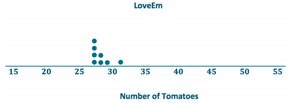
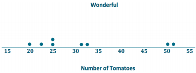
Eight of each of two varieties of tomato plants, LoveEm and Wonderful, are grown under the same conditions. The numbers of tomatoes produced from each plant of each variety are shown:

Eureka Math Grade 6 Module 6 Lesson 11 Problem Set Answer Key 9

a. Draw dot plots to help you decide which variety is more productive.
Answer:
Eureka Math Grade 6 Module 6 Lesson 11 Problem Set Answer Key 10

Eureka Math Grade 6 Module 6 Lesson 11 Problem Set Answer Key 11

b. Calculate the mean number of tomatoes produced for each variety. Which one produces more tomatoes on average?
Answer:
The mean number of LoveEm tomatoes is 28, and the mean number of Wonderful tomatoes is 32. Wonderful produces more tomatoes on average.

c. If you want to be able to accurately predict the number of tomatoes a plant is going to produce, which variety should you choose – the one with the smaller MAD or the one with the larger MAD? Explain your reasoning.
Answer:
LoveEm produces fewer tomatoes on average but is far more consistent. Looking at the dot plots, its variability is far less than that of Wonderful tomatoes. Based on these data sets, choosing LoveEm should yield numbers in the high 20’s consistently, but the number from Wonderful could vary wildly from lower yields in the low 20’s too huge yields around 50.

d. Calculate the MAD of each plant variety.
Answer:
The sum of the distances from the mean for LoveEm is 8 because 1 + 1 + 1 + 0 + 3 + 1 + 0 + 1 = 8.
Therefore, the MAD for LoveEm is 1 tomato because \(\frac{8}{8}\) = 1.

The sum of the distances from the mean for Wonderfulis 74 because 1 + 12 + 7 + 18 + 0 + 7 + 10 + 19 = 74. Therefore, the MAD for Wonderful is 9.25 tomatoes because \(\frac{74}{8}\) = 9. 25.

Eureka Math Grade 6 Module 6 Lesson 11 Exit Ticket Answer Key

Question 1.
You need to decide which of two brands of chocolate chip cookies to buy. You really love chocolate chip cookies. The numbers of chocolate chips in each of five cookies from each brand are as follows:

Eureka Math Grade 6 Module 6 Lesson 11 Exit Ticket Answer Key 12

a. Draw a dot plot for each set of data that shows the distribution of the number of chips for that brand. Use the same scale for both of your dot plots (one that covers the span of both distributions).
Answer:

Eureka Math Grade 6 Module 6 Lesson 11 Exit Ticket Answer Key 13

Eureka Math Grade 6 Module 6 Lesson 11 Exit Ticket Answer Key 14

b. Find the mean number of chocolate chips for each of the two brands. Compare the means.
Answer:
Mean for ChocFull: 18 chocolate chips
Mean for AliChoc: 18 chocolate chips
The means for the two different brands are the same.

c. Looking at your dot plots and considering variability, which brand do you prefer? Explain your reasoning.
Answer:
Students could argue either way:
1. Students who prefer ChocFull may argue that they are assured of getting 18 chips most of the time, with no fewer than 17 chips, and a bonus once in a while of 19 chips. With AliChoc, they may sometimes get more than 20 chips but would sometimes get only 14or 15 chips.

2. Students who prefer AllChoc are the risk-takers who are willing to tolerate the chance of getting only 14 or 15 chips for the chance of getting 21 or 22 chips.

Eureka Math Grade 6 Module 6 Lesson 10 Answer Key

Engage NY Eureka Math Grade 6 Module 6 Lesson 10 Answer Key

Eureka Math Grade 6 Module 6 Lesson 10 Example Answer Key

Example 1: Describing Distributions

In Lesson 9, Sabina developed the mean absolute deviation (MAD) as a number that measures variability in a data distribution. Using the mean and MAD along with a dot plot allows you to describe the center, spread, and shape of a data distribution. For example, suppose that data on the number of pets for ten students are shown in the dot plot below.

Eureka Math Grade 6 Module 6 Lesson 10 Example Answer Key 1

There are several ways to describe the data distribution. The mean number of pets for these students is 3, which is a measure of center. There is variability in the number of pets the students have, and data values differ from the mean by about 2.2 pets on average (the MAD). The shape of the distribution is heavy on the left, and then it this out to the right.

Exercises 1 – 4:

Exercise 1.
sSuppose that the weights of seven middle school students’ backpacks are given below.

a. Fill in the following table.
Eureka Math Grade 6 Module 6 Lesson 10 Example Answer Key 2
Answer:
Eureka Math Grade 6 Module 6 Lesson 10 Example Answer Key 3

b. Draw a dot plot for these data, and calculate the mean and MAD.
Answer:
Eureka Math Grade 6 Module 6 Lesson 10 Example Answer Key 4
The mean is 18 pounds.
The MAD is 0 pounds.

c. Describe this distribution of weights of backpacks by discussing the center, spread, and shape.
Answer:
The mean is 18 pounds. There is no variability.
All of the data values are equal.

Exercise 2.
Suppose that the weight of Elisha’s backpack is 17 pounds rather than 18 pounds.

a. Draw a dot plot for the new distribution.
Answer:
Eureka Math Grade 6 Module 6 Lesson 10 Example Answer Key 5

b. Without doing any calculations, how is the mean affected by the lighter weight? Would the new mean be the same, smaller, or larger?
Answer:
The mean will be smaller because the new weight is smaller than the other weights.

c. Without doing any calculations, how is the MAD affected by the lighter weight? Would the new MAD be the same, smaller, or larger?
Answer:
The MAD would be larger because now there is variability, so the MAD is greater than zero.

Exercise 3.
Suppose that in addition to Elisha’s backpack weight having changed from 18 to 17 pounds, Fred’s backpack weight is changed from 18 to 19 pounds.

a. Draw a dot plot for the new distribution.
Answer:
Eureka Math Grade 6 Module 6 Lesson 10 Example Answer Key 6

b. Without doing any calculations, how would the new mean compare to the original mean?
Answer:
The new mean is 18 1b., which was also the original mean.

c. Without doing any calculations, would the MAD for the new distribution be the same as, smaller than, or larger than the original MAD?
Answer:
Since there is more variability, the MAD is larger than the original MAD.

d. Without doing any calculations, how would the MAD for the new distribution compare to the one in Exercise 2?
Answer:
There is more variability, so the MAD is greater than the MAD in Exercise 2.

Exercise 4.
Suppose that seven-second graders’ backpack weights were as follows:

Eureka Math Grade 6 Module 6 Lesson 10 Example Answer Key 7

a. How is the distribution of backpack weights for the second graders similar to the original distribution for the middle school students given in Exercise 1?
Answer:
Both have no variability, so the MAD is 0 pounds in both cases. The shapes of the distributions on the dot plots are the same.

b. How are the distributions different?
Answer:
The means are different. One mean is 18 pounds, and the other is 5 pounds.

Example 2: Using the MAD

Using data to make decisions often involves comparing distributions. Recall that Robert is trying to decide whether to move to New York City or to San Francisco based on temperature. Comparing the center, spread, and shape for the two temperature distributions could help him decide.

Dot Plot of Temperature for New York City
Eureka Math Grade 6 Module 6 Lesson 10 Example Answer Key 8

Dot Plot of Temperature for San Francisco
Eureka Math Grade 6 Module 6 Lesson 10 Example Answer Key 9

From the dot plots, Robert saw that monthly temperatures in New York City were spread fairly evenly from around 40 degrees to around 85 degrees, but in San Francisco, the monthly temperatures did not vary as much. He was surprised that the mean temperature was about the same for both cities. The MAD of 14 degrees for New York City told him that, on average, a month’s temperature was 14 degrees away from the mean of 63 degrees.

That is a lot of variability, which is consistent with the dot plot. On the other hand, the MAD for San Francisco told him that San Francisco’s monthly temperatures differ, on average, only 3.5 degrees from the mean of 64 degrees. So, the mean doesn’t help Robert very much in making a decision, but the MAD and dot plot are helpful.

Which city should he choose if he loves warm weather and really dislikes cold weather?
Answer:
He should choose San Francisco because there is little variability, and it does not get as cold as New York City.

Exercises 5 – 7:

Exercise 5.
Robert wants to compare temperatures for Cities B and C.
Eureka Math Grade 6 Module 6 Lesson 10 Example Answer Key 10

a. Draw a dot plot of the monthly temperatures for each of the cities.
Answer:
City B
Eureka Math Grade 6 Module 6 Lesson 10 Example Answer Key 11

City C
Eureka Math Grade 6 Module 6 Lesson 10 Example Answer Key 12

b. Verify that the mean monthly temperature for each distribution is 63 degrees.
Answer:
The data are nearly symmetrical around 63 degrees for City B. The sum of the distances to the left of the mean is equal to the sum of the distances to the right of the mean. Each of these sums is equal to 32 degrees.
For City C, the sum of the distances to the left of the mean is equal to the sum of the distances to the right of the mean. Each sum is equal to 61.

c. Find the MAD for each of the cities. Interpret the two MADs in words, and compare their values. Round your answers to the nearest tenth of a degree.
Answer:
1. The MAD is 5.3 degrees for City B, which means that, on average, the monthly temperatures differ by 5.3 degrees from the mean of 63 degrees.
2. The MAD is 10.2 degrees for City C, which means that, on average, the monthly temperatures differ by 10.2 degrees from the mean of 63 degrees.

Exercise 6.
How would you describe the differences in the shapes of the monthly temperature distributions of the two cities?
Answer:
The temperatures are nearly symmetric around the mean in City B. The temperatures are compact to the left of the mean for City C and then spread out to the right (skewed right).

Exercise 7.
Suppose that Robert had to decide between Cities D, E, and F.
Eureka Math Grade 6 Module 6 Lesson 10 Example Answer Key 13

a. Draw a dot plot for each distribution.
Answer:
Eureka Math Grade 6 Module 6 Lesson 10 Example Answer Key 14

Eureka Math Grade 6 Module 6 Lesson 10 Example Answer Key 15

Eureka Math Grade 6 Module 6 Lesson 10 Example Answer Key 16

b. Interpret the MAD for the distributions. What does this mean about variability?
Answer:
The MADs are, all the same, so the monthly temperatures differ, on average, 10.5 degrees from the mean of 63 degrees. This means that all of the distributions have the same amount of variability.

c. How will Robert decide to which city he should move to? List possible reasons Robert might have for choosing each city.
Answer:
Robert needs to look more at the shapes of the distributions to help him make a decision.
City D – Appears to have four seasons with widespread temperatures.
City E – Has mainly cold weather and ¡s only hot for 3 months.
City F – Has mainly moderate weather and only a few cold months.

Eureka Math Grade 6 Module 6 Lesson 10 Problem Set Answer Key

Question 1.
Draw a dot plot of the times that five students studied for a test if the meantime they studied was 2 hours and the MAD was 0 hours.
Answer:
Since the MAD is 0 hours, all data values are all the same, and they would be equal to the mean value.
Eureka Math Grade 6 Module 6 Lesson 10 Problem Set Answer Key 17


Question 2.
Suppose the times that five students studied for a test are as follows:

Eureka Math Grade 6 Module 6 Lesson 10 Problem Set Answer Key 18

Michelle said that the MAD for this data set is 0 hours because the dot plot is balanced around 2. Without doing any calculations, do you agree with Michelle? Why or why not?
Answer:
No. Michelle is wrong. There is variability within the data set, so the MAD is greater than 0 hours.
Note:
If students agree with Michelle, then they have not yet mastered an understanding that the MAD is measuring variability. They need to understand that if data values differ in a distribution, whether the distribution is symmetric or not, then there is variability. Therefore, the MAD cannot be 0 hours.

Question 3.
Suppose that the number of text messages eight students receive on a typical day is as follows:
Eureka Math Grade 6 Module 6 Lesson 10 Problem Set Answer Key 19

a. Draw a dot plot for the number of text messages received on a typical day for these eight students.
Answer:
Eureka Math Grade 6 Module 6 Lesson 10 Problem Set Answer Key 20

b. Find the mean number of text messages these eight students receive on a typical day.
Answer:
Since the distribution appears to be somewhat symmetrical around a value in the 50’s, students could guess a value for the mean, such as 52 or 53, and then check the sum of the distances on either side of their predictions. Using the formula, the mean is 53 text messages because \(\frac{424}{8}\) = 53.

c. Find the MAD for the number of text messages, and explain its meaning using the words of this problem.
Answer:
The sum of the absolute deviations is 70. So, \(\frac{70}{8}\) yields a MAD of 8. 75 text messages.
This means that, on average, the number of text messages these eight students receive on a typical day differs by 8.75 text messages from the group mean of 53 text messages.

d. Describe the shape of this data distribution.
Answer:
The shape of this distribution is fairly symmetrical (balanced) around the mean of 53 messages.

e. Suppose that in the original data set, Student 3 receives an additional five text messages per day and Student 4 receives five fewer text messages per day.

i. Without doing any calculations, does the mean for the new data set stay the same, increase, or decrease as compared to the original mean? Explain your reasoning.
Answer:
The mean would remain at 53 messages because one data value moved the same number of units to the right as another data value moved to the left. So, the balance point of the distribution does not change.

ii. Without doing any calculations, does the MAD for the new data set stay the same, increase, or decrease as compared to the original MAD? Explain your reasoning.
Answer:
Since the lowest data point moved closer to the mean and the highest dota point moved closer to the mean, the resulting distribution would be more compact than the original distribution. Therefore, the MAD would decrease.

Eureka Math Grade 6 Module 6 Lesson 10 Exit Ticket Answer Key

Question 1.
A dot plot of times that five students studied for a test is displayed below.
Eureka Math Grade 6 Module 6 Lesson 10 Problem Set Answer Key 21

a. Calculate the mean number of hours that these five students studied. Then, use the mean to calculate the absolute deviations, and complete the table.
Answer:
The mean is 2 hours since the sums of the distances on either side of 2 hours are equal.
Eureka Math Grade 6 Module 6 Lesson 10 Problem Set Answer Key 22

b. Find and interpret the MAD for this data set.
Answer:
\(\frac{5}{5}\) = 1
The MAD is 1 hour. This means that, on average, the study times differed by 1 hour from the group mean of 2 hours.

Question 2.
The same five students are preparing to take a second test. Suppose that the numbers of study hours were the same except that Ben studied 2.5 hours for the second test (1. 5 hours more), and Emma studied only 3 hours for the second test (1. 5 hours less).

a. Without doing any calculations, is the mean for the second test the same as, greater than, or less than the mean for the first test? Explain your reasoning.
Answer:
The mean would be the same since the distance that one data value moved to the right was matched by the distance another data value moved to the left. The distribution is still balanced at the same place.

b. Without doing any calculations, is the MAD for the second test the same as, greater than, or less than the MAD for the first test? Explain your reasoning.
Answer:
The MAD would be smaller since the data values are clustered closer to the mean.

Eureka Math Grade 6 Module 6 Lesson 9 Answer Key

Engage NY Eureka Math Grade 6 Module 6 Lesson 9 Answer Key

Eureka Math Grade 6 Module 6 Lesson 9 Example Answer Key

Example 1: Variability

In Lesson 8, Robert wanted to decide where he would rather move (New York City or San Francisco). He planned to make his decision by comparing the average monthly temperatures for the two cities. Since the mean of the average monthly temperatures for New York City and the mean for San Francisco turned out to be about the same, he decided instead to compare the cities based on the variability in their monthly average temperatures.

He looked at the two distributions and decided that the New York City temperatures were more spread out from their mean than were the San Francisco temperatures from their mean.

Exercises 1 – 3:

The following temperature distributions for seven other cities all have a mean monthly temperature of approximately 63 degrees Fahrenheit. They do not have the same variability.

Eureka Math Grade 6 Module 6 Lesson 9 Example Answer Key 1

Exercise 1.
Which distribution has the smallest variability? Explain your answer.
Answer:
City A has the smallest variability because all the data points are the same.

Exercise 2.
Which distribution or distributions seem to have the most variability? Explain your answer.
Answer:
One or more of the following is acceptable: Cities D, E, and F. They appear to have data points that are the most
spread out.

Exercise 3.
Order the seven distributions from least variability to most variability. Explain why you listed the distributions in
the order that you chose.
Answer:
Several orderings are reasonable. Focus on student’s explanations for choosing the order, making sure that the ordering is consistent with an understanding of spread. There are some that will be hard for students to order, and if students have trouble, use this opportunity to point out that it would be useful to have a more formal way to measure variability in a data set. Such a measure is developed in Example 2.

Example 2: Measuring Variability

Based on just looking at the distributions, there are different orderings of variability that seem to make some sense. Sabina is interested in developing a formula that will produce a number that measures the variability in a data distribution. She would then use the formula to measure the variability in each data set and use these values to order the distributions from smallest variability to largest variability. She proposes beginning by looking at how far the values in a data set are from the mean of the data set.

Exercises 4 – 5:

The dot plot for the monthly temperatures in City G is shown below. Use the dot plot and the mean monthly temperature of 63 degrees Fahrenheit to answer the following questions.

City G
Eureka Math Grade 6 Module 6 Lesson 9 Example Answer Key 2

Exercise 4.
Fill in the following table for City G’s temperature deviations.

Eureka Math Grade 6 Module 6 Lesson 9 Example Answer Key 3
Answer:

Eureka Math Grade 6 Module 6 Lesson 9 Example Answer Key 4

Exercise 5.
What is the sum of the distances to the left of the mean? What is the sum of the distances to the right of the mean?
Answer:
The sum of the distances to the left of the mean is 10 + 6 + 3 + 3 = 22. The sum of the distances to the right of the mean is 1 + 1 + 1 + 1 + 1 + 5 + 5 + 7 = 22.

Example 3: Finding the Mean Absolute Deviation (MAD)

Sabina notices that when there is not much variability in a data set, the distances from the mean are small and that when there is a lot of variability in a data set, the data values are spread out and at least some of the distances from the mean are large. She wonders how she can use the distances from the mean to help her develop a formula to measure variability.

Exercises 6 – 7:

Exercise 6.
Use the data on monthly temperatures for City G given in Exercise 4 to answer the following questions.

a. Fill in the following table.

Eureka Math Grade 6 Module 6 Lesson 9 Example Answer Key 5
Answer:

Eureka Math Grade 6 Module 6 Lesson 9 Example Answer Key 6

b. The absolute deviation for a data value is its distance from the mean of the data set. For example, for the first temperature value for City G (53 degrees), the absolute deviation is 10. What !s the sum of the absolute deviations?
Answer:
The sum of the absolute deviations is 10 + 6 + 3 + 3 + 1 + 1 + 1 + 1 + 1 + 5 + 5 + 7 = 44.

c. Sabina suggests that the mean of the absolute deviations (the mean of the distances) could be a measure of the variability in a data set. Its value is the average distance of the data values from the mean of the monthly temperatures. It is called the mean absolute deviation and is denoted by the letters MAD. Find the MAD for this data set of City G’s temperatures. Round to the nearest tenth.
Answer:
The MAD (mean absolute deviation) is \(\frac{44}{12^{\prime}}\) or 3.7 degrees to the nearest tenth of a degree.

d. Find the MAD values in degrees Fahrenheit for each of the seven city temperature distributions and use the values to order the distributions from least variability to most variability. Recall that the mean for each data set is 63 degrees Fahrenheit. Looking only at the distributions, does the list that you made in Exercise 2 match the list made by ordering MAD values?
Eureka Math Grade 6 Module 6 Lesson 9 Example Answer Key 7
Answer:
If time is a factor in completing this lesson, assign cities to individual students. After each student has calculated the mean deviation, organize the results for the whole class. Direct students to calculate the MAD to the nearest tenth of a degree.

MAD values (in °F):
City A = 0
City B = 5.3
City C = 3.2
City D = 10.5
City E = 10.5
City F = 10.5
City G = 3.7
The order from least to greatest is A, C, G, B, and D, E, and F(all tied).

e. Which of the following is a correct interpretation of the MAD?
i. The monthly temperatures in City G are all within 3. 7 degrees from the approximate mean of 63 degrees.
ii. The monthly temperatures in City G are, on average, 3. 7 degrees from the approximate mean temperature of 63 degrees.
iii. All of the monthly temperatures in City G differ from the approximate mean temperature of 63 degrees by 3. 7 degrees.
Answer:
The answer is (ii). Remind students that the MAD is an average of the distances from the mean, so some distances may be smaller and some larger than the value of the MAD. Point out that the distances from the mean for City G were not all equal to 3.7 and that some were smaller (for example, the distances of 1 and 3) and that some were larger (for example, the distances of 5 and 10).

Exercise 7.
The dot plot for City A’s temperatures follows.
City A
Eureka Math Grade 6 Module 6 Lesson 9 Example Answer Key 8

a. How much variability is there in City A’s temperatures? Why?
Answer:
There is no variability in City A’s temperatures. The absolute deviations (distances from the mean) are all 0.

b. Does the MAD agree with your answer In part (a)?
Answer:
The MAD does agree with my answer from part (a). The value of the MAD is 0.

Eureka Math Grade 6 Module 6 Lesson 9 Problem Set Answer Key

Question 1.
Suppose the dot plot on the left shows the number of goals a boys’ soccer team has scored in six games so far this
season, and the dot plot on the right shows the number of goals a girls’ soccer team has scored in six games so far
this season. The mean for both of these teams is 3.
Eureka Math Grade 6 Module 6 Lesson 9 Problem Set Answer Key 9

Eureka Math Grade 6 Module 6 Lesson 9 Problem Set Answer Key 10

a. Before doing any calculations, which dot plot has the larger MAD? Explain how you know.
Answer:
The graph of the boys’ team has a larger MAD because the data are more spread out and have the larger distances from the mean.

b. Use the following tables to find the MAD for each distribution. Round your calculations to the nearest hundredth.

Eureka Math Grade 6 Module 6 Lesson 9 Problem Set Answer Key 11
Answer:

Eureka Math Grade 6 Module 6 Lesson 9 Problem Set Answer Key 12
The MAD for the boy’s team is 2 goals because \(\frac{12}{6}\) = 2. The MAD for the girls’ team is 0.67 goal because \(\frac{4}{6}\) ≈ 0.67

c. Based on the computed MAD values, for which distribution is the mean a better indication of a typical value? Explain your answer.
Answer:
The mean is a better indicator of a typical value for the girl’s team because the measure of variability given by the MAD is lower (0.67 goal) than the boys’ MAD (2 goals).

Question 2.
Recall Robert’s problem of deciding whether to move to New York City or to San Francisco. A table of temperatures (in degrees Fahrenheit) and absolute deviations for New York City follows:

Eureka Math Grade 6 Module 6 Lesson 9 Problem Set Answer Key 13

a. The absolute deviations for the monthly temperatures are shown in the above table. Use this information to calculate the MAD. Explain what the MAD means in words.
Answer:
The sum of the absolute deviations is 168. The MAD is the average of the absolute deviations. The MAD is 14 degrees because \(\frac{168}{12}\) = 14. On average, the monthly temperatures in New York City differ from the mean of 63 degrees Fahrenheit by 14 degrees.

b. Complete the following table, and then use the values to calculate the MAD for the San Francisco data distribution.

Eureka Math Grade 6 Module 6 Lesson 9 Problem Set Answer Key 14
Answer:
The sum of the absolute deviations is 42. The MAD is the mean of the absolute deviations. The MAD is 3.5 degrees because \(\frac{42}{12}\) = 3. 5.

Eureka Math Grade 6 Module 6 Lesson 9 Problem Set Answer Key 15

c. Comparing the MAD values for New York City and San Francisco, which city would Robert choose to move to if he is interested in having a lot of variability in monthly temperatures? Explain using the MAD.
Answer:
New York City has a MAD of 14 degrees, as compared to 3.5 degrees in San Francisco. Robert should choose
New York City if he wants to have more variability in monthly temperatures.

Question 3.
Consider the following data of the number of green jelly beans in seven bags sampled from each of five different candy manufacturers (Awesome, Delight, Finest, Sweeties, YumYum). Note that the mean of each distribution is 42 green jelly beans.

Eureka Math Grade 6 Module 6 Lesson 9 Problem Set Answer Key 16

a. Complete the following table of the absolute deviations for the seven bags for each candy manufacturer.

Eureka Math Grade 6 Module 6 Lesson 9 Problem Set Answer Key 17
Answer:

Eureka Math Grade 6 Module 6 Lesson 9 Problem Set Answer Key 18

b. Based on what you learned about MAD, which manufacturer do you think will have the lowest MAD? Calculate the MAD for the manufacturer you selected.

Eureka Math Grade 6 Module 6 Lesson 9 Problem Set Answer Key 19
Answer:
Use the MAD for each manufacturer to evaluate student’s responses.

Eureka Math Grade 6 Module 6 Lesson 9 Problem Set Answer Key 20

Eureka Math Grade 6 Module 6 Lesson 9 Exit Ticket Answer Key

Question 1.
The mean absolute deviation (MAD) is a measure of variability for a data set. What does a data distribution look like if its MAD equals zero? Explain.
Answer:
If the MAD is zero, then all of the absolute deviations are zero. The MAD measures the average distance from the mean, and the distance is never negative. The only way the MAD could average to zero is if all the absolute deviations are zero. For example, City A had a dot plot where all of the temperatures were the same. Because all of the temperatures were the same, all of the absolute deviations were zero, which indicates that there was no variability in the temperatures.

Question 2.
Is it possible to have a negative value for the MAD of a data set?
Answer:
Because a MAD is the average of distances, which can never be negative, the MAD is always zero or a positive number.

Question 3.
Suppose that seven students have the following numbers of pets: 1, 1, 1, 2, 4, 4, 8.

a. The mean number of pets for these seven students is 3 pets. Use the following table to find the MAD for this distribution of number of pets.

Eureka Math Grade 6 Module 6 Lesson 9 Exit Ticket Answer Key 21
Answer:
\(\frac{14}{7}\)
The MAD number of pets is 2.

Eureka Math Grade 6 Module 6 Lesson 9 Exit Ticket Answer Key 22

b. Explain in words what the MAD means for this data set.
Answer:
On average, the number of pets for these students differs by 2 from the mean of 3 pets.

Eureka Math Grade 8 Module 1 Answer Key | Engage NY Math 8th Grade Module 1 Answer Key

eureka-math-grade-8-module-1-answer-key

EngageNY Math Grade 8 Module 1 Answer Key | Eureka Math 8th Grade Module 1 Answer Key

Topic A: Exponential Notation and Properties of Integer Exponents (8.EE.A.1) – Page No 11

Eureka Math Grade 8 Module 1 Mid Module Answer Key: Mid-Module Assessment and Rubric – Page No 72

Topic A (assessment 1 day, return 1 day, remediation or further applications 1 day)

Topic B: Magnitude and Scientific Notation (8.EE.A.3, 8.EE.A.4) – Page No 85

Eureka Math Grade 8 Module 1 End of Module Answer Key: End-of-Module Assessment and Rubric – Page No 148

Topics A through B (assessment 1 day, return 1 day, remediation or further applications 2 days)

Eureka Math Grade 8 Module 7 Answer Key | Engage NY Math 8th Grade Module 7 Answer Key

eureka-math-grade-8-module-7-answer-key

EngageNY Math Grade 8 Module 7 Answer Key | Eureka Math 8th Grade Module 7 Answer Key

Eureka Math Grade 8 Module 7 Introduction to Irrational Numbers Using Geometry

Eureka Math Grade 8 Module 7 Topic A Square and Cube Roots

Eureka Math 8th Grade Module 7 Topic B Decimal Expansions of Numbers

Eureka Math Grade 8 Module 7 Mid Module Assessment Answer Key

Engage NY Math 8th Grade Module 7 Topic C The Pythagorean Theorem

EngageNY Math Grade 8 Module 7 Topic D Applications of Radicals and Roots

Eureka Math Grade 8 Module 7 End of Module Assessment Answer Key

Eureka Math Grade 8 Module 6 Answer Key | Engage NY Math 8th Grade Module 6 Answer Key

eureka-math-grade-8-module-6-answer-key

EngageNY Math Grade 8 Module 6 Answer Key | Eureka Math 8th Grade Module 6 Answer Key

Eureka Math Grade 8 Module 6 Linear Functions

Eureka Math Grade 8 Module 6 Topic A Linear Functions

Eureka Math 8th Grade Module 6 Topic B Bivariate Numerical Data

Eureka Math Grade 8 Module 6 Mid Module Assessment Answer Key

Engage NY Math 8th Grade Module 6 Topic C Linear and Nonlinear Models

EngageNY Math Grade 8 Module 6 Topic D Bivariate Categorical Data

Eureka Math Grade 8 Module 6 End of Module Assessment Answer Key

Eureka Math Grade 8 Module 5 Answer Key | Engage NY Math 8th Grade Module 5 Answer Key

eureka-math-grade-8-module-5-answer-key

EngageNY Math Grade 8 Module 5 Answer Key | Eureka Math 8th Grade Module 5 Answer Key

Eureka Math Grade 8 Module 5 Examples of Functions from Geometry

Eureka Math Grade 8 Module 5 Topic A Functions

Eureka Math 8th Grade Module 5 Topic B Volume

Eureka Math Grade 8 Module 5 End of Module Assessment Answer Key

Eureka Math Grade 8 Module 4 Answer Key | Engage NY Math 8th Grade Module 4 Answer Key

eureka-math-grade-8-module-4-answer-key

EngageNY Math Grade 8 Module 4 Answer Key | Eureka Math 8th Grade Module 4 Answer Key

Eureka Math Grade 8 Module 4 Linear Equations

Eureka Math Grade 8 Module 4 Topic A Writing and Solving Linear Equations

Eureka Math 8th Grade Module 4 Topic B Linear Equations in Two Variables and Their Graphs

Eureka Math Grade 8 Module 4 Mid Module Assessment Answer Key

Engage NY Math 8th Grade Module 4 Topic C Slope and Equations of Lines

EngageNY Math Grade 8 Module 4 Topic D Systems of Linear Equations and Their Solutions

8th Grade Eureka Math Module 4 Topic E Pythagorean Theorem

Eureka Math Grade 8 Module 4 End of Module Assessment Answer Key

Eureka Math Grade 8 Module 3 Answer Key | Engage NY Math 8th Grade Module 3 Answer Key

eureka-math-grade-8-module-3-answer-key

EngageNY Math Grade 8 Module 3 Answer Key | Eureka Math 8th Grade Module 3 Answer Key

Eureka Math Grade 8 Module 3 Similarity

Eureka Math Grade 8 Module 3 Topic A Dilation

Eureka Math Grade 8 Module 3 Mid Module Assessment Answer Key

Eureka Math 8th Grade Module 3 Topic B Similar Figures

Eureka Math Grade 8 Module 3 End of Module Assessment Answer Key

Engage NY Math 8th Grade Module 3 Topic C The Pythagorean Theorem


Eureka Math Grade 8 Module 2 Answer Key | Engage NY Math 8th Grade Module 2 Answer Key

eureka-math-grade-8-module-2-answer-key

EngageNY Math Grade 8 Module 2 Answer Key | Eureka Math 8th Grade Module 2 Answer Key

Eureka Math Grade 8 Module 2 The Concept of Congruence

Eureka Math Grade 8 Module 2 Topic A Definitions and Properties of the Basic Rigid Motions

Eureka Math 8th Grade Module 2 Topic B Sequencing the Basic Rigid Motions

Eureka Math Grade 8 Module 2 Mid Module Assessment Answer Key

Engage NY Math 8th Grade Module 2 Topic C Congruence and Angle Relationships

Eureka Math Grade 8 Module 2 End of Module Assessment Answer Key

EngageNY Math Grade 8 Module 2 Topic D The Pythagorean Theorem