Engage NY Eureka Math 6th Grade Module 2 Lesson 1 Answer Key
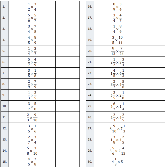
Eureka Math Grade 6 Module 2 Lesson 1 Example Answer Key
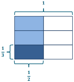
Example 1.
\(\frac{3}{4}\) gallon of batter is poured equally into 2 bowls. How many gallons of batter are in each bowl?
Answer:
→ Since the whole is being put into 2 equal parts or bowls, this is the partitive model of division. What division expression can we write to match this story?
→ \(\frac{3}{4}\) ÷ 2
→ We can also think of this problem as asking, “3 fourths is 2 groups of what?” Let’s take a look at how to solve this using an area model. What is the whole? How much batter is being shared?
→ Three-fourths gallon
→ The story tells us that the batter is poured equally into 2 bowls. How can we show this in the model?
→ We can draw another line, horizontally, to partition the model into 2 equal units.
→ Now our model shows 3 fourths being partitioned into 2 equal parts. Could we also say that our model shows \(\frac{1}{2}\) of 3 fourths?
→ Yes, it’s just like in the Opening Exercise where dividing by 2 and multiplying by are the same.
→ Let’s label our model to show that. What is half of 3 fourths?
Half of 3 fourths is 3 eighths.
→ Yes, and what is 3 fourths divided by 2?
→ It’s also 3 eighths!
→ We said that we could also think of this problem as, “3 fourths is 2 groups of what?” Is it true that 3 fourths is 2 groups of 3 eighths? Use a repeated addition or multiplication sentence to support your response.
→ Yes, it’s true. 3 eighths plus 3 eighths is 6 eighths, which is equal to 3 fourths. →. It’s true.
2 × \(\frac{3}{8}=\frac{6}{8}=\frac{3}{4}\).
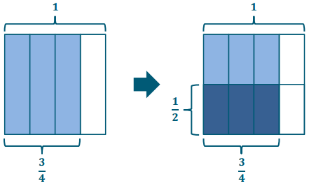
\(\frac{3}{4}\) ÷ 2 = \(\frac{1}{2}\) of \(\frac{3}{4}\) = \(\frac{3}{8}\)
\(\frac{3}{8}\) gallon of batter in each bowl.
Example 2.
\(\frac{3}{4}\) gallon of batter is poured equally into 2 bowls. How many gallons of batter are in each bowl?
Answer:
→ Again, this is partitive division problem since we’re told that there are 6 parts, or that the lasagna is being shared equally among 6 friends. Write a division expression to represent this story problem.
→ \(\frac{3}{4}\) ÷ 6
→ Remember when solving this problem, we can also think, “3 fourths is 6 groups of what?” Let’s draw another area model to solve. Think, what is our whole? Draw a model to show how much lasagna is being shared.
→ Now, partition your model again to show how it can be equally shared by 6 friends.
→ Remind me; dividing by 6 is the same as multiplying by what?
→ Multiplying by \(\frac{1}{6}\)
→ Look at our model. Explain to your neighbor how it shows division by 6 and also shows multiplication by \(\frac{1}{6}\).
→ Now write a multiplication expression that is equal to 3 fourths divided by 6.
→ \(\frac{1}{6}\) of \(\frac{3}{4}\) or \(\frac{1}{6}\) × \(\frac{3}{4}\)
\(\frac{3}{4}\) ÷ 6 = \(\frac{1}{6}\) of \(\frac{3}{4}\) = \(\frac{3}{24}\) = \(\frac{1}{8}\)
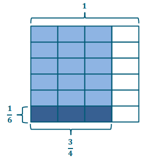
→ According to our model, what fraction of the pan will each friend get?
→ 3 twenty-fourths of the pan
→ Express 3 twenty-fourths in its simplest form.
1 eighth
Example 3.
A rope of length \(\frac{2}{5}\) m is cut into 4 equal cords. What is the length of each cord?
Answer:
→ Again, this is a partitive division problem since we’re told that there are 4 parts or that the rope is cut equally into 4 cords. Write a division expression to represent this story problem.
\(\frac{2}{5}\) ÷ 4
→ For this example, let’s draw a tape diagram and a number line.
→ The length of rope is cut into 4 equal cords. How can we show that in our models?
Partition the 2 shaded units into 4 equal parts.
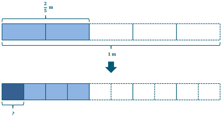
→ We originally drew fifths and shaded 2 of them to represent the length of the rope, but now what fractional unit does our model show?
Tenths
→ Answer the question. What is the length of each cord?
Each cord is \(\frac{1}{10}\) meter long.
\(\frac{2}{5} \div 4=\frac{1}{4} \text { of } \frac{2}{5}=\frac{2}{20}=\frac{1}{10}\)
Each chord is \(\frac{1}{10}\) m.
\(\frac{2}{5}\) ÷ 4 = 4 tenths ÷ 4 = 1 tenth = \(\frac{1}{10}\)
→ Take a look at the division sentence I’ve written using unit language. How do our models support this thought? How does the use of unit language support your understanding of this division problem?
→ We can also construct a number line to support our solution. When the number line is drawn beneath the tape diagram, we can see the similarities between the two models.
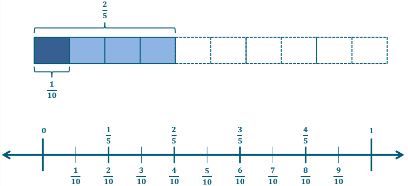 Encourage students to study the models and discuss the similarities between dividing by 4 and multiplying by \(\frac{1}{4}\). Students should articulate that both operations yield the same result.
Eureka Math Grade 6 Module 2 Lesson 1 Exercise Answer Key
Exercises 1.
Fill in the blanks to complete the equation. Then, find the quotient and draw a model to support your solution.
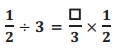
Answer:
\(\frac{1}{2} \div 3=\frac{1}{3} \times \frac{1}{2}=\frac{1}{6}\)
Exercises 2.
![]()
Answer:
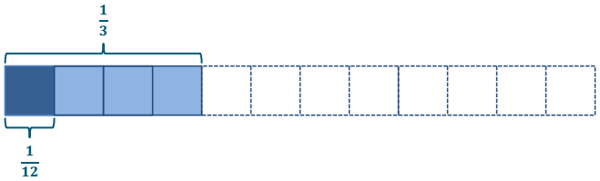
\(\frac{1}{3} \div 4=\frac{1}{4} \times \frac{1}{3}=\frac{1}{12}\)
\(\frac{1}{3}\) ÷ 4 = 4 twefiths ÷ 4 = 1 twelfth = \(\frac{1}{12}\)
Find the value of each of the following.
Exercises 3.
\(\frac{1}{4}\) ÷ 5
Answer:
\(\frac{1}{4} \div 5=\frac{1}{5} \text { of } \frac{1}{4}=\frac{1}{20}\)
Exercises 4.
\(\frac{3}{4}\) ÷ 5
Answer:
\(\frac{3}{4} \div 5=\frac{1}{5} \text { of } \frac{3}{4}=\frac{3}{20}\)
Exercises 5.
\(\frac{1}{5}\) ÷ 4
Answer:
\(\frac{1}{5} \div 4=\frac{1}{4} \text { of } \frac{1}{5}=\frac{1}{20}\)
Solve. Draw a model to support your solution.
Exercises 6.
\(\frac{3}{5}\)pt. of juice is poured equally into 6 glasses. How much juice is in each glass?
Answer:
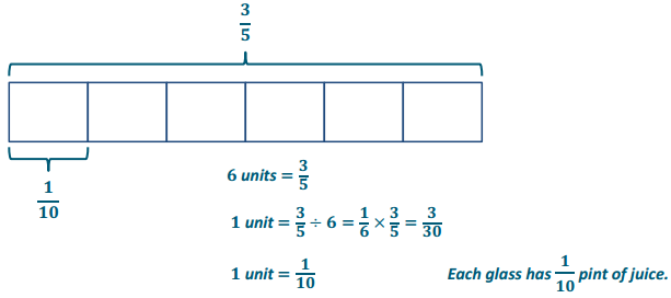
Eureka Math Grade 6 Module 2 Lesson 1 Problem Set Answer Key
Find the value of each of the following in its simplest form.
Question 1.
a. \(\frac{1}{3}\) ÷ 4
Answer:
\(\frac{1}{12}\)
b. \(\frac{2}{5}\) ÷ 4
Answer:
\(\frac{1}{10}\)
c. \(\frac{4}{7}\) ÷ 4
Answer:
\(\frac{1}{7}\)
Question 2.
a. \(\frac{2}{5}\) ÷ 3
Answer:
\(\frac{2}{15}\)
b. \(\frac{5}{6}\) ÷ 5
Answer:
\(\frac{1}{6}\)
c. \(\frac{5}{8}\) ÷ 10
Answer:
\(\frac{1}{16}\)
Question 3.
a. \(\frac{6}{7}\) ÷ 3
Answer:
\(\frac{2}{7}\)
b. \(\frac{10}{8}\) ÷ 5
Answer:
\(\frac{1}{4}\)
c. \(\frac{20}{6}\) ÷ 2
Answer:
\(\frac{5}{3}\)
Question 4.
4 loads of stone weigh \(\frac{2}{3}\) ton. Find the weight of 1 load of stone.
Answer:
\(\frac{2}{3}\) ÷ 4 = \(\frac{1}{6}\)
Each load of stone weighs \(\frac{1}{6}\) ton.
Question 5.
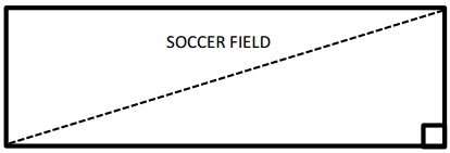
What is the width of a rectangle with an area of in and a length of 10 inches?
Answer:
\(\frac{5}{8}\) ÷ 10 = \(\frac{1}{16}\)
The width of the rectangle is \(\frac{1}{16}\) in.
Question 6.
Lenox ironed \(\frac{1}{4}\) of the shirts over the weekend. She plans to split the remainder of the work equally over the next 5 evenings.
a. What fraction of the shirts will Lenox iron each day after school?
Answer:
\(\frac{3}{4}\) ÷ 5 = \(\frac{3}{20}\)
Lenox will iron \(\frac{3}{20}\) of the shirts each day after school.
b If Lenox has 40 shirts how many shirts wlll she need to iron on Thursday and Friday?
Answer:
\(\frac{3}{20}\)(40) = 6
Lenox will need to iron 6 shirts on Thursday and 6 shirts on Friday.
Therefore, Lenox will need to iron 12 shirts on Thursday and Friday.
Question 7.
Bo paid bills with \(\frac{1}{2}\) of his paycheck and put \(\frac{1}{5}\) of the remainder in savings. The rest of his paycheck he divided equally among the college accounts of his 3 children.
a. What fraction of his paycheck went into each child’s account?
Answer:
\(\frac{1}{2}\left(\frac{1}{5}\right)=\frac{1}{10}\). This means \(\frac{1}{10}\) of Bo’s paycheck goes into savings. \(\frac{1}{2}+\frac{1}{10}=\frac{5}{10}+\frac{1}{10}=\frac{6}{10}=\frac{3}{5}\).
This means that \(\frac{3}{5}\) of Bo’s paycheck goes to bills and savings, which leaves \(\frac{2}{5}\) of his paycheck for college accounts.
\(\frac{2}{5}\) ÷ 3 = \(\frac{2}{15}\)
Therefore, Bo put \(\frac{2}{15}\) of his paycheck in each child’s account.
b. If Bo deposited $400 in each child’s account, how much money was in Bo’s original paycheck?
Answer:
$400 is \(\frac{2}{15}\) group of what size?
2 unIts = $400
1 unit= $400 ÷ 2 = $200
15 units = 15 × $200 = $3, 000
Bo was originally paid $3, 000.
Eureka Math Grade 6 Module 2 Lesson 1 Exit Ticket Answer Key
Write an equivalent multiplication expression. Then, find the quotient In its simplest form. Use a model to support your response.
Question 1.
\(\frac{1}{4}\) ÷ 2
Answer:
\(\frac{1}{4} \div 2=\frac{1}{2} \times \frac{1}{4}=\frac{1}{8}\)
Question 2.
\(\frac{2}{3}\) ÷ 6
Answer:
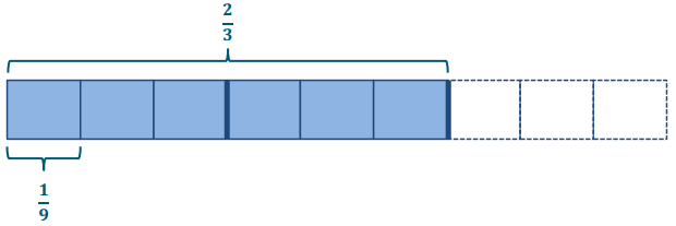
\(\frac{2}{3} \div 6=\frac{1}{6} \times \frac{2}{3}=\frac{2}{18}=\frac{1}{9}\)